Sunday, February 26, 2012

Sketch A Day: #29 - Dr. Sketchy's Smorgasborg!


A Dr. Sketchy's night in SF! Ben was a great model for the evening, and a lot of drawing got done! Alaina came with me, and we met our friend Heather there as well. They will have to talked into posting their drawings as well.

This clearly fulfills my sketch a day requirement for yesterday. letme know what you think.


Friday, February 24, 2012

Sketch A Day #28: Bad Night

Ok, so here is the story.

Nothing was working. Seriously, i did a whole steampunk woman in a cool costume that looked like complete and utter amateur night, worked two versions of her before scrapping all of them.

Did this sketch off of a profile pic of a semi-famous actress. Liked the mass of hair that she had up in back and all the strays that had gotten away. OK, decent sketch, tried to capture it about three different ways with markers, ink wash and ink.

They were all complete shit. Blew it up on the copier and put bristol over it and went to work with an HB Mirado black Warrior pencil and in 4 minutes had this.

So I quit. The rest is crap and, quite honestly, I'm not brave enough to scan them and show you how crap I am tonight. This is all you get today and its still not that good at all, lets face it. No idea why.

Going to Dr. Sketchys in SF tomorrow night with Alaina and Heather. We'll see how that goes.

Wednesday, February 22, 2012

Sketch A Day #27 - That Face

I've just seen a face, I can't forget the time or place where we just met.

She's just the girl for me and i want all the world to see we've met.

mmm-hmm.

copic marker on bristol

Tuesday, February 21, 2012

Sketch A Day #26 - Millais and more!

two more pieces from the Cult of Beauty exhibition! A second piece by Millais on the upper level, and two smaller sketches, one just quickly knocking in the layout of the painting, and another of an intricate bust with some of the greatest marble tits i've ever seen.

Sketch A Day #25 - Kate Perugini 1880 by Millais

The Cult of Beauty exhibition opened at the Legion of Honor in San Francisco this week, and the whole family journeyed in to see it. Good crowds, plenty of turn out for the first day; it should come as no surprise that there are plenty of lovers of the British Aesthetic Movement in San Francisco.

We all took sketchbooks with us, as we do now. While I expected to see the Brune-Jones and Rosetti pieces, I was quite caught up by two paintings by Millais, and did two quick sketches of them. The first is here: Kate Perugini, done in 1880.

Its a real treat to see this here, as this is the only stop in the USA for the tour, which has pieces from the Victoria and Albert Museum in London and the D'Orsay in Paris.

More tomorrow...

Friday, February 17, 2012

Sketch A Day #24: The Drummer from Planetary

And, finally, The Drummer from the series Planetary. Drums, while in most every issue of the series, and playing a pivotal role in a bunch of issues, remains mostly unchanged by the events around him. Lets face it, Ellis had a whole lot of plot and other fun stuff to do in Planetary, so Drums and Jakita Wagner get less development along the way.

Of course it is the young Drummer's comment, "Worst. Rescue. Ever." as they're blown out of the window 30 stories up that remains a personal favorite.

Thursday, February 16, 2012

Sketch A Day #23: A villian perhaps?

Someone new, an image that came to me with a pencil in my hand. perhaps a new villian for one of the stories that i have in my head.

Not certain yet.

Thats the beauty in art. you never quite know what you might end up with.

All i know is that i ended up with sketch #23.

Looking forward to being at Dr. Sketchys in San Francisco on the 25th for Samurai Night on Van Ness. If you're a blog reader, come up and say "hello."

india ink and Copic marker on Strathmore layout

Wednesday, February 15, 2012

Sketch A Day #22: Dr Strange

We interrupt the Planetary sketches for a random Dr. Strange sketch that i did last night. i realized, to my horror, that i did not remember how to do his cape of levitation, nor how to do that damn funky collar. And i declined to Google it.

so there. What you get is what you get.

Still working on a pose for the Drummer that i like, and maybe a Dr. Dowling for the Planetary series.

Yesterday, for Valentines Day, my wife gave me a book, 642 Things to Draw, that breaks you out of your rut, if you follow the book, and i may be posting from that as well...

Monday, February 13, 2012

Friedrich, Ghost Rider & that damn work for hire contract

I've not posted anything on the the Gary Friedrich suit against Marvel for the ownership of Ghost Rider, nor the recent judgement against him to the tune of $17,000, and thats partly because it has gone so viral that it really isn't necessary for me to do so.

Daniel Best has, once again, with the time and inclination to read through the court documents and understand the legalese to the point where he can break it down for us laymen. i wanted to link out to further distribute the short and dirty version of where it all stands right now, with the second movie about to open and in trailers.

Gary has no way to win this really. If Jack's heirs couldn't win against Marvel and their lawyers, then Gary has no chance of it. I guess I find it just shocking how these piddly little properties that were given away for $35 a page have turned into million dollar inventions. For the record, the second comic I ever owned was Marvel Team-Up #15, with Spider-Man and the Ghost Rider. Now there is a Kane/Romita cover I'd love to own.

And, as always, the little guy gets screwed. Period. And you'd think that Marvel would want to avoid the obvious bad press, but their lawyers are (quite correctly) worried that allowing any loophole, any crack of precedent to show through, will open the floodgates. Wolfman and Colan's heirs would go after Blade (again) and so would all the rest.

And none of this would have happened had the industry not been born on the backs of utter mobsters and crooks. Reasonable contracts up front would have taken of all of this, or at least made it a little easier. But when Seigel and Shuster and Bill Finger and Friedrich and Burgos and Everett all practically on or over the edge of poverty, there is no nice, there is no warm fuzzy spot. There is only the sound of us long time, life long comic fans sliding the tectonic plates of our nostalgia around to accomodate all the evil done to the creators over the years.

They don't sit easily together, do they?

Sketch A Day #21 - Ambrose Chase from Planetary & writing for the trade

The mysterious Ambrose Chase, who haunts much of the Planetary story, in a pensive moment, using his time stopping powers to simply slow down and appreciate a few droplets of rain.

I've never run into Warren Ellis at a convention, but will someone tell him "thanks" for me? I love this rich series and I'm having a blast doing the characters from it.

So here is the question: are stories like Planetary and Sandman things that we would consider "writing for the trade", a term using with increasing frequency in a derogatory fashion to explain the lack of enjoyment with reading the current pamphlet?

In both of those cases, I say an emphatic "No." Both of those series make sense in a single issue context, and also reveal, onion-like, many different layers upon repeated readings. They are truly the best of both worlds when they're on their game, providing both the good single issue experience and the great re-reading experience.

Now I don't believe that writing for the trade is a bad thing. For one thing, it means a longer shelf life for the work if it does read well when its collected. In many ways, it may also hasten the transition from the single issue malaise that has long affected American comics and get creators to continue to think in long form, and the inherent complexities that can are native to that (when done right).

It does mean that perhaps we can do away with the example of ultra "decompressed" comics. Catagorically, I'll state right here and now that I don't want to constantly read ultra "abbreviated" comics paced like the mid-60's DC Comics, nor do I want everything to read like Bendis' Jinx or Goldfish or Powers. Personally, I'd love to see the pace change through out the work, slowing down and speeding up when necessary. And I want my story to take me somewhere.

Is that too much to ask?

Sunday, February 12, 2012

In Review Of: Genius, Isolated by Mullaney and Canwell


The artist biography writ large, that is what Genius, Isolated (2011, IDW) is. Unexpectedly hardback and beautifully art directed, one wonders why all biographies can’t be like this.

Well, for one thing, there is pretty much no one like Toth. I say this as both good and bad really, since his reputation precedes him. It colors our opinion of his work as much as the scribbled postcards that show up in Alter Ego, as much as the nostalgia factor of seeing his hand in Space Ghost, Toth the perfectionist crank has become as much of a charicature as the real thing.

But given that this is the first volume of the three volume series, lets get a few things out of the way, because this review is partly a review of the biography, and partly a review of Toth, and how he is a symbol for discussing comics from the past in a general sense. IDW has pulled out all the stops and the volume does practically what I’ve always hopes that an artist biography would be: Plenty of scans from original pages, older photographs, correct annotations, arranged thematically as opposed to simply chronologically (which accounts for the second third volumes breaking both a person’s life up as well as the different periods of work that they created), clear art direction in both layout, and great readability in the typefaces. Hardback, meant to last, even a bookmark ribbon for keeping place. Crisp printing with deep black blacks, essential for someone like Toth.

It does everything right. Interviews with everyone still living that, and research to dig up quotes from past contemporaries to illustrate both Toth’s employment situations as well as his reaction to them. Mullaney and Canwell do a good job of not trying to sweep Toth’s legendary anger under the rug, but, perhaps, trying to give it some context.

So lets ask this question: for a beautiful book like this, is Toth deserving of it?

It may seem like an odd question really. Toth epitomizes “the artist’s artist”. His work had a documented profound effect on his contemporaries, and he’s been labeled a genius too many times to count for his brevity of line, precise and deliberate negative space and pacing acumen, his work drives many an artist to simply shake their head and say, “I can’t layout that panel better than that.” But a read through the book simply points out the utter mediocrity of the early decades of comics, and how, twenty years on from Bob Kane and Bill Finger on Batman, the industry had learned less than nothing about how to do better work.

Small wonder that Toth fumed and exploded on his bosses at, it seems, almost every opportunity. All that artistic talent and no where to go with it.

So yes, to answer my own question, yes Toth the artist deserves a biography of this magnitude, Toth from the pages of the comics doesn’t. Far too many of his stories were utter crap and then they were colored by hacks who lacked the rudimentary ability to simply determine a light source for the panel that they were rolling their crayons over. I go back to the Miller quote, back before Frank went off the deep end, when he said (and I’m paraphrasing here): “People act like we’ve got fifty years of behind us when we have fifty years of crap.” And its true.

And he’s not infallible either. While the letter that he wrote to Steve Rude ripping apart a story that Steve had penciled has circulated around the internet for years, there are certainly choices where his panel to panel transitions don’t quite up. In a way, it’s a relief to see a story where there are times that he’s not perfect either.

And that moves us to an integral part of the artwork: as the Artist's artist, I certainly can look at superior storytelling and recognize it when i see it. I can also recognize lazy storytelling or inept storytelling pretty damn quick. Trying to explain the nuances of WHY Toth's work is superior is an entirely different science, and one that the book doesn't even try to do. And I'm not sure it should. Digging into the semiotics of comics is a complex science, and one that is fraught with misunderstandings. There is not a common language sometimes that even allows to have that discussion on the interwebs, so no wonder the book decides to circumvent the entire discussion. Toth's work passes the smell test for those of us who know good storytelling when we see it. And if you don't give a damn, then you're not likely to be reading this biography.

But it is a joy to see some brilliant pages where Toth’s simplicity and expression shine through in the original black and white, as opposed to through poorly printed and designed color. It is then that all the elements that make Toth that artist’s artist shine through. Beautiful examples are the originals from “The Crushed Gardenia” (Who is Next #5) pages 115-122 and “I Fooled My Heart” (Popular Romance #24) on pages 123-129.

As professionals in this industry, we take on illustrating stories like the ones presented here, stories that almost seem to prove the long held opinion that comics are for mentally deficient humans. Could Toth have adapted to deeper, more adult work had the industry been there for him to work in? Almost certainly.

It’s a shame that he didn’t have the opportunity to work in a world were Maus had won the Pulitzer, where comics had become a medium to be respected. But, sadly, one is left with the idea that Toth, the tortured artist, Toth, the emotionally immature, Alex Toth, always his own worst enemy, would have fucked it up. And that's sad. This was, after all, Toth, the man who refused to get help for his depression and his OCD tendencies.

So I’m left with two questions: when is the next volume coming out? And… if you can do this sort of treatment for Alex Toth, a true luminary, why can’t this be done for the true king of 20th Century comics, for Jack Kirby?

Saturday, February 11, 2012

Sketch A Day #20: John Stone from Planetary

John Stone of S.T.O.R.M., a little older, still just as deadly and still rocking those impeccable suits. It reminds me of the old days, when tradecraft was done with style.

Ellis and Cassaday give us adventures that Steranko never quite got around to drawing... well, a glimpse of them at least.

I like this one.

Ink and Copic marker on 2-ply bristol

Sketch A Day #19: Jakita Wagner from Planetary

working my way through the Planetary cast, today with the least developed of the regular cast, Jakita Wagner. Really, she gets the least emotional journey through the epic arc of the Planetary story. Its fine, she exists to hit things, which of course is why she's so frustrated in the story at the end. We'd reached a point where just hitting isn't a solution anymore.

What would superhero comics be without hitting things as a solution? Lost, I tell you, lost.

india ink on bristol

Thursday, February 09, 2012

Sketch A Day #18: Elijah Snow from Planetary

Or should i have just labeled this "the fourth man:" and let those in the know get the joke?

Sorry to have been away, technical difficulties and all that. Time to climb back up on that horse and keep on ridin'

Elijah Snow, from my favorite series of the last decade, Planetary. Ink on 2-ply bristol with brush, quill and technical pen. 


You might have noticed that i said bristol. yes, that's right, I've gotten the last piece of the puzzle towards changing my studio, an excellent LED lightbox to combine with my new table. The frustration has been knowing the method that i wanted to use for drawing, but lacking all the bits to put it together. Thanks to my generous father-in-law, I'm finally able to do that.

In the meantime, we'll be back to our sketch a day starting with...NOW!

Tuesday, December 27, 2011

Sketch A Day #17 - Punk is as Punk does

Inspired by a couple different photos in the sunday Times, including a review of the Reznor Girl with the Dragon Tattoo soundtrack i created this punker, a punker that likely wouldn't so much identify as a 'punk" but as someone who chooses subculture simply because that is how she sees herself, not simply as an act of rebellion.

Mirado Black Warrior #2 on tracing paper


I'mm old enough to remember the original punks, 1977, before it all fizzled out and the rebellion was co-opted into corporate tie-ins and snide jokes on lame sitcoms. Twenty years later when i trailed the punks walking down St Marks Place in New York I had to laugh. they were infants when the Pistols flamed out and Sid OD'd over in Chelsea. Did they think that they were becoming part of a tribe or expressing their individuality by copying someone elses' Mohawk and safety pin ridden jeans vest? Part of a tribe, yes, part of a rebellion whose best days were by the legacy of scattered needles and spit upon bodies? It was a tribe whose elder members spent time on methadone and let the piercings heal up before they moved on. you can stay angry, but, shockingly, what you're angry about doesn't always stay the same.

Saturday, December 24, 2011

Sketch A Day #16 - The Shadow Knows

The weed of crime bears bitter fruit.


The Shadow knows.

If Alex is going to keep posting Shadows, then so will I.

Hope that everyone had a good holiday weekend.

Mirado Black Warrior 2.5, Lumorcolor "F", colors in photoshop

Sketch A Day #15 - George C.Scott as Scrooge

Sketched as my family watched "A Christmas Carol" with the great George C. Scott as everyone's favorite boss to hate.

Scott, of course, doesn't chew the scenery as so many Scrooges do, and of course he's scarier all the more for it. This was done with the ghost of Christmas Past, as he looks whistfully back upon the love of his youth when he worked for old Fezziwig.

I know, what a Jewish program to be watching.

Sketch A Day #14 - Loomis figure studies

Some figure studies from the Loomis' Figure Drawing For What its Worth, one of the two or three greatest books ever published in its class. Beautiful text, beautiful illustrations, excellent about actually teaching you this stuff.

With the holidays I've been working a bunch and falling behind on posting my sketches, but I've been working and will do some catch up posts.

has anyone else fallen behind a bit on their blogging?

Monday, December 19, 2011

Sketch A Day #13 Dickens Fair Lass

Inspired by my visit to the Dickens Fair in San Francisco comes this quick sketch. smoother paper than the last one, so less texture for the pencil to pick up.

Mirado Black Warrior 2.5

Tuesday, December 13, 2011

Sketch A Day #12 - The Old Man and the Sea

On sketchbook paper, which has a nice tooth to it. You can get good texture with the pencil on this paper.

Mirado Black Warrior 2.5

Obsolete Inkers, Fading Away & Jason Pearson

You know, we've talked about this before, and asked all these questions before: what do comics owe us? Do they owe us a living? Do we bleed hours and talent and fingers onto the page that is glanced at, and then discarded with nary a backward glance?

Why, yes, yes we do.

The post by Jason Pearson on Facebook about his financial and personal situation highlights the difficulties in being an artist, especially a work for hire artist, in these difficult times. I don't know Jason, we've simply never crossed paths at conventions or anything like that, but I do know where he is. I've been to that place. Mid-90's, comics going into freefall like its 1954 all over again.

And what makes it worse? Watching lesser lights, people you know who aren't as good as you still churning out monthly work, and you know that they're submitting vouchers for it and getting paid. While you're not. And you're running out of food. And rent. And the salt in the wound? Jason tried to do creator owned work, tried to create the property that could have been something really big, except that... for all the varied reasons in the world, it didn't get the movie money. Didn't hit the brass ring. Jason didn't just depend on the thinking that he could stay on the monthly treadmill forever and that Marvel and DC would continue to send him work, he tried to do more.

And yet here he is, an exceptionally talented and uniquely styled individual in a precarious situation with seemingly no way out. And it is awful to to read that.

I don't know Jason, but I find his work inspired and original and while his Facebook post reads like a suicide note, I fervently hope that its not and that others can show him the revenue stream to get out of his trap. If he had a Kickstarter project, I'd contribute now, and clearly so would a hell of a lot of others.

Artist Gerry Alanguilan was inspired to write about the future of comics and inkers in particular, and wondering just who and when it all becomes obsolete and we end up in situations like Jason. I was right there in 2000, finishing off the biggest project in my comic career, a Batman series with Doug Moench and Paul Gulacy, two of my idols, and I walked away. I had finally gotten my career to the point where I was working with "A" list pencillers, so i didn't have editors blaming my inks for construction problems that the penciller couldn't solve. Except that digital inking was looking and I could see pencillers being angled to doing such complete work that they wouldn't need inkers. I realized that sooner rather than later inking and inkers would be made, on the mid-end level, obsolete, and to continue to rely on that was stupid. Sean Godron Murphy has his thoughts on it as well, and I agree with him. My analogy is the same as his: for years I said that it was like wanting to design buggys for horses to pull at the dawn of the automotive age. You may make the best buggys ever, but if the world is pulling against you, then you're going down. Better to diversify as much as you can and not get locked into a support position. When the people you support get laid off, you're getting laid off first.

The only thing that Sean talks about: if they don't want to pay for inking, he'll raise his pencilling rate. Perhaps we should be asking why, given that Marvel and DC should be rolling in money from their recent movie successes, they're laying off people right and left. If what they want are properties to cherry pick, why kill off the people creating the properties? I'm glad that Sean has the DC direct work, but why is DC struggling? Even if the publishing arm isn't moving units, its putting butts into seats at $12 a pop for a 3-D movie.

Why did Kick-Ass get made into a movie and Body Bags didn't? No one knows.

When are us artists going to get better about living in the real world and making a living instead of living inside of these cool worlds inside of our heads?

Answer: Never.

We gotta take care of each other and ourselves. Diversify people, make friends, make connections, make sure you got more than one skill.

Get lucky.

Sketch A Day #11 - The Shadow

Ok, some odd technical difficulties with the computer, as well as my daughter's 11th birthday party and a Joe Bonamassa concert... but mostly technical difficulties with the damn computer.

Inspired by Alex Sheikman's Shadow piece the other day, I pulled out some of the pulp material that i have and got inspired. Still not happy with the inking in part with markers, but it is for speed. also some brush work on this one as well, which i'm much happier with. Looking back at the published covers, i realize, again, how much i love George Rosen's work.

Hope this one was worth the wait.

Mirado Black Warrior #2.5 pencil, Lumocolor, Deleter #4 ink, colors in Photoshop

Thursday, December 08, 2011

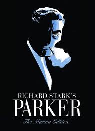
In Review Of: Parker: The Martini Edition by Stark & Cooke

With an almost jet black cover and spine, and the embossed figure of parker himself, the cypher of a criminal, on the front, we see the perfect analogy for the anti-hero: he is embossed, stuck forever in fabric of the book, but it lacks detail, lacks anything other than the outline and basic details of who he is. It tells us nothing about what motivates him, nothing about his comings and goings, nothing about his past or future. Its is both timeless and of its time.

We live in a banner time for crime comics. And, like the pulp era before, a time of anti heroes born out of a time of horrible economic disparity where the poor are on the streets and the rich live like robber barons, we find solace in the man not afraid to live in fear of his mortgage being ripped out from under him by Bank of America, or of losing his job to China; he is a criminal with a moral code of being true to himself in all that that means. We admire him because he's not afraid even as we recognize what a bad man he is. As Cooke continues to work on adapting the Westlake Parker novels for comics, it is easy to take for granted just how good these books are.

The Martini Edition hardback version of the first two adaptions does a great case for making sure that you not only get the story but get the art as well. reproduced right around original size, you get to really see the unyielding swath of ink that makes up the actual weight of Cooke's art. As well, you get to see more of the texture in the monochromatic treatments that Darwyn is working with. They're not overlays dropped in on the computer but actual brush strokes and marker strokes.


I have the two original hardbacks, as well as the larger one shot "The Man with the Getaway Face", and it was IDW publishing Getaway in the larger format that convinced me how much better Cooke's art would be at that size. There are plenty of considerations of why this is, mostly address above, but here is a small one that was bugging me: the lettering that Darwyn uses simply doesn't reduce as well as the rest of the artwork. not that it was unreadable, there were very few dropouts or close-ups on reversed out lettering, but it lacked a certain crispness really makes reading the books enjoyable.

The Hunter is good. The Man with the Getaway Face is good, the Outfit is superb. Cooke feels full of himself and is settling in enough to change styles three different times within the book, each time taking a chunk of the story and decisively changing his approach both storytelling wise and illustratively. This is only happens with creators that really are feeling at the height of their powers, and it is here.

The new story, The Seventh, picks up stylistically where the Outfit leaves off, and there is no mistake about it, this is not a little filler story, just one more brilliant little bit of Westlake/Stark crime noir that both thrills us and makes us quite happy that we're not living in that world. One small quibble: on the bottom of the pages, we have the story title carried over, and pages 322 & 323 both have "The Hunter" on the bottom, when they should have "The Seventh" like 326 & 327. Its a typo, but you think that someone would have caught it.

The extras? A gallery of Cooke pieces and notes on different movie Parkers, as well as an excellent Comics Reporter interview with Cooke, Spurgeon and Ed Brubaker. Its freely available online, but the sort of thing that might be hard to find 10 years from now, and so worth having in print.

And one final, appropriately labelled Parting Shot: a one page passage from Butcher's Moon, one of Westlake's favorite pieces of prose, and a full bleed black and white illustration that kicks as hard as anything Toth ever drew up.

All in all? Well worth the price of admission in just about every way. As always, one wonders if and when the crime story gets above itself. Its highly likely that the crime story prefers to drink its booze in dark, seedy dive bars instead of brightly lit TGI Fridays, and prefers to be published in dog-eared paperbacks as opposed to deluxe edition. Screw it, I want to read it in this edition. Fortunately, it has no say in the matter.

And yes, I made myself a vodka martini before starting on this review.

Wednesday, December 07, 2011

Sketch A Day #10 - Robert Fawcett Study

Pencil study from a 1946 illustration by the brilliant Robert Fawcett, the illustrator's illustrator. The book about him is just genius in that it gives lots of room for the art to speak, and certainly reproduces it larger and on better paper that it ever had the first time around.

We should all be so lucky, to have our best art presented in such a fashion.

After we're dead, and not getting paid for it again, and not around to enjoy it. But still, there you go. Fawcett kicked serious butt with his talent and, lets face it, hard work.

Tuesday, December 06, 2011

Sketch A Day #9 - Cooke-Inspired Gangster

Pencil sketch inspired by my Darwyn Cooke Parker: Martini Edition by IDW Publishing that I picked up today.

#2 Mirado Black Warrior, nuttin' else

OK, its pretty bad ass. Lets talk martinis in the next post.


Monday, December 05, 2011

Sketch A Day #8 - Golden Age Green Lantern

OK, I fully admit that not only do i have no affinity for the Golden Age DC heroes (outside of Bill Finger/Bob Kane Batman), I really don't even like Green Lantern.

Of course, in going through the Levitz DC book again, I found myself sitting down to do tonight's sketch with an aim todo something different.

So there you go. The Alan Scott Green Lantern. Deliberately tried to ape some of the Golden Age "simplicity" but I don't think that i comes through at all except for the face. Ah well, they're not all winners.

I really get dissatisfied with inking with markers. There is a flatness that i can't stand to the line, and it makes me think of all the artists who went to them in the '80's and '90's and just how much got lost in the art. Obviously they're fast and easy, but they lack nuance in all but the best of them.

Pencils, inks with markers (Staedtler Lumocolor, Pigma Micron, Sharpie), color in Photoshop


So what kicks butt in the golden Age DC books? The first Hawkman story, totally off the rails crazy and pulp with great art, the early Batmans with their great nior world and Kane's stiff, representational art, and the early Spectre's, which are incredibly tame compared to where he would go later, but they're interesting in their own way.

Saturday, December 03, 2011

Sketch A Day #7 - Rorschach and the fork


If you don't know this moment, then i'm not sure that I can explain it to you.

pencil sketch, Mirado black Warrior #2.5, Sharpie & Staedtler Lumocolor on Vellum, tones in Photoshop

Thursday, December 01, 2011

Sketch A Day #6 - The Invincible Iron Man

Although, if you look through the George Tuska issues, Tony was pretty vincible when it comes down to it. Over in the Avengers he totally kicked ass, and then in his own book he was being whipped, melted, shot at, had chunks of his armor falling off at any provocation, constantly running out of power and falling to his knees and having his butt handed to him by the likes of Mikas, the Soulfather.

Yikes. Being an Iron Man fan was not easy.

Marker sketch, Copic Markers, Sharpie and Micron on Vellum

Wednesday, November 30, 2011

Sketch A Day #5 Lord Morpheus

Was rereading some of the old Sandman comics, and marveling at all the balls that Neil kept juggling through the series. Of course he bit off a bit more than he thought for the final Kindly Ones storyline, but it was one hell of a ride.

For the record, my favorites in the series: The Dolls House and Inn at the End of Time arcs.

Perhaps one day I'll find the pencils from the final issues that Dringenberg drew and scan them for you all to see.

Tuesday, November 22, 2011

Sketch A Day #4

pencil (Mirado Black Warrior if you must know) from the sketchbook. Two people at the dentist's office. Sexy, I know.


Two heads for the price of one!

Monday, November 21, 2011

Totoro memes: inkwells and plushes

Never underestimate the creative spirit out there. While checking in with Comic Tools blog for an update on brushes I happened to scroll down to post on inkwells.

Yes, inkwells, you know, the sort of thing designed to keep a small mammal, like, say, a cat from knocking things over in their insane desire to get pets.

a totoro among the apples
So, of course, katrina decides to make her own, which is just about as cute as these felted critter from Pussycat Crafts. While you're over there, make a crafter's day and purchase one. Those Totoros are really frikkin' cute.

Sketch A Day #3 Who is this guy?

marker sketch, colors in photoshop

Was house sitting the last couple of days, so i'll be scanning sketches/drawings today to catch up. Hope that you like some of them.

Friday, November 18, 2011

Sketch A Day #2: Steranko-esque head

Not a clue as to why this head reminds me of the '60's Jim Steranko, perhaps because i had pulled out that collected Captain America book to scan...

I dunno, sometimes this stuff just comes out of your brain and on to the paper.

Using the Koh-I-Noor Woodless Colour Pencils that
I've fallen in love with. I grab them when I go out into the world with the sketchbook.

I want to eventually post a review of the monstrous Paul Levitz DC coffee table book, but I realize that I'm reading it with a completely different criteria than it was written with, so the review is essentially moot. I can't square the sanitized version of the events presented in the book with the back story that we know from all the principals involved. Quite frankly, the back story, well covered in Men of Tomorrow and other places with the true originals of National Periodical Publications (Siegle and Shuster, Bob kane and Bill Finger, the Moulton menage a trios) are far more fascinating than the published comics.

I at least want more background, more artwork that we've not seen, want the editors of the book to simply take even more advantage of the sheer spectacle of size that they were working with.

sigh

I'll get to it, I promise.

Wednesday, November 16, 2011

In Review Of: Overkill by Tomer Hanuka

The figures are lithe, twisted in action, reaction, ecstacy, despair, and the choking out of a death rattle. The colors could redefine garish, subtle; there are whole new qualities to the definition of "mauve" than you've ever appreciated. In the narrative of each piece, there is nothing written, and certainly nothing illustrated, on the nose. The book is likely the first ever in hot pink with an ax on the cover.

Overkill: the art of Tomer Hanuka

Deliciously, Tomer has shown us his working process on Tropical Toxic for years, which, instead of de-mystifying the process, has only made me appreciate his stuff more, especially seeing the pieces printed larger, where i can start to appreciate the liveliness of his holding lines and the inexactness of with which they're being applied.


And, of course, its all commercial work, and interestingly enough, the book holds together by technique and approach, not subject matter. We know that we're looking a myriad number of commercial assignments, not even in chronological order, so the glue here is viewpoint. And what a viewpoint it is. In every piece the camera is tilted or the figure is twisted or the light or fabric is shifted so that there is nothing settled, nothing at rest within the single panel narrative. Tomer mentions in sole text page in the back of the book about wanting to do slick American work, but it ended up with a middle easterner's anxiety underneath. And what anxiety it is. The contortion of limbs whether in violence or sexual climax mirrors the rending of cloth or flesh in decidedly non-linear fashion.

And the colors? Well, yes, the colors. tomer uses color in a very different fashion than most. There is a new palette that we see this generation using, James Jean and a whole bunch of others in Juxtapoz. While we initially saw everyone with Photoshop immediately go full color in every direction, Tomer has gone the opposite, limiting the work to four or five colors. It is interesting to note in the back that he mentions that he colors up a "regular" version, before experimenting with what are some of the most amazing combinations of shades, combining fades, dropped holding lines and sillouettes into astonishing menageries of single panel narratives.

And, yes, the final ingredient is that everyone of these pictures was the weight of narrative to them. they exist not just as that single frame, but encapsulate some of the story or article that they accompany. That we need not see the story to begin to guess from the clues shows how much visual communication is happening here. From the scattered wrapper on the floor to the line of coke on the woman's naked torso, story is unfolding everywhere you look.

I've been clipping the small accompanying illustrations that Tomer used to do for the New yorker before realizing that, after a few months, i was clipping pieces by the same artist. Clearly his aesthetic was working for me. Luckily, now i have hardback to go to over and over. You should to.

Tuesday, November 15, 2011

Sketch A Day #1, Hugo Cabret & Steranko's Cap

Leonard from the Big Bang Theory episode with paintball was frozen on the TV screen when i picked up the pencil, so he got immortalized in this sketch thanks to the magic of the DVR. Not what I imagined opening the 365 Day challenge with, but sometimes you have to go with it.

A number of years ago The Invention of Hugo Cabret ended up on my daughter's book shelf. I've no idea where it came from, but i scooped it up to read. Enjoyed it, thought that as long as you didn't try to make sense of it, your could let the plot flow along because, well, the writer was taking it where he wanted it to go. It was filled with a child's sense of wonder at the world, and a distinct lack of grown-up inflicted logic to ruin the experience. Appropriate, since the protagonist is a child, one who lived in a fairy tale world behind the clock works of a busy Paris train station. It is appropriately viewed as both staging area and metaphor since Hugo and his deceased father were the ones that kept the clocks running on time, and now that his father has passed away, the completion of the clockwork man, the finding of the missing key and the discovery of his orphanhood are coming to a head as his time runs out.

Yes, I hear you complain, I know all that. I've read the reviews and I've seen the trailer. But what you want to know is: is it a graphic novel? Or a Big Little Book on steroids?

Now that's a good question. There certainly are a huge number of illustrations (284 to be precise) as well as prose, and if we're going to argue that graphic novels can be Blankets or Cages or Goodbye Chunky Rice, but not the latest collection TPB of Fables, then we have to consider Cabret a novel. Yes, it has prose sections and employs not a single word balloon in its pages, but it does use images to advance the narrative sequentially, something that pure prose work would never do. Its an inventive use the form, and while a purist might argue that it doesn't fit, i've gotten tired of purists over the years, especially when the person breaking the rules comes up with a solid entertaining read.

And, of course, I just had to share the joys... the joys of the hard cover collector's edition of the three Steranko Captain America issues... and the quality printing that they used on the special edition.

You don't find that kind of care and attention to the registration of color these days.

Ack.

Monday, November 14, 2011

I'm back with the 365 Day Challenge

Of course, the funny thing is that I've been away for a while, but I can't keep away anymore, and hope that we'll all find some great things (in the true tradition of the blog-o-sphere) to argue about. Robert Fawcett, the Parker books by Cooke, whether Hugo Cabret is actually a graphic novel, Jim Shooter's blog, instructional books on storytelling and more. Anyone interested in coming along?

Here are a few sketches from the Vivian DeMilo session at Dr. Sketchy's SF last month. The wife and I went, sketchbooks in hand, and had a great time trying to shake the rust off of the pencils.

Now, I've never done the 24 hour comic, but my good friend Alex Sheikman has done the sketch a day challenge over at his blog, although I can't recall how long he kept it up. But given that i've never been known to be prolific, i've used some of the time away to try some different approaches and hope to force myself to play with them while knocking out some work, as well as laying out and starting on some new projects. There are a couple in mind that i can't wait to do. How long it will take to get to them is another story. 

Thursday, January 20, 2011

Closing Up Shop - Goodbye to all

A big goodbye, for now, to all of those who have followed, read, or argued with me over the last 4 years of this blog. I find that real world tragedies make it such that to continue to post here would be a dilution of my time and energy, something that i can no longer continue to do.

I've really enjoyed it, much more than i thought that i would have even. Dirk over at the late lamented Journalista gave me all sorts of traffic, and i was really thrilled to have readers in Bosnia, New Zealand, Italy and other spots all over the world. I mean, this one of those times when you say, "This is what the interwebs is all about."

I hope that my archives will continue to amuse someone or another out there. Should time and circumstances permit, I'll reopen the doors and begin again. Perhaps.

Ta. Must dash.

Wednesday, January 19, 2011

Dr Sketchy's Black Cat

One of the drawings from Dr. Sketchy's last night in SF. A rather fetching Black Cat sketch here.

The room was packed at 111 Minna, and they did admit that they've outgrown the space. This was done sitting on the floor with my pad in my lap and a single Mirado Black Warrior HB.

I'll post up one or two others in the next day or so. Looking forward to the February Steampunk themed one!

Tuesday, January 18, 2011

Sketching at dr sketchys sf

Dr. Sketchy's in San Francisco Tonight!

Tonight I'll be with pencil/pen/brush in hand at Dr. Sketchy's SF event on Minna St. Any of my comic book peeps has the evening free, that's where i'll be, so come by and say "hello" and bring your sketch pad!

If I get anything good, i promise the scan and post up soon!

Wednesday, January 05, 2011

In Experiment: Santiago in Color

Another experiment in colors - using Photoshop and modifying the opacity among other things. Whoever came up with "multiply" in the menus was a genius.

I typically think of Photoshop as the ocean. Depending on where you use it, you can get really good at 1% or maybe 3%, but its so deep and so wide and the potential applications of it so vast that no one, not even the programmers, will know it all. Learn to do what you want with it and move on.

I still prefer real paper, with real ink and then scanning and moving on to the final version. There is a pressure/texture feeling that the tablets can't mimic, and i think of it as the ultimate level of "undo". Should all else fail, harddrive wise, there is still the original art!

Thursday, December 30, 2010

In Experiment: Girl #1

Been a long time since i've experimented with color, but getting the new Robert Maguire book (Dames, Dolls and Gun Molls by Jim Silke) for Chanukah, i've felt the need to play around a little bit.

Comments?

Monday, December 27, 2010

Event Marketing vs. - gasp- Actual Stories

So its come to this has it? The Event loving chickens have come home to roost and sales are down at retailers for 18 months straight and suddenly the retailers and publishers are wondering where the readers have gone. And they both have different ideas of who to blame.

Johanna Carlson comes in with a short but succinct post about it, comparing quotes from Brian hibbs and marvel's Tom Breevort concerning cutting back the publishing line, since Brian believes that it is just such a glut of overlapping titles that has sapped the will of the consumer to buy. The Robot 6 post puts the two of them head to head.

Now, I know that i'm not the average superhero consumer. Quite the opposite it seems, since i tend to despise the event marketing and feel that it simply disrupts the actual writing of good stories, since there is so much crap that each issue has to do to make sure that it links in with the other issues properly. And, as we all know, they NEVER interlink properly.

So i've been buying Thor and Fantastic Four AS LONG AS THEY DON'T INTERLINK WITH THE REST OF THE MARVEL UNIVERSE. And because there were some interesting stories going down there. But now I'm seeing multiple Thor books and FF appearsl to be coming out sporadically and Marvel is, once again, pissing me off. So yes, the local retailer is going to have a harder time getting my money because they are once again making my life difficult.

Why is it that hard? Because nothing succeeds like copying success, and if the event strategy has worked in the past, you're not going to convince the heads up at marvel with their sales charts not to do it again, despite the general blog-o-sphere showing that the public is tired of the events. Companies, constantly looking ahead by checking out the past are notoriously bad at taking the temperture of the general public. otherwise we wouldn't have seem so many Disco albums released after 1980. Or so many Secret Wars after the wars were no longer... um... secret.

So here's the deal guys: I don't quite believe in Brian's hypothesis that the event marketing has conditioned me to ignore titles that weren't part of the cross over, it has done the opposite. It has made me want to only look at titles that weren't part of the crossovers. But he's right in that the missing ingredient in comics right now is that they're not giving me my series heroin: a series so good that i'm there for it each and every damn month and if I don't get it I'll explode. And while Tom is busy asserting that sale don't aggregate if you were to consolidate the different Spider Man (and I'm sure that he has the data to back it up), i wish that he would answer the other unspoken question of whether or not sales would go up if you had a dedicated writer and artist creating a better product rather than a product noted for simply interlocking. Or a comic noted for being a great read rather than a comic noted for crossing over to other cross overs.

Either way, in a shitty economy, you're lost readers and that's never good.

Ever.