Thursday, April 26, 2012

International Storytelling Part 1: French Albums to Kill For


If the British and the Americans can be people separated by the same language, then what are we to make of reading graphic novels in a language other than your own? How common is the visual language of comic storytelling?

It is an intriguing proposition to explore, given all the work that I’ve done in the blog over the years discussing storytelling, as I’ve been loaned a number of graphic albums recently. All in French; none of which, to my knowledge, having ever been translated into English at any point, leaving me with an experiment. How much to gleam from the storytelling alone, from the visuals, the character designs?

Up for discussion today is Orbital by Pelle and Runberg, Lupus Vol.1 by Frederik Peeters and Sambre by Yslaire and Balac. Peeters, of course, authored the brilliant Blue Pills that I reviewed years ago here, and still think fondly of (given that I believe that I loaned my sister in law my copy and I don’t think that it ever came back to me, but that’s a quibbling point). The other writers and artists are unknown to me. And I fully admit hating to type that sentence. Because I love this medium, and like most Americans I find myself provincially mired in the American comics scene, when there is a whole world of astonishing artists with which to explore.

So, without speaking a word of French, what can we take from the reading of these stories? Both a little and a lot, and much of that comes from embracing the different: different art styles, different story pacing, and different levels of imagination. Lets start with the last one first.

From the very beginning I believe that the American comic book was constrained by three things: the criminal low class with which the books were produced, the format that they were presented in, and the success of Superman. At the very onset of cheap reproduction, the pulps were overtaken by the one thing that comics needed, a hit. And a hit that would codify the way that comics were perceived (low budget crap with poor art and poorer stories), the format in which they were presented (short chapters that easily fit into a defined page count for a periodical), and that they presented a powerful nostalgia factor (kids reading Superman would want to go on and create “their” Superman for fun and profit (and, it turns out, litigation)). Super heroes would dominate most of the American market for the next 90 years. The Europeans, with a longer tradition of art and storytelling magic would produce Nosferatu to our Dracula, and years later Lt Blueberry to our Two Gun Kid. There is no way to measure the seismic difference between those books.
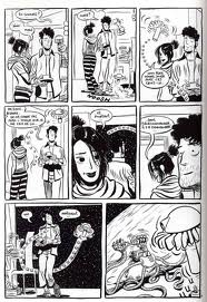
So what can we take away from those books? That the French are utterly, astonishingly, so much less fettered in their imagination that even when working on very familiar ground they inject freshness into the story. Sambre appears to be a love story between a young, depressed nobleman and a beautiful vampire. The middle third contains one long intercut seduction/sex scene in a crypt that is gorgeously drawn and staged. Orbital looks to have a future Earth being invaded by dark spider/insect aliens and the drama of the rag-tag interstellar who will have to learn to work together to save the planet.

Lupus? I have no idea what the fuck is going on. Other than it appears that Peeters doesn’t own a pencil and simply goes straight to ink on every panel that he draws. The wet, inky boldness of his drawing both sucks me in and makes the book appear to have simply appeared from his sketchbooks as opposed to the intricate work in Sambre and Orbital.

There is more design imagination in the construction of the Orbital architecture than in the last 12 issues of Fantastic Four and X-Men. And, yes, there are certainly echos of McKie, and Alien and Blade Runner and the Rebel Alliance but who cares? Even working the interstellar troops trope the books crackles with conviction

Next up: thoughts on how the page count and page size contributes to the storytelling experience (and differences therein). Not to mention the revelation that men have penises during sex scenes.

Wednesday, April 25, 2012

Inks Du Jour: Supergirl and Batwoman by Noto & Yoakum

A commission to ink and tone Phil Noto's pencil work by good friend Steven Woo. He picked up the finished piece today and left me with a new, intriguing one to work on. I'll post that later when it gets finished.

In the mean time, enjoy the fully finished Noto piece. I wish that he would fill in his own work to this level. I've seen a number of his pieces that look almost done, but never seem to get there. Fortunately I get the opportunity to do the work myself sometimes...

I have an open schedule for a little bit if anyone wants commission work, contact me via the blog.

Koh-I-Noor ink, Rafael brushes, Hunt 102 nibs and Copic Markers on bristol

Monday, March 26, 2012

Sketch A Day #39 - No, thats not a perm

I'll be upfront about it: I keep doing the Wonder Women because, one, the costume is too much fun, but two, primarily, because i don't like the way that i draw women. So, clearly, one has to continue to draw women and work on it until you get it right.

This means that you do NOT just draw male superheroes punching the crap out of each other because you've never actually been with a real woman.

I know that I lost a lot of audience right there. Just go on back to watching Big Bang Theory and think, "I'd know how to get Penny." In the meantime, I'll continue to work on until they do things like have internal organs or spines that don't show their boobs and ass at the same time.

Speaking of which, its quite nice to see that on my Google stats, the term "Ms Marvel Boobs" has fallen from being one of my top ten search engine hits. Currently, however, "Naughty Wonder Woman" is trending.

Friday, March 23, 2012

Sketch A Day #38: Wonder Woman in the Victorian Age

A liittle more work and i finalized this in a way i was almost seeing in my head.

Did things a little differently this time, since the sketch a day project is specifically to make myself take chances and do some different things.

After coming up with a pencil drawing that i liked, I lightboxed the drawing onto bristol. First I added the tones using Copic markers, the inks on the outlines with a vintage hunt 107 crowquill dip pen, then did the interior cross hatching with a hunt 102, and finally a the hair with the Rafael 8404 size 0 brush.

Wednesday, March 21, 2012

Sketch A Day #37: Victorian Wonder Woman

a new Victorian Wonder Woman piece in process. didn't really capture what i wanted from her the last two times, nad thats kinda what this whole sketch a day process is about: creating and moving on and not totally obsessing about the ones that don't work. Move on and make one that does work to your satisfaction.

yes, its true, i totally fell off the wagon for a few days. sorry. life gets busy sometimes is all.

Wednesday, March 14, 2012

RIP: Jean Giraud 1938-2012

A giant has left us, and, since he was French and didn’t do a moderately lengthy run on the X-Men at some point, there is a lot less fanfare than there should be. Jean was a GIANT in his field, and stands at the highest peaks of what it is to do with comic art. While the rest of the American comic book artists see that there is little beyond the world of superheroes, Jean, the FRENCHMAN, created the sweeping vistas of art that graced arguably the best sustained western comic epic, Lt. Blueberry, and then moved to science fiction, opening Moorcock’s door and exploring the Airtight Garage, designing uniforms for Ridley Scott’s Alien (even doing a short story with screenplay writer Dan O’Bannon that I consider a minor masterpiece). How about mentioning his short humerous pieces? Of the beautiful fantasy, Arzach, or his more lyrical illustrations that have graced more publications than can be counted?

This is not a comic book artist, this was an artist. And one whose craft was beyond remarkable. His visual shorthand showed a degree of craft that matched his vision, and one can only imagine that it was borne out his not being straightjacketed by the narrow minded vision of the American comic book industry.

It was long said that Jack Kirby got to the top of his mountain and couldn’t see the next mountain, and that Gil Kan got to the top of his mountain but didn’t know how to get to the next mountain. Moebius simply didn’t see the valleys between and strode rather effortlessly from one to the next. While I don’t always agree with that analogy, I will make the case the Moebius is the musician who appears to be able to play anything, and his ability and talent masque just how damn hard he worked.

Ah, yes, Moebius. Jean Giraud made the excellent choice to do his science fiction work under the pen name, perhaps freeing himself from the constraints of his western style for Blueberry, perhaps freeing himself from having to be any one thing, since it was clear that the Airtight Garage, his delightful epic serialized in the 1970’s Heavy Metal, took Jerry Cornelius into places that Michael Moorcock’s imagination simply wouldn’t have taken him (which, yes, was the entire point of Jerry anyway wasn’t it?). Heavy Metal, originally the best place to find hand drawn tits and ass for us naughty juveniles in the days before internet porn, now gets to be remembered more fondly for introducing us to European artists whose imaginations weren’t limited to Siegel and Shuster hand-me-downs. (Was there anything like the beautiful open line Moebius illustrations sitting next to Phillipe Druillet’s interdimensional space gothic cathedrals? Even if you weren’t stoned, there was this whole other reality that existed to open up new synapses of your brain just for trying to understand to the artwork.) That the original Airtight Garage may not have had the best translation only adds to the charm of it.

And what to make of the pen name itself? The Moebius strip winds and loops around to itself, never finding a beginning or ending, it is too perfect for the reality jumping of the Airtight Garage which needs neither a beginning or ending but, like all reality, is a series of nows that flow from one to the next.

The Incal work he did is breathtaking, although it has suffered through what appears to some onerous coloring issues that make some versions less than desireable, as well as even more onerous publishing histories of the sort that make me just want to pick them up every now and then and enjoy them in small doses. The wordless Arzach fantasies are a goldmine of subconscious images that resonate on very emotional levels with many. Moebius’ imagery is so good that it has been appropriated into world wide pop culture over the last couple decades.

Jean Giraud was an artist’s artist, a shy man that I met once in passing and, quite honestly, didn’t know what to say to him. He is one of those artists whose work has burned into the visual cortex of my brain and I don’t quite think that its ever going to leave. And it isn’t about copying him, which is terribly difficult since his work was so unique  and it generally looks like you’re just doing a poor man’s Moebius, but it’s about looking at his approach to storytelling and design. His approach was so rich and imaginative. His establishing shots, his character design, he gets his visual perspective right, and when not given a rigid structure, he finds all the subtle ways to make hard visual regression shots work and impossible shots look easy. He was an artist’s artist.

And a real giant.


Friday, March 09, 2012

Sketch A Day #36 - Femme Fatale

A femme fatale, based on an older photograph with cool dual lighting of Helena Christianson.

HB Mirado Black Warrior on Bristol

Wednesday, March 07, 2012

Sketch A Day #35 - KA-BOOM!

Drawn on the beach at Carmel-By-The-Sea this last weekend while reading over The Clockwork Prince and Tale of Sand.

HB Mirado Black Warrior on sketchbook paper

Tuesday, March 06, 2012

In Review Of: World's End Volume 1 by Tim Perkins

Very few times has someone pulled off such a beautiful thing as actually showing us the end of the world, meaning the true edge, where the water falls off into the cosmos, and the final inches of land give way to the stars and nebulae. Three quarters of the way into his debut graphic novel, one printed in full color and in a very handsome hardback edition, Tim gives us that edge shot on a two page spread with full bleed... and then dives back into his story, what appears to be a young adventure coming of age story, repleat with wise magician, evil villians from another dimension and even a mysterious girl who may or may not eventually become a love interest to young Ralf.

I had the pleasure of working with Tim back in the '90's at Defiant Comics, and it was clear from the long hours of working on pages with him that there was far that he wanted to do story-wise. Cutting his teeth on the fledgling British comics scene before coming over the states, he learned all sort of craft and it all shows up here. Jim Shooter's emphasis on clean, clear storytelling shows up here, as there is no point in the novel that you see style over substance, to where the art overwhelms the story. I bring this up because it is so important that, in a graphic novel that could very well target a younger reader, you don't want to lose them along the way. They will be come vested in your characters by story, not by endless splash page after page. Tim does a great job of keeping the story moving forward in a clear and concise manner.


And the color is brightly rendered, giving the book a full, rich sweep of colors to the panoramic shots of the alien worlds. This is no cheat, where the artist draws the background once and then conveniently saves time by dropping the background out. Tim doesn't skimp: we are front and center in a world not of our making from the first page, and it never lets up. As much attention is lavished on the interior of the invading alien's spacecraft as it is to the beautiful desert panoramas.

The story is an introduction to a much larger world, and on these coming of age stories, there is much that is saved for the later volumes. We get a scant three pages worth of the young girl Zephol, and i'm assuming that she'll play a much larger role in the narrative since she gets to be on the cover, but we spend very little time with her in the book. The majority of the book is devoted to Ralf, local scamp and royalty, and the Mathemagician Gweldar, who is equally at home casting some spells as is flying a scud bike, so he had a foot in each world as well. Unfortunately we barely get started on our quest to the World's End before we're at the end of volume 1.


Tim has long been documenting how work on the first volume over at his blog Wizard's Keep, and you can order this first volume over the web here. Go take a chance on a new author making a big leap and publishing his own work! Supporting artists directly is best way, obviously, to keep them creating new and entertaining works for us to read. (Tim also does a great job of detailing the backstory of the making of World's End in the book, describing his process in the creation of the work. Wonderful material for any aspiring artist perhaps motivated to try his or her own hand at creating the their own work.

Friday, March 02, 2012

Sketch A Day #34 - Busted!

A little fun, with our cat Voldemort standing in for the unfortunate tabby.

Still loving the victorian Wonder Woman costume, having fun drawing it. Just got Jim Henson's Tale of Sand, adapted by Ramon Perez today. i'll be reading it over the weekend and getting back to you all with a review.

Personally, I think that the cat isn't in nearly as much trouble as he thinks he is: a true Amazon appreciates the thrill of victory.

Sketch A Day #33 - She's My Kinda Girl

Didn't like my original sketch that i was working on, one of the victorian Wonder woman holding a pussycat. i'll keep working that one til i get it right. its pretty cute.
This one? an excuse to pull out my #1 and #4 brushes and let the bristles feel the texture of the bristol board. you don't get THAT on a Wacom.

Of course, i stole the title from Ramon Perez's blog that he used to post pics of the pretty girls on, my little homage.


in reality, of course, here is truly MY kinda girl.


Thursday, March 01, 2012

Sketch A Day #32 - Victorian Wonder Woman

 not entirely happy with this one, but there are some things that i like about it. This was the second pose for her and the one that i finally liked. The up shot on her face is tricky, and i'm going to go back to that until i get the regression in space correctly.

This was inspired by a cosplay photo of a Victorian Wonder Woman costume that i found on the great Fashionably Geek site. i fully admit that i never found anything that worked for me on the traditional WW costume. It simply made no sense as anything other than Marston's fantasy female dress-up. And that wasn't working for me on the comic book page (although the drop dead gorgeous, sexy and classy Lynda Carter was certainly working for me back in the 1970's) when it came to drawing her.

Running across this jpeg of the cosplay and another variation of the costume recently made me want to draw her just to do some versions that would make more physical sense in the real world.

yes, i know, i didn't get the bracelets right, and i'm not sure that the swoop of the material behind her is attached correctly. Perhaps if someone knows the cosplayer they can get a few more photos sent my way so that i can get the details correct. Thank you, whoever you are.

Amended to add - I was quite correctly pointed in the direction of Himearts.com, which is the home of the most amazing cosplayer, Riddle. Her victorian Wonder Woman page is here. Just clicking around, many of her other costumes are simply amazing as well, hopefully she won't mind my providing the link.

What is also killing me on the photo is the porker Captain America in the background. Man, that is funny.


Tuesday, February 28, 2012

Sketch A Day #31 - Samurai!

Reworked a sketch from this last saturday and came up with one that i really like. Reminds me a little of Mike Oeming's stuff on the mid-period Powers series that i liked.

Little more cartoony than I usually do, or is this just a cleaned up version of my usual style?

"G" nib Crow Quill, Brush, Rotring Technical pen on Bristol


I know that a lot of mangaka like the "G" Nib, but i'm having a hard time using it on bristol, it stalls out when i want it to start a line. I still prefer the old style Hunt 102s. Any thoughts by other artists out there?

Monday, February 27, 2012

Sketch A Day #30 - A Rolling Pin

After all the work at Dr. Sketchy's on saturday night, today you get one of the challenges from 642 things to draw book:

A rolling pin.

Enjoy!

Sunday, February 26, 2012

Sketch A Day: #29 - Dr. Sketchy's Smorgasborg!


A Dr. Sketchy's night in SF! Ben was a great model for the evening, and a lot of drawing got done! Alaina came with me, and we met our friend Heather there as well. They will have to talked into posting their drawings as well.

This clearly fulfills my sketch a day requirement for yesterday. letme know what you think.


Friday, February 24, 2012

Sketch A Day #28: Bad Night

Ok, so here is the story.

Nothing was working. Seriously, i did a whole steampunk woman in a cool costume that looked like complete and utter amateur night, worked two versions of her before scrapping all of them.

Did this sketch off of a profile pic of a semi-famous actress. Liked the mass of hair that she had up in back and all the strays that had gotten away. OK, decent sketch, tried to capture it about three different ways with markers, ink wash and ink.

They were all complete shit. Blew it up on the copier and put bristol over it and went to work with an HB Mirado black Warrior pencil and in 4 minutes had this.

So I quit. The rest is crap and, quite honestly, I'm not brave enough to scan them and show you how crap I am tonight. This is all you get today and its still not that good at all, lets face it. No idea why.

Going to Dr. Sketchys in SF tomorrow night with Alaina and Heather. We'll see how that goes.

Wednesday, February 22, 2012

Sketch A Day #27 - That Face

I've just seen a face, I can't forget the time or place where we just met.

She's just the girl for me and i want all the world to see we've met.

mmm-hmm.

copic marker on bristol

Tuesday, February 21, 2012

Sketch A Day #26 - Millais and more!

two more pieces from the Cult of Beauty exhibition! A second piece by Millais on the upper level, and two smaller sketches, one just quickly knocking in the layout of the painting, and another of an intricate bust with some of the greatest marble tits i've ever seen.

Sketch A Day #25 - Kate Perugini 1880 by Millais

The Cult of Beauty exhibition opened at the Legion of Honor in San Francisco this week, and the whole family journeyed in to see it. Good crowds, plenty of turn out for the first day; it should come as no surprise that there are plenty of lovers of the British Aesthetic Movement in San Francisco.

We all took sketchbooks with us, as we do now. While I expected to see the Brune-Jones and Rosetti pieces, I was quite caught up by two paintings by Millais, and did two quick sketches of them. The first is here: Kate Perugini, done in 1880.

Its a real treat to see this here, as this is the only stop in the USA for the tour, which has pieces from the Victoria and Albert Museum in London and the D'Orsay in Paris.

More tomorrow...