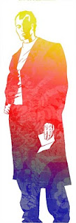
 Another experiment in colors - using Photoshop and modifying the opacity among other things. Whoever came up with "multiply" in the menus was a genius.
I typically think of Photoshop as the ocean. Depending on where you use it, you can get really good at 1% or maybe 3%, but its so deep and so wide and the potential applications of it so vast that no one, not even the programmers, will know it all. Learn to do what you want with it and move on.
I still prefer real paper, with real ink and then scanning and moving on to the final version. There is a pressure/texture feeling that the tablets can't mimic, and i think of it as the ultimate level of "undo". Should all else fail, harddrive wise, there is still the original art!

3 comments:
Charles, that is very nice. Again, nice figure work that is augmented by your color scheme.
I think that the "Undo" function is very interesting in Photoshop. With hand held tools once you make a mark, if it is not what you had in mind, you need to find a way to modify it to make it work (either by adding something or trying to white stuff out). In the process, I think, you learn a lot about drawing (what you like and what you don't like). With Photoshop, once the "brushes" are defined, every line is perfect and if you don't like it, selecting the "undo" function lets you start again. So I think it is a different mind set because of the different tool set.
I like it! This one more than the first one - I think it works better with the color patterns replacing black rather than white. Or maybe it's just particular to this drawing, in that the black spots are large areas, and the color patterns don't compete with the small details of the piece?
@ alex - agreed, it is a different mentality. sort of trying not to ever use whiteout on paper. taken to very far extremes. I used to pride myself on inking with out any mistakes, but i was missing that adding white ink isn't to cover mistakes but that art can be subtractive as well as additive.
@ Dan - thanks, I'm still playing around, but this one works better for me as well. I like to use large black areas, and this is one way to change how that plays out. I faded out the pattern details so that it wouldnt interfere with the face. Glad you noticed.
Post a Comment