Tuesday, December 27, 2011

Sketch A Day #17 - Punk is as Punk does

Inspired by a couple different photos in the sunday Times, including a review of the Reznor Girl with the Dragon Tattoo soundtrack i created this punker, a punker that likely wouldn't so much identify as a 'punk" but as someone who chooses subculture simply because that is how she sees herself, not simply as an act of rebellion.

Mirado Black Warrior #2 on tracing paper


I'mm old enough to remember the original punks, 1977, before it all fizzled out and the rebellion was co-opted into corporate tie-ins and snide jokes on lame sitcoms. Twenty years later when i trailed the punks walking down St Marks Place in New York I had to laugh. they were infants when the Pistols flamed out and Sid OD'd over in Chelsea. Did they think that they were becoming part of a tribe or expressing their individuality by copying someone elses' Mohawk and safety pin ridden jeans vest? Part of a tribe, yes, part of a rebellion whose best days were by the legacy of scattered needles and spit upon bodies? It was a tribe whose elder members spent time on methadone and let the piercings heal up before they moved on. you can stay angry, but, shockingly, what you're angry about doesn't always stay the same.

Saturday, December 24, 2011

Sketch A Day #16 - The Shadow Knows

The weed of crime bears bitter fruit.


The Shadow knows.

If Alex is going to keep posting Shadows, then so will I.

Hope that everyone had a good holiday weekend.

Mirado Black Warrior 2.5, Lumorcolor "F", colors in photoshop

Sketch A Day #15 - George C.Scott as Scrooge

Sketched as my family watched "A Christmas Carol" with the great George C. Scott as everyone's favorite boss to hate.

Scott, of course, doesn't chew the scenery as so many Scrooges do, and of course he's scarier all the more for it. This was done with the ghost of Christmas Past, as he looks whistfully back upon the love of his youth when he worked for old Fezziwig.

I know, what a Jewish program to be watching.

Sketch A Day #14 - Loomis figure studies

Some figure studies from the Loomis' Figure Drawing For What its Worth, one of the two or three greatest books ever published in its class. Beautiful text, beautiful illustrations, excellent about actually teaching you this stuff.

With the holidays I've been working a bunch and falling behind on posting my sketches, but I've been working and will do some catch up posts.

has anyone else fallen behind a bit on their blogging?

Monday, December 19, 2011

Sketch A Day #13 Dickens Fair Lass

Inspired by my visit to the Dickens Fair in San Francisco comes this quick sketch. smoother paper than the last one, so less texture for the pencil to pick up.

Mirado Black Warrior 2.5

Tuesday, December 13, 2011

Sketch A Day #12 - The Old Man and the Sea

On sketchbook paper, which has a nice tooth to it. You can get good texture with the pencil on this paper.

Mirado Black Warrior 2.5

Obsolete Inkers, Fading Away & Jason Pearson

You know, we've talked about this before, and asked all these questions before: what do comics owe us? Do they owe us a living? Do we bleed hours and talent and fingers onto the page that is glanced at, and then discarded with nary a backward glance?

Why, yes, yes we do.

The post by Jason Pearson on Facebook about his financial and personal situation highlights the difficulties in being an artist, especially a work for hire artist, in these difficult times. I don't know Jason, we've simply never crossed paths at conventions or anything like that, but I do know where he is. I've been to that place. Mid-90's, comics going into freefall like its 1954 all over again.

And what makes it worse? Watching lesser lights, people you know who aren't as good as you still churning out monthly work, and you know that they're submitting vouchers for it and getting paid. While you're not. And you're running out of food. And rent. And the salt in the wound? Jason tried to do creator owned work, tried to create the property that could have been something really big, except that... for all the varied reasons in the world, it didn't get the movie money. Didn't hit the brass ring. Jason didn't just depend on the thinking that he could stay on the monthly treadmill forever and that Marvel and DC would continue to send him work, he tried to do more.

And yet here he is, an exceptionally talented and uniquely styled individual in a precarious situation with seemingly no way out. And it is awful to to read that.

I don't know Jason, but I find his work inspired and original and while his Facebook post reads like a suicide note, I fervently hope that its not and that others can show him the revenue stream to get out of his trap. If he had a Kickstarter project, I'd contribute now, and clearly so would a hell of a lot of others.

Artist Gerry Alanguilan was inspired to write about the future of comics and inkers in particular, and wondering just who and when it all becomes obsolete and we end up in situations like Jason. I was right there in 2000, finishing off the biggest project in my comic career, a Batman series with Doug Moench and Paul Gulacy, two of my idols, and I walked away. I had finally gotten my career to the point where I was working with "A" list pencillers, so i didn't have editors blaming my inks for construction problems that the penciller couldn't solve. Except that digital inking was looking and I could see pencillers being angled to doing such complete work that they wouldn't need inkers. I realized that sooner rather than later inking and inkers would be made, on the mid-end level, obsolete, and to continue to rely on that was stupid. Sean Godron Murphy has his thoughts on it as well, and I agree with him. My analogy is the same as his: for years I said that it was like wanting to design buggys for horses to pull at the dawn of the automotive age. You may make the best buggys ever, but if the world is pulling against you, then you're going down. Better to diversify as much as you can and not get locked into a support position. When the people you support get laid off, you're getting laid off first.

The only thing that Sean talks about: if they don't want to pay for inking, he'll raise his pencilling rate. Perhaps we should be asking why, given that Marvel and DC should be rolling in money from their recent movie successes, they're laying off people right and left. If what they want are properties to cherry pick, why kill off the people creating the properties? I'm glad that Sean has the DC direct work, but why is DC struggling? Even if the publishing arm isn't moving units, its putting butts into seats at $12 a pop for a 3-D movie.

Why did Kick-Ass get made into a movie and Body Bags didn't? No one knows.

When are us artists going to get better about living in the real world and making a living instead of living inside of these cool worlds inside of our heads?

Answer: Never.

We gotta take care of each other and ourselves. Diversify people, make friends, make connections, make sure you got more than one skill.

Get lucky.

Sketch A Day #11 - The Shadow

Ok, some odd technical difficulties with the computer, as well as my daughter's 11th birthday party and a Joe Bonamassa concert... but mostly technical difficulties with the damn computer.

Inspired by Alex Sheikman's Shadow piece the other day, I pulled out some of the pulp material that i have and got inspired. Still not happy with the inking in part with markers, but it is for speed. also some brush work on this one as well, which i'm much happier with. Looking back at the published covers, i realize, again, how much i love George Rosen's work.

Hope this one was worth the wait.

Mirado Black Warrior #2.5 pencil, Lumocolor, Deleter #4 ink, colors in Photoshop

Thursday, December 08, 2011

In Review Of: Parker: The Martini Edition by Stark & Cooke

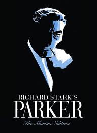
With an almost jet black cover and spine, and the embossed figure of parker himself, the cypher of a criminal, on the front, we see the perfect analogy for the anti-hero: he is embossed, stuck forever in fabric of the book, but it lacks detail, lacks anything other than the outline and basic details of who he is. It tells us nothing about what motivates him, nothing about his comings and goings, nothing about his past or future. Its is both timeless and of its time.

We live in a banner time for crime comics. And, like the pulp era before, a time of anti heroes born out of a time of horrible economic disparity where the poor are on the streets and the rich live like robber barons, we find solace in the man not afraid to live in fear of his mortgage being ripped out from under him by Bank of America, or of losing his job to China; he is a criminal with a moral code of being true to himself in all that that means. We admire him because he's not afraid even as we recognize what a bad man he is. As Cooke continues to work on adapting the Westlake Parker novels for comics, it is easy to take for granted just how good these books are.

The Martini Edition hardback version of the first two adaptions does a great case for making sure that you not only get the story but get the art as well. reproduced right around original size, you get to really see the unyielding swath of ink that makes up the actual weight of Cooke's art. As well, you get to see more of the texture in the monochromatic treatments that Darwyn is working with. They're not overlays dropped in on the computer but actual brush strokes and marker strokes.


I have the two original hardbacks, as well as the larger one shot "The Man with the Getaway Face", and it was IDW publishing Getaway in the larger format that convinced me how much better Cooke's art would be at that size. There are plenty of considerations of why this is, mostly address above, but here is a small one that was bugging me: the lettering that Darwyn uses simply doesn't reduce as well as the rest of the artwork. not that it was unreadable, there were very few dropouts or close-ups on reversed out lettering, but it lacked a certain crispness really makes reading the books enjoyable.

The Hunter is good. The Man with the Getaway Face is good, the Outfit is superb. Cooke feels full of himself and is settling in enough to change styles three different times within the book, each time taking a chunk of the story and decisively changing his approach both storytelling wise and illustratively. This is only happens with creators that really are feeling at the height of their powers, and it is here.

The new story, The Seventh, picks up stylistically where the Outfit leaves off, and there is no mistake about it, this is not a little filler story, just one more brilliant little bit of Westlake/Stark crime noir that both thrills us and makes us quite happy that we're not living in that world. One small quibble: on the bottom of the pages, we have the story title carried over, and pages 322 & 323 both have "The Hunter" on the bottom, when they should have "The Seventh" like 326 & 327. Its a typo, but you think that someone would have caught it.

The extras? A gallery of Cooke pieces and notes on different movie Parkers, as well as an excellent Comics Reporter interview with Cooke, Spurgeon and Ed Brubaker. Its freely available online, but the sort of thing that might be hard to find 10 years from now, and so worth having in print.

And one final, appropriately labelled Parting Shot: a one page passage from Butcher's Moon, one of Westlake's favorite pieces of prose, and a full bleed black and white illustration that kicks as hard as anything Toth ever drew up.

All in all? Well worth the price of admission in just about every way. As always, one wonders if and when the crime story gets above itself. Its highly likely that the crime story prefers to drink its booze in dark, seedy dive bars instead of brightly lit TGI Fridays, and prefers to be published in dog-eared paperbacks as opposed to deluxe edition. Screw it, I want to read it in this edition. Fortunately, it has no say in the matter.

And yes, I made myself a vodka martini before starting on this review.

Wednesday, December 07, 2011

Sketch A Day #10 - Robert Fawcett Study

Pencil study from a 1946 illustration by the brilliant Robert Fawcett, the illustrator's illustrator. The book about him is just genius in that it gives lots of room for the art to speak, and certainly reproduces it larger and on better paper that it ever had the first time around.

We should all be so lucky, to have our best art presented in such a fashion.

After we're dead, and not getting paid for it again, and not around to enjoy it. But still, there you go. Fawcett kicked serious butt with his talent and, lets face it, hard work.

Tuesday, December 06, 2011

Sketch A Day #9 - Cooke-Inspired Gangster

Pencil sketch inspired by my Darwyn Cooke Parker: Martini Edition by IDW Publishing that I picked up today.

#2 Mirado Black Warrior, nuttin' else

OK, its pretty bad ass. Lets talk martinis in the next post.


Monday, December 05, 2011

Sketch A Day #8 - Golden Age Green Lantern

OK, I fully admit that not only do i have no affinity for the Golden Age DC heroes (outside of Bill Finger/Bob Kane Batman), I really don't even like Green Lantern.

Of course, in going through the Levitz DC book again, I found myself sitting down to do tonight's sketch with an aim todo something different.

So there you go. The Alan Scott Green Lantern. Deliberately tried to ape some of the Golden Age "simplicity" but I don't think that i comes through at all except for the face. Ah well, they're not all winners.

I really get dissatisfied with inking with markers. There is a flatness that i can't stand to the line, and it makes me think of all the artists who went to them in the '80's and '90's and just how much got lost in the art. Obviously they're fast and easy, but they lack nuance in all but the best of them.

Pencils, inks with markers (Staedtler Lumocolor, Pigma Micron, Sharpie), color in Photoshop


So what kicks butt in the golden Age DC books? The first Hawkman story, totally off the rails crazy and pulp with great art, the early Batmans with their great nior world and Kane's stiff, representational art, and the early Spectre's, which are incredibly tame compared to where he would go later, but they're interesting in their own way.

Saturday, December 03, 2011

Sketch A Day #7 - Rorschach and the fork


If you don't know this moment, then i'm not sure that I can explain it to you.

pencil sketch, Mirado black Warrior #2.5, Sharpie & Staedtler Lumocolor on Vellum, tones in Photoshop

Thursday, December 01, 2011

Sketch A Day #6 - The Invincible Iron Man

Although, if you look through the George Tuska issues, Tony was pretty vincible when it comes down to it. Over in the Avengers he totally kicked ass, and then in his own book he was being whipped, melted, shot at, had chunks of his armor falling off at any provocation, constantly running out of power and falling to his knees and having his butt handed to him by the likes of Mikas, the Soulfather.

Yikes. Being an Iron Man fan was not easy.

Marker sketch, Copic Markers, Sharpie and Micron on Vellum