With an almost jet black cover and spine, and the embossed figure of parker himself, the cypher of a criminal, on the front, we see the perfect analogy for the anti-hero: he is embossed, stuck forever in fabric of the book, but it lacks detail, lacks anything other than the outline and basic details of who he is. It tells us nothing about what motivates him, nothing about his comings and goings, nothing about his past or future. Its is both timeless and of its time.

We live in a banner time for crime comics. And, like the pulp era before, a time of anti heroes born out of a time of horrible economic disparity where the poor are on the streets and the rich live like robber barons, we find solace in the man not afraid to live in fear of his mortgage being ripped out from under him by Bank of America, or of losing his job to China; he is a criminal with a moral code of being true to himself in all that that means. We admire him because he's not afraid even as we recognize what a bad man he is. As Cooke continues to work on adapting the Westlake Parker novels for comics, it is easy to take for granted just how good these books are.
The Martini Edition hardback version of the first two adaptions does a great case for making sure that you not only get the story but get the art as well. reproduced right around original size, you get to really see the unyielding swath of ink that makes up the actual weight of Cooke's art. As well, you get to see more of the texture in the monochromatic treatments that Darwyn is working with. They're not overlays dropped in on the computer but actual brush strokes and marker strokes.
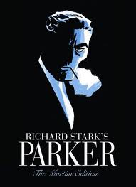
I have the two original hardbacks, as well as the larger one shot "The Man with the Getaway Face", and it was IDW publishing Getaway in the larger format that convinced me how much better Cooke's art would be at that size. There are plenty of considerations of why this is, mostly address above, but here is a small one that was bugging me: the lettering that Darwyn uses simply doesn't reduce as well as the rest of the artwork. not that it was unreadable, there were very few dropouts or close-ups on reversed out lettering, but it lacked a certain crispness really makes reading the books enjoyable.
The Hunter is good. The Man with the Getaway Face is good, the Outfit is superb. Cooke feels full of himself and is settling in enough to change styles three different times within the book, each time taking a chunk of the story and decisively changing his approach both storytelling wise and illustratively. This is only happens with creators that really are feeling at the height of their powers, and it is here.
The new story, The Seventh, picks up stylistically where the Outfit leaves off, and there is no mistake about it, this is not a little filler story, just one more brilliant little bit of Westlake/Stark crime noir that both thrills us and makes us quite happy that we're not living in that world. One small quibble: on the bottom of the pages, we have the story title carried over, and pages 322 & 323 both have "The Hunter" on the bottom, when they should have "The Seventh" like 326 & 327. Its a typo, but you think that someone would have caught it.
The extras? A gallery of Cooke pieces and notes on different movie Parkers, as well as an excellent Comics Reporter interview with Cooke, Spurgeon and Ed Brubaker. Its freely available online, but the sort of thing that might be hard to find 10 years from now, and so worth having in print.

And one final, appropriately labelled Parting Shot: a one page passage from Butcher's Moon, one of Westlake's favorite pieces of prose, and a full bleed black and white illustration that kicks as hard as anything Toth ever drew up.
All in all? Well worth the price of admission in just about every way. As always, one wonders if and when the crime story gets above itself. Its highly likely that the crime story prefers to drink its booze in dark, seedy dive bars instead of brightly lit TGI Fridays, and prefers to be published in dog-eared paperbacks as opposed to deluxe edition. Screw it, I want to read it in this edition. Fortunately, it has no say in the matter.
And yes, I made myself a vodka martini before starting on this review.


