Was rereading some of the old Sandman comics, and marveling at all the balls that Neil kept juggling through the series. Of course he bit off a bit more than he thought for the final Kindly Ones storyline, but it was one hell of a ride.
For the record, my favorites in the series: The Dolls House and Inn at the End of Time arcs.
Perhaps one day I'll find the pencils from the final issues that Dringenberg drew and scan them for you all to see.
Wednesday, November 30, 2011
Tuesday, November 22, 2011
Sketch A Day #4
pencil (Mirado Black Warrior if you must know) from the sketchbook. Two people at the dentist's office. Sexy, I know.
Two heads for the price of one!
Monday, November 21, 2011
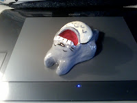
Totoro memes: inkwells and plushes
Yes, inkwells, you know, the sort of thing designed to keep a small mammal, like, say, a cat from knocking things over in their insane desire to get pets.
a totoro among the apples |
Sketch A Day #3 Who is this guy?
Friday, November 18, 2011
Sketch A Day #2: Steranko-esque head
Not a clue as to why this head reminds me of the '60's Jim Steranko, perhaps because i had pulled out that collected Captain America book to scan...
I dunno, sometimes this stuff just comes out of your brain and on to the paper.
Using the Koh-I-Noor Woodless Colour Pencils that
I've fallen in love with. I grab them when I go out into the world with the sketchbook.
I want to eventually post a review of the monstrous Paul Levitz DC coffee table book, but I realize that I'm reading it with a completely different criteria than it was written with, so the review is essentially moot. I can't square the sanitized version of the events presented in the book with the back story that we know from all the principals involved. Quite frankly, the back story, well covered in Men of Tomorrow and other places with the true originals of National Periodical Publications (Siegle and Shuster, Bob kane and Bill Finger, the Moulton menage a trios) are far more fascinating than the published comics.
I at least want more background, more artwork that we've not seen, want the editors of the book to simply take even more advantage of the sheer spectacle of size that they were working with.
sigh
I'll get to it, I promise.
Wednesday, November 16, 2011
In Review Of: Overkill by Tomer Hanuka
The figures are lithe, twisted in action, reaction, ecstacy, despair, and the choking out of a death rattle. The colors could redefine garish, subtle; there are whole new qualities to the definition of "mauve" than you've ever appreciated. In the narrative of each piece, there is nothing written, and certainly nothing illustrated, on the nose. The book is likely the first ever in hot pink with an ax on the cover.
Overkill: the art of Tomer Hanuka
Deliciously, Tomer has shown us his working process on Tropical Toxic for years, which, instead of de-mystifying the process, has only made me appreciate his stuff more, especially seeing the pieces printed larger, where i can start to appreciate the liveliness of his holding lines and the inexactness of with which they're being applied.
And, of course, its all commercial work, and interestingly enough, the book holds together by technique and approach, not subject matter. We know that we're looking a myriad number of commercial assignments, not even in chronological order, so the glue here is viewpoint. And what a viewpoint it is. In every piece the camera is tilted or the figure is twisted or the light or fabric is shifted so that there is nothing settled, nothing at rest within the single panel narrative. Tomer mentions in sole text page in the back of the book about wanting to do slick American work, but it ended up with a middle easterner's anxiety underneath. And what anxiety it is. The contortion of limbs whether in violence or sexual climax mirrors the rending of cloth or flesh in decidedly non-linear fashion.
And the colors? Well, yes, the colors. tomer uses color in a very different fashion than most. There is a new palette that we see this generation using, James Jean and a whole bunch of others in Juxtapoz. While we initially saw everyone with Photoshop immediately go full color in every direction, Tomer has gone the opposite, limiting the work to four or five colors. It is interesting to note in the back that he mentions that he colors up a "regular" version, before experimenting with what are some of the most amazing combinations of shades, combining fades, dropped holding lines and sillouettes into astonishing menageries of single panel narratives.
And, yes, the final ingredient is that everyone of these pictures was the weight of narrative to them. they exist not just as that single frame, but encapsulate some of the story or article that they accompany. That we need not see the story to begin to guess from the clues shows how much visual communication is happening here. From the scattered wrapper on the floor to the line of coke on the woman's naked torso, story is unfolding everywhere you look.
I've been clipping the small accompanying illustrations that Tomer used to do for the New yorker before realizing that, after a few months, i was clipping pieces by the same artist. Clearly his aesthetic was working for me. Luckily, now i have hardback to go to over and over. You should to.
Tuesday, November 15, 2011
Sketch A Day #1, Hugo Cabret & Steranko's Cap
Leonard from the Big Bang Theory episode with paintball was frozen on the TV screen when i picked up the pencil, so he got immortalized in this sketch thanks to the magic of the DVR. Not what I imagined opening the 365 Day challenge with, but sometimes you have to go with it.
A number of years ago The Invention of Hugo Cabret ended up on my daughter's book shelf. I've no idea where it came from, but i scooped it up to read. Enjoyed it, thought that as long as you didn't try to make sense of it, your could let the plot flow along because, well, the writer was taking it where he wanted it to go. It was filled with a child's sense of wonder at the world, and a distinct lack of grown-up inflicted logic to ruin the experience. Appropriate, since the protagonist is a child, one who lived in a fairy tale world behind the clock works of a busy Paris train station. It is appropriately viewed as both staging area and metaphor since Hugo and his deceased father were the ones that kept the clocks running on time, and now that his father has passed away, the completion of the clockwork man, the finding of the missing key and the discovery of his orphanhood are coming to a head as his time runs out.
Yes, I hear you complain, I know all that. I've read the reviews and I've seen the trailer. But what you want to know is: is it a graphic novel? Or a Big Little Book on steroids?
Now that's a good question. There certainly are a huge number of illustrations (284 to be precise) as well as prose, and if we're going to argue that graphic novels can be Blankets or Cages or Goodbye Chunky Rice, but not the latest collection TPB of Fables, then we have to consider Cabret a novel. Yes, it has prose sections and employs not a single word balloon in its pages, but it does use images to advance the narrative sequentially, something that pure prose work would never do. Its an inventive use the form, and while a purist might argue that it doesn't fit, i've gotten tired of purists over the years, especially when the person breaking the rules comes up with a solid entertaining read.
And, of course, I just had to share the joys... the joys of the hard cover collector's edition of the three Steranko Captain America issues... and the quality printing that they used on the special edition.
You don't find that kind of care and attention to the registration of color these days.
Ack.
Monday, November 14, 2011
I'm back with the 365 Day Challenge
Of course, the funny thing is that I've been away for a while, but I can't keep away anymore, and hope that we'll all find some great things (in the true tradition of the blog-o-sphere) to argue about. Robert Fawcett, the Parker books by Cooke, whether Hugo Cabret is actually a graphic novel, Jim Shooter's blog, instructional books on storytelling and more. Anyone interested in coming along?
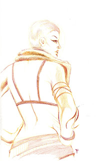
Here are a few sketches from the Vivian DeMilo session at Dr. Sketchy's SF last month. The wife and I went, sketchbooks in hand, and had a great time trying to shake the rust off of the pencils.
Now, I've never done the 24 hour comic, but my good friend Alex Sheikman has done the sketch a day challenge over at his blog, although I can't recall how long he kept it up. But given that i've never been known to be prolific, i've used some of the time away to try some different approaches and hope to force myself to play with them while knocking out some work, as well as laying out and starting on some new projects. There are a couple in mind that i can't wait to do. How long it will take to get to them is another story.
Subscribe to:
Posts (Atom)