#1 on the list, always, was Avengers Annual #10, the utter tour de force from Michael Golden and Armando Gil, a comic where, literally, every page was a stunner and a new lesson in how to do Marvel comics. Introducing Maddy Pryor and Rogue, it turned into a lynch pin of understanding the New X-men as well. Amazing. And it was saddled with this cover.
Monday, June 25, 2012
Avengers Annual #10: Worst to Best Cover Ever by Michael Golden
Among the hyperbolic winners in our comic group's informal chat sessions: best comic with the worst cover. As opposed to many issues of Rom: Space night that had great covers and regrettable interiors, or plenty of other issues with solid interesting Cockrum covers and, again, generic interiors.
#1 on the list, always, was Avengers Annual #10, the utter tour de force from Michael Golden and Armando Gil, a comic where, literally, every page was a stunner and a new lesson in how to do Marvel comics. Introducing Maddy Pryor and Rogue, it turned into a lynch pin of understanding the New X-men as well. Amazing. And it was saddled with this cover.
Don't get me wrong, I love Al Milgrom. As I've said, he was one of the two biggest influences on my inking and it is to my current regret that i've not met him in person to thank him. But this was not his best work. It honestly looks like something knocked out at the last minute in the office when another cover didn't work and the deadline was, well, passed most likely.So I've honestly no idea where this piece came from, other than it might be a commission by a fan for Golden to do what would have been his take on the cover. The style says to me that its fairly recent, but your could try to convince me otherwise. Either way, its beautiful, and i'm psyched that someone went to the trouble to get the correct trade dress for the art. Enjoy the comic that might have been.
#1 on the list, always, was Avengers Annual #10, the utter tour de force from Michael Golden and Armando Gil, a comic where, literally, every page was a stunner and a new lesson in how to do Marvel comics. Introducing Maddy Pryor and Rogue, it turned into a lynch pin of understanding the New X-men as well. Amazing. And it was saddled with this cover.
Friday, June 22, 2012
The Toby Keith Project: Gulacy, Yoakum & Mounts
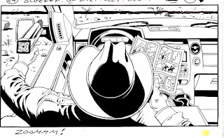
Finished panels from the Toby Keith project with the astonishingly talented Paul Mounts doing the colors.
Wow. Paul and I never had it so good.
The animated piece is for the song "Beer for my horses", and is playing, so I understand, at a Toby Keith concert near you. If anyone goes and sees it at the show, I'd love to hear from them how it was presented.
Wow. Paul and I never had it so good.
The animated piece is for the song "Beer for my horses", and is playing, so I understand, at a Toby Keith concert near you. If anyone goes and sees it at the show, I'd love to hear from them how it was presented.
Sketch A Day #42: Fernanda Zombie Slayer pt. 2
the lovely and kick ass Fernanda holding the body part of some poor unfortunate that no longer needs it. Dr. Sketchy's in the Mission District.
Me trying to ink it like David Mazzucchelli inked Batman Year One, which had a loose and lively ink line to it. Does anyone mind not having every lace done in the boots, as opposed to the suggestion of there being laces in the boots? The artist in me wants to put in the suggestion, the fanboy in me wants to put in all the laces.
Mirado Black Warrior, #4 Utrecht red sable, Koh-i-noor india ink
Wednesday, June 20, 2012
The Mighty Logo: Alex Jay's Thor logo
Just discovered, yes i'm late to the game, alex jay's great 8 part series about redesigning the Thor logo back in 1983 for Walt Simonson's epic run. Go have a quick read and enjoy!
Tuesday, June 19, 2012
Sketch A Day #41: Fernanda the Zombie Hunter
just back from another edition of Dr. Sketchy's in San Francisco, armed with a few new pieces of art. Here is one of my two favorites from the evening.
Was clearly rusty on the drawing tonight. Using my inking chops versus drawing are two very different things for me.
Monday, June 18, 2012
Quick Peek: Gulacy & Yoakum Storyboards
As you can see, i've been gone from the blogging world for over a month, pretty sketchy even with my history. Paul Gulacy and I have been hard at work on storyboards for an animated piece for Country and Western singer Toby Keith. Just wanted to share a few of the panels before the esteemed Paul Mounts gets his hands on them and makes them look 10 kinds of incredible.
edited to add: for color versions, click here!
yes, it was impossible to keep up my sketch a day with the addition of the freelance work that i picked up. sorry for any of you who were actually entertained by the drawings. they will resume tomorrow!
Subscribe to:
Posts (Atom)