Saturday, December 29, 2007
In Review Of: Modern Masters -#12 Michael Golden
I was there in the beginning of Golden's career, and was immediately taken by the fact that, within a few months it seemed, DC comics in 1977 has lucked on to two very striking talents: Marshall Rogers and Michael Golden. The early stories by Golden, one stand alone issue of Batman, and the Batman family stuff in the dollar comics were eye-catching in the extreme. There was a two page Man-Bat splash, as well as a two page Demon spread that were more dynamic than almost anything published at DC over the last decade. After years of fairly pedestrian work, DC would discover two greats right before the now infamous Implosion. Looking through this book should have been a real joy.
I emphasize should have been. Oh, the book has been put together with care and love by John Morrow and Eric Nolen-Weathington, the reproduction is very nice, the interview covering a great scope of Golden's career. The problem is mine really. I was so dis-satisfied with the reality that there is no deeper to Golden's artwork. To paraphrase, to him, its a job and one that he took to pay the rent and to try to do the best he could. he sort of drifted into the work from doing vans and skateboards, without a great love of the medium, and was pushed into going to NYC to visit Marvel and DC.
Feh, thats what i have to say. Reading the interview and reading his rather non-commital answers to questions about the Nam, or the single greatest annual story since Kirby drew the monumental FF Annual #1, Avengers Annual #10, leave me flat. I want there to be some more emotion, some more reaction on his part. after all, I found his art to be so interesting, so dynamic that I want to believe that there is something more there than craft.
And its clear that there isn't.
And its my own fault as a fan really, to have put my expectations on the artist and the art, and now I find myself reading it with a different sense of how the art came about. I have one Golden original, from a clever little Batman/Talia/Ra's Al Ghul story from the Batman Spectacular issue also featuring art by Rogers and Nasser. And yes, the art betrays the slightly muddied lighting sources that plagued Golden's work in the first year or two, but otherwise is a fun little piece of art. And I never saw any sweat stains or deep pencil grooves in the bristol.
And now I know why. Because it was easy.
Friday, December 28, 2007
My first experience with original art
Mid 1970's and I'm a kid living down in the Diamond Bar area outside of LA, occasionally to some slightly distant shops outside of the little area that I'm living in. Typically via the understanding other parent, since mine could care less, then and now, about comics. However, I had friends whose parents would actually take part in the collecting part of it, and would be willing to drive to shops where other bit and pieces could be found: the missing book, the upgrade on the vintage Neal Adams work, etc.
So we're outside of the town, I forget exactly where, and I have amassed $20, which was a lot for a 12 year old back then. Where it came from, I don't know, perhaps it was birthday money. I certainly didn't have a job back then. There were no comic shops in Diamond Bar back then, perhaps still aren't now. I've not been back in 20 years. What they did have were the trusty 7-11 with the understanding owner, and a couple grocery stores that still had spinner racks in them, so going to an actual comic shop was a huge treat. Kid in a candy store and all that.
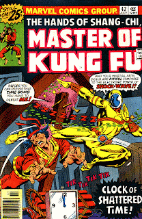
So I'm filling the in the last couple of Master of Kung Fu's that I need to have a complete run, and the shop owner says, "I have an original from MOKF, would you like to see it?" "Really," I ask, as though somehow the idea of an actual original hadn't occured to me. "Yeah, its from Gulacy." I was, of course, already infatuated with Paul's art already, and since he had never been at a convention that I had been, the idea that one of his originals was in the area wouldn't have dawned on me.
So he pulls out a portfolio and in there is a page from MOKF #42, inked by Tom Sutton, using the patented confusing-in-a-non-novel-way flash forward effect that Doug Moench was never to use again. And I was blown away to find myself looking at the non-repo blue on the page, and looseness of Tom's inks at full size. It was quite an education for the 10 minutes that I spend looking at it.
Oddly enough, I didn't catch the original art bug then, probably because I knew that price, even at 1970's rates, was well out of my reach then, lacking parental involvement. But I started to have the idea of what it should look like. And the differences that exist between printed art and the originals. I don't think that I've looked at printed art the same way since.
What do the Comics owe you? Anything? Nothing?
The only problem is that comics is a brutal business. And as I type that, I struggle with how that sounds, yet it is the truth. Every bit of experience I have tells me that is the truth, every interaction that I had with other professionals, from Gene Colan, George Tuska, Herb Trimpe and Dave Cockrum to the modern era artists tells the same story. The American comic business has a relentless series of deadlines on work for hire that will burn a person into the ground unless they are (and I know someone who is) almost inhumanly fast with their pencilling.
Valerie has a list of quotes that she has heard, over her years in editorial, that are chilling, and worth going to read over at her site when you're done here.
So what does comics owe me? Will it give me back my sanity after working two 22-hour days in a row on Good Guys #1 (and still having the book come out late)? Will it give me back my dignity after having to kiss ass to get the next shitty job that was running late out of a company, so that you can get blamed on the work, when the "star" penciller is the one screwing all the others down the line from him? Of course not. But we make our choices. Comics did give me the rush of walking into any comics shop in Manhattan and seeing my name on the cover of the Batman book. That is as singular a thrill as many of us will ever get. Just as any job has the good with the bad, this is the story of what bad you'll take to get the good.
"The problem is that they think comic books owes them. That's the problem with hiring fans."
And the problem with hiring editors that are fans, hiring fans to work on the books. The word professional was bandied about pretty casually inside the industry, when, typically, the industry is anything but. The same people who would complain that an artist didn't handle his or her work professionally, were most likely the same people who begged the artist to take the late job and bring it in on time. The cardinal rule of doing unto others doesn't seem to play out here very well.
One problem is that the comics industry, from Weisinger and Donenfeld in the 40's to now, has been its smallness. Even when the books were selling in the millions, they weren't supported by advertising the way the traditional periodicals were, and so the money being paid out was small, enough to keep an indentured servant class that either didn't know how to do anything else, or didn't want to leave because this what they loved. In the last decade, I know that I did a back flip when I saw the first Mazuchelli cover on the New Yorker. At last we had the chance to go uptown. As anyone, in any career can tell you, options are leverage, and leverage is good. Otherwise, you're in a small industry that has more people, far more people, than work. That is not good.
"And I asked them why I wasn't being hired anymore, give me a reason. I mean, what else am I good at?"
The piecemeal way that American comics are done has also done its share of damage to artists, trapping them into a niche that doesn't allow for them to do anything else, and certainly not to have skills that would allow them other options. In the age of scanned pencils (and Lenil Yu, I'm looking at you) where does the inker go? In the age of Comicraft, where does the letterer go? I somehow doubt that any of us thought, "when I grow up, I'm going to get trapped in a niche!" but that is what happens, and its sad. The artist should, and usually does, go into things will a series of skills, some more developed than others. Just working in one area shouldn't preclude getting the opportunity to show the others. Of course, many times, it does.
Back to choices however. I made the choices that allowed me to get into comics back in 1992 in a niche position, because I couldn't bear to live without seeing my name on that cover. I did make the right choice back then, no matter how many sleepless nights it involved, no matter how much sciatica came from sitting in the same position in the same Brooklyn apartment night after night after night. Because the same shit exists in every profession. So we had all better really enjoy the highs because the lows are the same crappy lows, and we only go around once.
Comics doesn't owe me anything, but it gave me plenty.
Monday, December 17, 2007
In Review Of: Local #2 by Brian Wood and Ryan Kelly
Local works in stand alone stories, so they're easy to review, easy to read and that makes them damn hard to draw and write. After all, lets face it, while there may be a bias against craft among certain elements in the comic book world, it takes real craft to make things look easy. (You want an example? try to write a good Beatles song. Maybe been done 10 times since 1970 total.) Kelly's art, echoing Pope, certainly works on its own merits without him being a total stylemonger, and has a nice feel for the negative and positive elements of the art. In a black and white book, that is absolutely key.
Local #2 is located in Minneapolis, Kelly's hometown, and he draws with a great feel for the locale obviously. Megan, obstensibly the book's protagonist (or at least re-occuring character), has an interesting flirtation with a guy who sneaks into her apartment and leaves her notes and polariods. And, no, she does not know him. From one odd little set up we get a tasty little slice of life story, one that rings true in the final panel when it ends. I won't spoil it for you if you decide to pick it up, but its a fun little read that, really, seems inevitable that it can only end the way that it does. That is, I tell you, a nice bit of writing, and, given the amount of silent sequences that need to convey the story, some nice drawing by Kelly.
While there have been more than a few discussions about what makes comics 'tick', one of them being the telling of stories that contain a mix of pictures and words unique to the graphic medium. This is one of those that verges on fitting that definition. The is a great degree of information and mood given in single horizontal panels that allow our eyes to linger across the cinemascope presentation before moving on. There are, really, three characters in the entire story, and as such, we're given a minimum of talking heads to present who these people are.
You could make a nice little art house vingette out of this issue.
Coming up, more issues of Local soon.
Wednesday, December 12, 2007
If you emailed me about artwork...
Comics Criticism: Art or Science
The state of portfolio reviews in comics is poor, horribly subjective and downright bizarre to most people who have never done professional work. Yes, lets get the obvious out of the way first: art itself is subjective and yes, there are clearly different styles for many different types of comic work, so we'll confine ourselves to the narrow band of Marvel/DC /Image /WildStorm etc superhero styles that exist. We're not talking about Fantagraphics, Last Gasp, and the like, which clearly have different styles, different aims.
As much as you might pity the poor beginner who signs up to sit through a number of different portfolio sessions at San Diego, Wonder Con or Wizard Con, and basically is given so much conflicting advice that they leave with no idea of essentially where to star, the person in the worst position is the moderately talented artist. Yes, this person has digested much of the beginners mistakes and eliminated them from his or her work, so they've advanced into the shadowy netherworld of almost employable but not quite. The mistakes are more subtle, harder to pick up on in a quick review, more detailed in the subtle terms of what needs fixing. This person is not in a great position.
While reviewing those portfolios in Chicago, I tried to concentrate on saying, "Here is a clear objective: spatial separation, black spotting, helping the penciller's composition. And here is why this doesn't work." Or better, "Here is why this does work," since its many times easier to make the positive example stick that hitting the person over the head with WHAT (whack) THEY'RE (whack) DOING (whack) WRONG.
The older editors that I worked with usually had the best vocabulary to describe what it was they liked about a page, but also what wasn't working and WHY it wasn't working. That was key for me at least. Younger editors would have, sometimes the eye to pick up on what wasn't working, but couldn't, for their life, tell you why it didn't work. And the freelancer was left to go puzzle out what the hell to do, while all the time worrying about their next assignment.
I think that this is why people responded so well to the Scott McCloud books: we were desperate for a shared verbal vocabulary by which to discuss our visual vocabulary. To many miles separated the terms by which the arcane art of combining words and pictures could be discussed. McCloud hits on many of the themes: we use language stolen from the film industry or the novel world and oft times it just doesn't hit all the things that it needs to. Try translating Yiddish into English: one yiddish word invariably needs a whole phrase or two of english to get its point across. Comics are like yiddish: one simple panel could convey what might take a whole paragraph of words to get across. Are comics easy to critique? To that I answer: Oy Vey.
By the way: for any of those people that I talked to in Chicago all those years ago, I dearly hope that I made some sense, and that maybe I helped out just a little bit. If I didn't, I'm sorry. Know that the criticism was at least well meant by someone who actually cared.
Saturday, December 08, 2007
Howard the Duck - Breaking the Fourth Wall?
Sadly, this is the dreaded "plot" issue, and Templeton squeezes a lot of stuff into the issue. It moves so damn fast that we barely take note of She Hulk's pink panties late in the issue. (Nice to see the Jennifer picks a color that compliments her skin tone. Can we thank the colorist for that one?)
In many ways, I'm rather glad to get the plot out of the way. We all know that Howard works best in set pieces, pretty similar to the Marx Brothers, so move the characters from point A to Point B as fast as possible and lets get to the funny stuff. Works for me.
Some good social commentary on this one, with Jennifer Walters trying to actually be a lawyer with a judge who would have been well at home at any of the celebrity trials of the last couple years. Beverly, who is sorely underused in this issue, gets some time on the Larry King show, and Howard finally gets to see MODOT, the player behind this rogue group of AIM scientists. I'd say that we're setting up for a rousing finale with a lot of explosions in the final issue when it all goes to hell.
This is a fun series, and I can't recommend it enough as an antidote to the over the top brutality of the Annihilation:Conquest series. and I like Annihilation:Conquest. just, man, you gotta have something to laugh at as well. As Alan Weiss used to say to me, "its all comical books, you know!"
Just posted: an interview the Templeton here. Go read it yourself! Waaugh!
Monday, December 03, 2007
All Hail, ROM - Greatest of the Spaceknights
I won't be there, but this piece will be, along with a hundred others, so go and have fun and bid generously on some of the artwork. Props to Bill and Sal Buscema for taking a shitty '70's failure of a toy and making it something that people genuinely loved and remembered. That, my friends, is talent.
Saturday, December 01, 2007
Desolation Jones: The Commentary track by Warren Ellis
I like how Warren decided to confront the ghost of Raymond Chandler head on the first series by taking The Big Sleep and putting a few new twists onto it. Chandler's book has been adapted so many times that it might want to be printed on Silly Putty. And that's a good thing.
In any case, I enjoyed Warren's comments on the first issue from the JH Williams arc and will do some poking around to see if he has commentary on the other five issues. If I find the link I'll post it later.
Wednesday, November 28, 2007
Feminist Controversy or A Subtle Dig at Marvel:The Steel Cage Match
bolts, and takes it as either a) a slap in the face to feminist bloggers, or b) a sign that all the uproar over the MJ statue was exactly the sort of publicity that they want. I have to say, without even reading the rest of the book, that I respectfully disagree.
As much as I believe that Joe and the gang over at Marvel probably do get a good laugh over the majority of the internet posts on their work, this page looks a hell of a lot more like the writer getting the opportunity to make fun of Marvel itself, within one of their own books.
Think about it, Moonstone here, not the nicest character, is being exploited by the big bad government with a tasteless statue, and Songbird, the book's sole moral core, is getting the chance to laugh at the whole thing. In fact, Songbird is even being told in the first panel that she has the more selective fanbase, and won't be exploited as crassly.
Get it? Harry Osborne is taking the place of Marvel, Marvel that OK'd the MJ statue. Rather than a slap at feminists, I think that this is an acknowledgment that occasionally Marvel does do rather crass stuff, knowing that they have the fans to sell it. Or, at least, the subset of fans.
I'd be the first to call them on this, if it really was a stick in the eye to all the very reasonably worded objections to the original MJ statue, but I think it is anything but.
In Review Of: Genshiken 9 by Kio Shimoku
I've said it before and I'll say it again, Kio's work is that of a great storyteller, one who is certainly so confident in his craft that he takes chances, and almost always those chances pay off in big ways. A final chapter here is presented solely in pictures, allowing us, the dedicated readers, to fill in the dialogue in our heads. Its beautifully presented, and needs no word balloons. We know the characters; we've lived with them now for a number of years. We can hear their voices, we have no need for Kio to put the words into Saki's mouth as she discovers Ohno doing to worst possible thing: distributing pictures of her doing cosplay to Madrame in the hallway. It sandwiches in between the quiet touching moments one last scene of the way things were when we started: Saki at most furious, Ohno at her most mischevious, Madrame and Sasahara and rest along for the ride. It is hysterical, and like all moments from the end of college, taken in with the knowledge that this is a time that will end, and that things will never be the same again. On pages 138 and 139 we see Madrame looking up at the ceiling, trying desperately to ignore the fight between Saki and Ohno at his feet, Sasahara and Oguie holding back Kucchi, and he's smiling. We know that he seeing, in his mind, the moment of the Genshiken as it is now and never will be again.
If there is a tightrope to walk here, it is one covered with grease and done in high, dangerous swirling winds. Doing the bittersweet finale to any popular series is so fraught with the potential to slide into saccharine that its a wonder that some authors never want to undertake it, (Jerry Seinfeld should never have done it certainly.) and others can't wait to wallow in it. The middle part of the book, the real emotional meat to the volume, is the chapter with Oguie and Sasahara negotiating the minefield that is trying to work professionally with one's significant other. Oguie has a thin layer of civility on her emotions on her best day, and she's barely going to be able to handle the tough personal criticism that the professional artist has to endure, much less from her boyfriend. Kio has the camera as an unflinching eye on them as they work to reach a personal and professional understanding. It is not given "happily ever after" treatment. The narrator is given the last line in the chapter: "Sasahara couldn't stop worrying about the future of their relationship". Its a realistic, adult assessment and ending.
There are plenty of other moments that show the maturity of the characters. Madrame is given plenty of opportunity and time to finally reveal his secret love of Saki to her... and in the end doesn't. What is beautiful is the he realizes how much better it was that he didn't say anything. The younger Madrame would never have come to that understanding.
I'll admit that the final two chapters left me confused, so perhaps someone can explain them to me and I'll suddenly end up feeling fairly stupid. Sasahara's sister shows up at the graduation and says that "she's in the Genshiken", when we know that she's not in school there. Perhaps she thinks that she's "in" because they all went to beach two years ago. And at the end of chapter 55, we see three people walking in to the Genshiken room, saying, "President, we've got a new member." I'm taking it that we're getting a glimpse of the new Genshiken members that start to come during Oguie's term as president. The picture on the outside of the door might be one of the cosplay shot's of Saki as the President, but if it is, then I'm not sure what it is supposed to signify. Last, Del Rey handily translates the word Tsendere for us, but not the term Moe, which is, of course, an integral part of the conversation that takes place at the final graduation party. Any help here?
All in all, the nine volumes of Genshiken sit on the bookshelves of my studio waiting to cracked open again and again. Its a great piece of work, and despite what some people might think, the Otaku culture translates far too well for american comic fans. I'll miss these characters. They've become buddies and I'll wish that I knew what they were up to 5 years from now, 10 years from now.
Perhaps I'll just have to Google "Madrame-san" and see what shows up in 10 years.
Tuesday, November 27, 2007
Who is your buddy? Its ROM, the Greatest of the Spaceknights
If you're in the Portland area, Floating World is at 20 NW 5th Ave, and you should really go by. I won't be there, but one of my pieces will be. I'll be posting the work here when its done, so should the spirit move you, go and bid it up as its a good cause. Jason Leivian is putting the whole thing on, so thank him by going by and eating whatever goodies they decide to put out. Bring your checkbook. Make it happen. Special Props to Jason.
Also, if you're in the mood, find David Yurkovich's tribute book with lots of great quotes about Bill and a great history lesson on Marvel in the 1970's.
Sunday, November 25, 2007
In Praise Of: 52 The Covers by JG Jones
In the current landscape of simply horrendous comic artists who couldn't draw their way out an old issue of Ambush Bug, it should be a joy to go through and see the weight and heft that JG's people have: when Black Adam stands up, gravity pulls at his heels. When Batwoman spins around, there are real hips moving under those tights.
It also should be an interesting lesson for many young artists to read the sidebars and realize how diverse the influences are that inform the art for these covers: 14th century painters, old movie posters, dog-eared paperback book covers, old soviet propaganda posters. The lessons here: go the Met once a month, keep your eyes open and always bring your sketchbook with you. Perhaps I'll add: spend a little time studying Tiepolo's use of cloth.
It is also interesting to me to note that this series of covers simply couldn't have been done as fast to make the deadlines had Photoshop not been invented. Certainly JG could have painted in color, but it would have taken longer and been harder. The computer has certainly taken over, hasn't it?
For a hardback, 52 The covers is a great deal at $20 whole dollars. Do yourself a favor and get it. And spend some quality time poring over it.
Sunday, November 18, 2007
Staking Our Claim: Comics and their Legacy
And we all know what you don't do to the void.
Frank Miller was memorably quoted in the Comics Journal at the time, as saying, "people talk as if we have this great history behind us, when what we have are 50 years of shit." And, collectively, many of us agreed with him and hoped to see a whole bunch of new work, better work, adult work.
I think that its time to reassess that quote and see if its true. And how we answer it may depend on your definition of success.
Very clearly, no one in their right mind in the mid-80s would ahve ever predicted the phenominal success of the X-Men and Spider-Man movies. Conditioned to the lackluster or just plain horrible 1970's films or TV movies, Dr. Strange and Daredevil included, and the Bill Bixby Hulk series, there simply is no way to have foreseen that you could bring Wolverine to life on the big screen and not make him a laughing stock, much less Colossus or Doctor Octopus or The Sandman. We had no way of knowing that effects would simply become this good. Nor that the comic geeks would take over Hollywood 20 years later.
So, on one hand, we have a checkered literary past with a lot of work that, lets face it, simply doesn't stand up to the level of complexity that we've seen in the last 16 years. I don't have to go through the litany of names, I'm sure, to make this argument. Nor do I doubt that the stellar lights from comics past, Bernie Kreigston I'm looking at you, could have done work this adult, this real had they been given the opportunity. Clearly they were never going to be given that opportunity, nor would the readers have been there anyway.
But the films have exposed comics as being something taht we fans always said they were: great breeding grounds for the fantastic, fertile earth for creating interesting characters. Our little 4 color fantasies ahve given life to some amazing characters, characters that have now tickled the funny bone of the great unwashed pop culture masses in ways that only your die hard comic fan used to know. We weren't wrong, it seems. We knew how good the Clarement/Byrne X-Men were, and now so does the rest of the world. We knew how good the O'Neil/Adams and Englehart/Rogers Batman was, and now t he rest of the world knows as well. We were willing to look past shoddy printing and dodgy art occasionally to get our fix of these characters.
Do I really need the thick phone books reprinting every single issue of Iron Man? No, not really. And I love Iron Man. Your average sane individual doesn't need that much George Tuska art in his life. We do have a rather dodgy legacy, and right now much of that legacy is being put back into print, and I'm not sure that much of it holds up under anything other than through the lens of nostalgia. But it proves that the individuals who worked in this formerly reviled industry were, under tight deadline and often bizarre editorial direction, relentless in using the dark corners of their imaginations to provide us with some brilliant and memorable ideas.
Diamonds among the dross. We comic fans have always found them. And slowly the rest of America is as well.
Tuesday, November 13, 2007
Oh Yes, Proof that I Was There Then... Love and Rockets #17
No fight from me here on the work that Marc is doing. Its great stuff. And I appreciate that here he breaks out this 3 favorite quotes from that issue's letters page.
Yes, that is your faithful writer, still in college when he wrote that letter, and still exhibiting the need for a good copy editor. I appreciate that Marc pulled it out and put it up on the site. I am proud to have been reading way back when. My first L&R issue was #5.FAVORITE LETTERS QUOTES
"One of Jaime's strengths is his ability to sketch his characters just enough so that we delight in their interplay because we know them as our friends, but not so fully that we know them too well. If possible they are not just barrio archetypes, but more human personalities that we see around us, that we date, that we sleep with, that we shun."
Re: Love & Rockets #17
- Charles Yoakum, on Jaime's Locas.
For my money, Palomar and Locas are, collected separately, the greatest Graphic Novels that this medium has ever seen.
Saturday, November 10, 2007
In Review Of: Annihilation Book Two
The Silver Surfer here is treated with importance and deference due to a being of his stature. But the Surfer has always been problematic. Trying to reconcile the different versions of the character has put writers in a bind, especially if they adhere to the whiny Stan Lee version of the character. Kirby’s take on the Surfer in the FF was of a being that had lost his humanity out there among the stars, and would start to find its way back while trapped on earth. Stan’s emo Surfer was already human, so achingly so, that he needed, no matter what, to get away from it all. All later writers, Englehart and Starlin included, have tried to reconcile the different versions.
But somewhere in there, we lost the majesty of the silver god that flew down in the pages of Fantastic Four #48. He was from far beyond the stars, and carried himself as such.
But here is something different. In the surfer’s four issue series, the Surfer doesn’t wish to fight Annihilus until provoked by Gabriel the Air Walker’s destruction at the hands of his negative zone counterparts, Ravenous and his seekers. But once provoked, we see how far from the former Norrin Radd this Surfer is. An experienced citizen of the cosmos, he marshals his forces, makes plans with the other heralds that haven’t been rounded up yet and starts to take his place in the cosmic scheme of things.
Because, of course, it is not just Annihilus that we have to worry about. (Since, really, Annihilus and his kind would not really be able to stand up to the combined power of three heralds of Galactus.) The Kiln, a prison built in a collapsing star by an architect unknown even to Galactus, has let loose the elders Tenebrous and Aegis, and they have a fight to pick with Galactus.
The Surfer makes the decision to talk to Galactus, and to take his part in the fight. And here is the interesting part. As they talk, we realize that the Surfer is the favored herald of Galactus, that here was an ordinary man given power by a God from beyond this universe. And for all that power, he had still suffered his God’s displeasure.
The Surfer that we’ve been used to seeing, with the Power Cosmic, was not the being of Fantastic Four #48. That was a different Surfer, one in full favor of his God and Master. And with a few pages of dialogue, the Surfer returns to work with Galactus.
And is forgiven.
Say it with me. The Surfer has been forgiven. Because if the Surfer’s story is one of finding his humanity after his fall, this is his story reconciliation with God, with his sacrifice, this time without the moral manipulation that was masterminded by Starlin as a retcon, and power of that submission and reconciliation. It is a moment when Ravenous realizes that he’s screwed. He doesn’t want to admit it, but he knows it.
And really, in the other two mini series collected here, we begin to understand that reconciliation is the true theme here. Super Skrull and Ronin both take part in their own stories, pawns to set up like pieces on the Grandmaster’s cosmic chess board, and they both seek their own reconciliation among their people. It is a powerful theme to exert as the key character component since it leads us to see that there should be real and fundamental changes to the characters in the finale.
The Surfer stories, which are the rirst four of the book, and clearly the strongest part, are by Keith Giffen and Renato Arlem. Giffen, for all the Ambush bug goofiness, has the strongest grasp on what makes space opera work since Jim Starlin. This was clear years and years ago by the Legion of Superheroes #50, where 6 or 7 of the Legionaires were kidnapped by the Time Trapper and taken to the end of time. For a comic of it's era, it was as bleak and brutal in its treatment of its heroes as it could be. And considering how the Legion writers had pretty much put themselves in a bind over the years with the Trapper, Giffen came up with a more than novel way to finally end the Trapper and his danger. It was a brilliant ending, and showed Keith's gift for the inventive plotting and use of continuity. Here, we have the same thing. Including Thanos again introducing himself into the proceedings.True science fiction has operated as an outside view in the character of man, and instead of the obvious, the path tread here is far more interesting. I'm fascinated, intrigued and ready for the final volume in the series.
Friday, November 09, 2007
In Review Of: Howard the Duck by Templeton, Bobillo and Sosa
Me? I know funny. Trust me, I know funny.
Born on Duckworld, but really born in the far stranger land called the early '70's brain of Steve Gerber, Howard had a quick walk-on in Fear #19, in a book already held hostage by the character the Man-Thing, and he was really there to simply be goofy and make the un-real limbo of... uh... unreality seem all that more strange. He also got a few plum lines along the way, and was unceremoniously thrown aside.
Except that people liked the Duck. Certainly not Stan Lee and editorial powers that were at the time, but it is hard to argue with success. Marvel was building their early-70's line up of 2nd generation heroes by their 2nd generation of writers and artists and the books were, to put it mildly, spinning blindly out of control. The House that Stan and Jack had built was being turned in to something rather different in the odd corners: Gerber, Starlin, Englehart, Weiss, Moench and McGregor were running rampant.
That Howard survived to return in 2007 is a minor miracle. Templeton is spinning a fun yarn, and perhaps will take a huge amount of flack for not being Steve Gerber, but then, so did Bill Mantlo on Howard's abortive B&W book. The reality is that Gerber's Howard was a bizarre run through of Gerber's neuroses and pet peeves mixed with an often hysterical dose of the back side of the Marvel Universe as it stood then. When he was fired off of the book by Jim Shooter in a personality clash, Bill Mantlo was given the opportunity to run with the book, in a less censored arena: the Black and White magazine.
Bill did his creative best, and the magazine took a few issues to settle into a rhythm, but a couple of the final issues had Michael Golden and Marshall Rogers turning in inspired turns on the art. Bill’s approach to the book was less didactic than Gerber’s, but by the end of Gerber’s run, things had become less funny, and Howard’s depression over being stuck in the city of Cleveland was starting to rub off on the reader: despite the inspired parody “Star Waugh” in the mid 20’s issues, we were tired of being trapped in this series. Mantlo’s run, while reviled at the time, is actually funnier and edgier than it appeared at the time.
Templeton opens his series with all the usual motifs of Howard’s banal existence: stuck being a cab driver, the lovely yet slightly ditzy Beverly his companion, the oddball play promoter, bizarre scientists from A.I.M. and scientists that happen to be the worst shots in the world hunting him. It really is an opening right out of either Gerber’s or Mantlo’s run. And that’s ok. Really it is. This hasn’t gotten to go-around for over 20 years, and its new to most of its audience.
Lets face it: there really isn’t a different way to write Howard. Howard’s story is the story of the “other”, but he doesn’t really want to be the other, he just wants to blend in so that things can be easy for once. And it allows him to be the crusty commentator, the sole voice of reason and the occasional straight-man all in one. Bobillo’s art is inspired when Howard is on stage, occasionally a bit simple on some of the other areas of the story. Templeton, whose comedic work I still remember from the great “Even Teddy Bears Get the Blues” story in the Critters collection, is a natural to write this. He has the timing and the lines. The only thinkg that I wish on the story: that people remember
Is this fun? Absolutely. And if you don’t pick up this series you’re missing out. So get out there and support some comic fun in your comics!
Thursday, November 01, 2007
To Critique or Not To Critique: Who The Hell Cares Commentary
Do we have a novel length answer here? How about a short version. The blogs and the internet have given many of us, who had never thought to write critically professionally for the comics industry a voice. Sometimes a measured voice, some times (many times unfortunately) a shrill one, some times an authoratative one. In An Interview with Tom Spurgeon I ran across this comment and it made me stop and think:
Q: I think with the Internet, and God knows I’m guilty of it, there’s a tendency to write quickly and get it out fast and you don’t read back what you’ve written.A: Yeah, I think there’s a tendency, but that’d be like me calling someone hefty. I can’t throw that knife because I write really quickly and all of my Internet writing has probably been a lot quicker. It kind of demands a certain productivity that doesn’t flatter it in terms of going back considering things.
I think that’s true. I think there aren’t always considered arguments. But we talked about having an honest reaction to something and building on that, more than trying to craft a impenetrable little diamond of a review. If a quick review that’s sloppily written has an insight into a work then it’s infinitely more valuable to me than something that’s well written and constructed and entertaining on those levels.
and I had to agree on the second paragraph, as my own poor typing skills have accounted for many a typo that has snuck out of the blog, but the thinking and the opinion I'm expressing remains valid, even if the grammar (or spelling) is somewhat suspect.
The audience these days will decide who they like and who they don't. And if I get 3 readers a day I'll still write and hope that I can entertain and inform the 3 people who show up. Fortunately I get more than that, so I can feel good about hitting "post" on an entry and have it matter just a little more, but I sure as hell don't get the hits that Valerie D'Orazio gets on her blog, but then she's a ten times better writer than me so she deserves those hits. I guess that I don't feel the need to generate a particular CV to justify my critiques: You'll either get my point from the review and respect it (or enjoy my snark) or not.
In Response: Wishing the Competition Away
Were this the top of the Hyatt at San Diego, we could do this with a couple of drinks in us and it would take a lot less time, but the lack of alcohol probably makes for a more solid (and less digressive) discussion. Lets discuss "wishing the competition away". Because I'm not so sure that that is the right way to look at.
Brian Hibbs and Lisa at Neptune are both making comments lamenting the change in the business that they're in, in Hibb's place, however, it is a fundamental change in the presentation of comics themselves, pamphlets vs the trades, and in Lisa's place it is the competition via the internet.
What is the role of the retailer with regards to the two items? Do people want to flip through their games and see what hot developer is working on their new game? I see the role of the retailer with regards to comics is not only a place to buy, but a place to expand upon the tastes of your consumers, to expand their buying habits. Any comic retailer that isn't putting new things into their customer's hands is missing out on expanding the market and using their ability to be hub of all things comics in their area. You can't depend on the current X-men reader just finding other works by themselves. You'll never get them into Powers without some work, and from there you might get them into Liberty Meadows and Samurai Jack and.... And that is how you try to keep those sales from declining. We've probably all gotten into some interesting conversations in the comic shop, some that we'd probably rather get out of quickly, but I'm sure that we've all heard a new artist's or book's name and decided to pick it up once or twice.
I completely disagree with Hibb's desire to see the trades made so unavailable that I, as a consumer, will be forced to go back to buying the floppies and searching in vain for that one back issue that he under-ordered. No thank you. Johanna very succinctly skewers that with: "That’s one way to deal with competition, to wish the competing, preferable product out of the market. Not a very forward-looking way, though." I want to see work in print for good. Can you imagine trying to get someone into Sandman or Fables and handing them a stack of pamphlets? They'd laugh at you. The comics retailers haven't had the energy or the push to change the business model, and now consumer tastes are forcing them to. And change sucks and its hard, but the people have spoken, and we can keep this medium alive and growing with better formats to present good work.
Lisa, on the other hand, is talking about the same competition that we've been hearing retailers yell about for 4 or 5 years now. And the question, again, is what role the retailer plays in gaming. Personally, I don't game, gave away my Playstation 1 years ago and thats pretty much been that. If the retailer is to survive, then there has to be a reason for the brick and mortar. If I can just get the stupid game online, then why am I driving down to a store? Johanna's line of "If the customer isn’t shopping from them anyway, what does it matter if they continue to exist?" is fair, but when she says that "I just find this attitude disheartening, because it makes clear that their interests are not mine.", it only appears as if her interests are scoring games as cheaply as possible. Is there any interest in being part of a local gaming community? If so, then you have to suck it up and support a local retailer, presumably one that pays taxes in your community and helps to provide actual jobs in your area. People everyday make a conscious decision to shop locally and support local businesses because they know that it trickles down to jobs, to property values, to local services. You, the retailer, simply need to give the consumer a reason to shop there.
There will always be the consumer who doesn't give a damn about anything but saving every last little penny, and then will complain that the quality product, game or comic, isn't being made anymore and they wonder why. The internet has certainly enabled certain things to be made available as such rock bottom prices that it has fundamentally changed the nature of retailing. Instead of killing off all the local stores, it has, in some places, revived the art of customer service long since thought killed off. Of course customers don't want things to be restricted, as Johanna phrases it, but that isn't what Mayfair is doing. Mayfair is looking to work with, and add some value to the brick and mortar representative of their games. After all, as long as Mayfair gets their wholesale on the games, why do you think that they care who sells them?
Monday, October 29, 2007
In Review Of: Annihilation Book One
But now I take a step back and review the original space opera that set up Conquest: The Annihilation crossover event.
And here is the kick: I've not read a single page of it before.
Yup, I'm coming into this one cold, and decided to keep it that way until I could read the collections and get the whole damn thing in one shot. I simply hadn't counted on Marvel waiting this long to release the softcover of the series.
Hey, sidenote here, who would buy this stuff in hardcover? I've yet to find a shop owner that believes that this is hardcover material whatsoever. Lee/Kirby Masterworks? That's hardcover material, not this. This is killer softcover reading. Is anyone thinking that this is so deathless as to deserve hardcover treatment?
This collection covers the four issue Drax the Destroyer series, Annihilation prologue and four issues of Annihilation: Nova.
The Drax issues: lots of Giffen silliness, except here Keith uses his rather ideosyncratic writing in service of a dark story, and a fair amount of continuity retooling, delving back into the Starlinverse to use the Blood Brothers to help reintro Drax. Starlin himself clearly had tired of the character that he had created back in 1972, and turned him into comic relief in the mid '90's when the tone was a little (or a lot) less dark. I'm sure that Keith had Captain Marvel #28 and Marvel Feature #12 on his mind when he was working on this, with the return of the Blood Brothers. Drax is given a bizarre female sidekick, our entry into what is clearly a new and different universe. Drax is different, sarcastic, and I'm not altogether sure where his character arc will go, but he's a new Drax for the new millenium, and I'm willing to go with it for now.
The Annihilation Prologue: Nova takes over, front and center. Nova. Richard- I've been drawn by Sal and John Buscema and my finest moment was against the Sphinx- Ryder. Not my favorite. Here he acts as a stand in for Green Lantern, and the Nova Corps certainly have followed the precedent of the Lanterns. Nice continuity with some of the aliens being from older Marvel mags: a Rigellian and the blue skinned girl (not Kree) with the fin who is from the same race as Yondu from the Guardians of the Galaxy.
And the first thing they do is kill off the rest of the Corps. Thank god. Did no one over at DC realize that the moment that we actually saw the Lantern Corps, Hal Jordan ceased to be really special? The same thing would have happened here if they had simply knocked them all off. Good storytelling, nice idea.
And we reintroduce Annihilus. And ooohh baby, what a reintroduction it is. Less man and far more insect than even Kirby made him, and wicked evil.
Annihilus works well as long as we're willing to buy into the body count that a creature like Annihilus would leave behind. Fortunately, we're got time and pages to show it. This is not your Rich Buckler Annihilus. Makes you wonder how the Fantastic Four would ever stand up against this version.
This is the day that the Negative Zone decided to come and kick our asses.
(Two small teases: We get a small one page interlude with the Silver Surfer. Which makes me sure that this is not going to be a battle fought with only the lightweights like Nova. At some point, the power cosmic will come into play. And, two, we get a text page introducing newbies to Thanos. Heh, heh, heh.)
The Nova issues: Nova picks up Drax and his companion and they're off to meet Quasar. The first encounter with Annihilus does not go well. Pretty much at all. Nova and Drax get out with their lives and start thinking that they need to get better at, well, at everything. Ring the curtain, wait for the next part of the story.
Loads O' Fun: a great start to the space opera, tons of death, and a resurrection of a great old Lee/Kirby villian. Now if only we don't see the wimpy Silver Surfer when he shows up, don't see the conflicted Thanos when he shows up... and if only Mar-Vell were here to help save our butts. Some great Keith Giffen writing in the dialogue, nice pacing by Lanning and Abnett and, while varied, the art by Kolins, Walker and Olivatti is good. Having a solid artist like Giffen to help pace things out doesn't hurt.
Welcome to the Starlinverse, Nova, enjoy the ride. I suspect that it's going to get a hell of a lot tougher from here.
Sunday, October 28, 2007
In Review Of: Logos and Comic Covers
Its been a tremendously enjoyable series for the illustrators and designers among us. And it points out how the design around and on top of the artwork directly effects our preception of the artwork. I can't count the number of times that I was at Acclaim watching good cover artwork overwhelmed by the vertical stripe text area that they insisted on having on the covers. It denied the artists to make more of a splash with the artwork, and thus, more possiblity to attract readers. (Oddly enough, as the rest of the comic companies were going full bleed and removing many of the borders so that you could groove on the full Lee or Portacio X-Men, Acclaim went for less artwork. Sigh. I would have loved to have seen more Rags Morales Turok. Hell, I would have loved to have inked more Rags Turok. I did two pages of samples that blew socks off of people back then.)
This is something that I've been bugged by for years, both as an illustrator and as a designer. Lets take a look at Marvel through the years, and critique what they've done for design over the years. We'll see the evolution of Marvel adapting both logo area and cover design to work with both the spinner rack and newsstand, and then move on to experimenting with the direct market.
Start at the beginning, looking at the space around the classic Fantastic Four logo. Interesting negative space, a large logo, with an odd jumble of letter forms. Yet it stands out from across the room, which is what its designed to do. There is very little trade dress around it, something that Marvel would work on soon enough.
I don't think that we can overstate the importance of having Jack Kirby as your cover designer. His work screamed out at you from the page, and he would border design elements on the edge when given the opportunity to help focus the eye. The last think that you really would want to do is restrict a Kirby cover.
Please note FF #140, not a good month for the cover designers, not a good time in cover design period. They were trying to come up with a story hook for the book, and have just as many baloons as on FF#1, but in a far less elegant manner.
What I was always fascinated by were the little corner symbols that they chose to put on the upper left of the book. For instance, I thought, would you be more likely to buy this comic by the fact that it had a guy made of fire, or a big orange rock guy rather than the rest of the cover? John Byrne said that he left the Dave Cockrum heads on the X-Men book for the same number of issues that Dave drew the book before changing it to his drawing. They left the horrible Shang Chi corner guy up there long after Gulacy came on the book, which I never understood.
I was particularly hard on the production guys doing Marvel Team-Up, which had a horizontal Marvel banner, the MTU (Oft called Marvel Throw Up by the less charitable among us) logo, the abridged Spider-Man logo followed by whatever other logo was co-starring with Spidey. I always noticed when they had a co-star that didn't have his own logo, because clearly Saladino or Brodsky or one of the production guys had to quickly knock something together. Or, they decided to try a new logo, perhaps to rebrand the character, even though the word "rebrand" wouldn't be coined for another 15 years.
Just how crappy is this stat of the Ghost Rider? Do we even know who created it?
As Marvel moved in to the seventies, the top banner Marvel Comics Group logo became the standard, thus removing a half inch of space from the page. There was also a solid color drop that started to come in behind certain logos, or on certain months. Someone clearly had decided that the Captain America logo was too busy and they would alternate either black or yellow behind it to make it pop. Of course, given that it wasn't just "Captain America" then but "Captain America and the Falcon", you had a logo treatment that took literally almost 50% of the cover surface area!
I mean, just how big and bold is this Cap logo from issue #104? And doesn't Captain America scream purple to you?
A "Yellow" month for Steve and Sam.
I also liked that they decided to make it easy of us kids perusing the spinner racks, but putting the name on the upper left corner, so that you could take a single thumb and finger connection and flip through all the books in a particular spinner slot in one fell swoop.
Every so often we see some logo work that echo's the negative space of those early FFs. We can see how much larger the Leave it to Chance logo was, in a design similar to the 1963 Marvels. After the initial 4 issue run, the UPS logo would be added, and the logo would be shrunk down slightly. Too bad.
Thursday, October 18, 2007
Oh, By The Way...
Been meaning to do that forever.
Tuesday, October 16, 2007
In Praise Of: Girls With Slingshots by Danielle Corsetto
I don't know Danielle Corsetto, have never met her at any of the conventions, but I appreciate that she has, little by little, piece by piece (the old fashioned way) built up a great little webcomic that would have not found a home anywhere except the internet.
Girls With Slingshots deserves a load of praise for being well written, for having evolved into being well drawn, for having a great cast, and for having great timing. None of these are nearly as easy as good cartoonists seem to make it look. Thankfully Danielle has worked out the kinks ( or in the case of Candy, in) on the personalities of Hazel, Jamie, Maureen, Clarice and Jameson, so much so that they have taken on their own voice, one that doesn't simply seem like the two hemisphere's of Danielle's brain taking positions and shouting at each other.
It should be said that occasionally Danielle writes herself into a corner, as she did last week, with Hazel and Zack, and you could tell that she wasn't sure what she wanted to say, thus the detour into slapstickville, and the current storyline with the talking cactus, McPedro. But that is all part of the fun, honestly. I find myself wondering if she's decided that her Moonlighting-killing moment of Havel getting laid is something that will never happen, and I actually hope that that is not the case. She's too good a cartoonist to believe that the strip will fall apart if Hazel finally falls into bed with someone. In fact, if she did, chances that she'd end up pining even worse when she can't get it again, so the humor is actually accentuated. Will Jamie give it up either? I'm voting for never here, only because the virgin having the best curves in the strip is just a great idea. No need to worry about jumping the shark for a long time here.
Hop on board the bandwagon early and go on over to Girls with Slingshots. Pour a shot of tequila and join in with the girls. Its a hoot. And I mean that in all the best ways.
Bill Watterson on Schultz and Peanuts
The comic strip grew slowly at first, but as its vision expanded and the characters solidified, it caught fire with readers. Schulz's fixation on his work was total, and his private life suffered as a result. Mr. Michaelis uncovers quite a bit of Schulz's more personal tribulations. Schulz's strong-willed and industrious first wife, Joyce, grew disgusted with his withdrawal, and she often treated him cruelly. As the marriage finally unraveled, Schulz had an unsuccessful affair, and he later broke up the marriage of the woman who became his second wife. Schulz's life turned more peaceful after he remarried, but he never overcame the self-doubt and dread that plagued him.It is certainly noteworthy that Watterson would comment on Peanuts, since so much of the book is concerned with the concealed pain that Sparky supposedly had, and how that bittersweet view of life drove the strip's humor. Watterson's Calvin was a marvel of conflicting humor and impulses, and he has, above just about everyone else, chosen to withdraw from the world of cartoons and art and leave the magic intact. With Peanuts, for many years, one had to live with any number of superficial interviews that very easily served both Sparky's, and/or the syndicate's needs without giving any real depth, any real window into the sardonic humor that made Charlie Brown, Snoopy, Lucy and Linus so memorable. So it is with Watterson. We are left to open up the three volumes of collected strips and relive Spaceman Spiff again and again with with naught but a hint but what lives behind Calvin's raised eyebrows. There is no man behind the curtain here for Toto to discover. The great and powerful Oz of Calvin and Hobbes telecommutes.
Schultz also, apparently, phoned his pain and loneliness and imagination from a much closer area code of Santa Rosa, but the roots of those emotions clearly go back in time and place to somewhere so far removed they may as well be Oz. I'm already reading Schultz and Peanuts, as well as reading how angry his family is in the New York Times, and will post a review soon.
Monday, October 15, 2007
In Reveiw Of: Nova #7 by Abnett, Lanning and Chen
This one, Nova 7, I have to say that I'm going after. First off, Granov's covers get a thumbs up, they've been decent promotional posters. I think that I'm a little put out that Chen needs two inkers to get everything to come together each issue. Are they that far behind the deadline? Is Scott Hanna simply too slow? I will say that I'm surprised at the story arc here. What is a little odd is the separation of the series that we're following: Nova, Star Lord, Quasar and the interminable Wraith. I was really hoping for some overlap on the stories to keep our interest as we jumped from book to book in the publishing schedule.
I liked the idea of a kree Nova, but Abnett and lanning had it in for her after only two issues. So we're stuck again with Richard Ryder, who has been a sap since Sal Buscema was delineating him in the 1970's. And worse, we've had to deal with three issues of Gamora, deadliest waxer in the galaxy, to judge by her costume.
I mean, must we? I thought that we'd moved beyond this. Its inspired an entire server full of internet snark over costumes like this, and, besides, Gamora used to have the kick-ass fur on her collar. If you were her, would you possibly ditch the fur? Space is very cold, and we wouldn't want to excite the fanboys now, would we?
Drax the Destroyer makes another appearance, and this time shows up infected with the technovirus, which makes no sense whatsoever. We're going to get into another of those, "did you actually do your homework?" scenarios by the end of the issue. After all, Drax is a Golem, pure and simple. Soul of Heather's father, trapped in dirt and formed by the god Chronos. The prior issue had him getting a beat down by Nova, which is already somewhat questionable, but they've decided to make Nova a major cosmic badass so OK. But there is no way that Drax should get infected with a technovirus. If anything, he shjould be more immune than Super Skrull, who is clearly fighting the virus over in the Wraith book. Finally, at the end of the issue, Drax puts on a space suit to go chase Nova, which is clear idiocy. Drax has never needed a space suit in his life.
And yes, these are fanboy points, but if you're going to play with the toys, you've got to respect some of the continuity as well. The Starlinverse wasn't built in a day, you know.
Final points: Nova has taken a couple twists that you wouldn't have seen at the first issue, which is good. Star Lord is great fun and far, far, far too short a run. It should be running for 7 or 8 issues to really give us the epic that team deserves. Wraith is boring and stupid. Ronin tortures the Wraith for two days to get him to talk, the Wraith finally laughs at him and says, "I live for pain." and then proceeds to conveniently tell the Accuser everything he needs to know. Quasar is a good quest book, also one that should be about 8 issues long, as 4 simply doesn't give you that good ol' "Marvel-epic from the 70's when the writers would smoke a spliff and go off on yet another tangent for an issue" feel.
And this could use it that feel. In fact, it would totally set if apart if it actually had that. Lets not overlook the value of being different.
Coming up next: an entire generation of children have been born in between Cho's Avengers #3 and #4. We talk to many of those children as they graduate college and see what they think of the Ultron epic that wouldn't end.
Wednesday, October 10, 2007
In Review Of: Meanwhile... the Milton Caniff biography
Certainly, if there are any cartoonists from the early days of the medium, days in which the cartoons reached a huge audience and provoked strong reaction from loyal readers, Caniff is one of the ones that deserve a 1000 pages. Active for 50 years of serial cartooning alone, not to mention all of his extra curricular activities during World War 2, Milton was there with a generation of giants who bestrode the ink stained world of the syndicates and papers in the 1930's.
However, which is almost as meaningful as the Meanwhile.... title of the book,
And, in reality, Caniff comes off as a fairly nice guy, who enjoyed great success with his work, but he's less interesting for his lack of faults than the work is. by his very words, Milton makes a point out of what makes his characters interesting, and he has very few of those qualities.
Along the way we continually run into memorable bits:
Now the criticisms:
I wonder how many will be tempted to slog through the 944 pages. And the truth here is that you need not work your way thorough everything here. There is plenty good to be found along the way for the casual fan. I sometimes wonder that there are fans of the medium who will pick up a tome like this just as they would Finnegan’s Wake: they pick it up because they think that they should, not because they want to. They guilt themselves into making the effort. And
Oh yeah, I can’t stand the dust jacket. Tossed it out in favor of the cover that I’ve scanned here: simple, clean and beautful.