So I sit here, in my studio, with a drawing table equipped with a state of the art LED light board affixed, over a terabyte of memory available on the tower at my feet, a tabloid scanner capable of scanning at 1200 dpi in 24 bit color and downloading into Adobe's Photoshop CS suite, shown on a HD flat screen monitor and manipulated by a Intuos 3 pressure sensitive tablet... and i'm creating a personalized Haggadah for tomorrow night's seder using a photocopier, an X-acto knife and roll of scotch tape. And i'm then going to photocopy the whole thing, en mass, for over 30 people.
Oh yes I am.
Anyone have a band they want me to promote?
Tuesday, March 26, 2013
Friday, March 22, 2013
Alien by Dorman & Yoakum
A new commission piece, and an interesting one to interpret, since i have no idea if the pencils that i was working off of were going to be inked, or were the basis for a painted piece. It meant that the values of the piece could have been changed significantly by having Dave separate the planes on the art by color, as opposed to line weight. I went in and did... well, what looked right to my eye, that's what. I've never drawn the Alien, even though I've seen it a million times in my nightmares.
Don't get me started on the first two films of the Alien franchise, they're both so utterly brilliant that its hard to start talking about them.
Click the image to embiggen.
Don't get me started on the first two films of the Alien franchise, they're both so utterly brilliant that its hard to start talking about them.
Click the image to embiggen.
Thursday, March 21, 2013
Quick Look: Hulk Special #1 Cover by Jim Steranko
While i'm on this Adams and Steranko kick, I wanted to share one of the most iconic images from that era, one that has gotten lost over the years as time has marched by. Steranko's Hulk cover was an astonishing design, with the integration of the logo into the artwork, and the fact that Hulk's head is really too large for his body. But it works, and it works beautifully since it allows the expression to be read better at this size, a triumph of getting the artwork to fit the message rather than be a slave to any one master (such as pre-designed proportions).
It isn't a wonder that Stan gave Jim all this freedom when it came to his work at Marvel, after all, he was looking at the stuff and knew that Steranko was on that enviable upward curve where the artwork experiences rapid leaps almost every month. What I don't get is how he didn't realize how Jim getting the writer credit and freedom to experiment would hurt Kirby. That lack of emapthy was a huge miscalculation at best, or a huge blind spot at worst. I suspect the latter.
Wednesday, March 20, 2013
A Quick Look: Iron Man #1 cover by Gene Colan
Gene Colan was a great artist with an utterly unique style that many times defied convention. Having seen Gene's pencils many times, I can honestly say that i'm glad that i was never asked to ink him. I couldn't have done what Tom Palmer did and sort through those myriad pencil lines to figure out which ones to highlight. Despite being a "brush guy". I look at Gene's work and think, "What the hell do you do for this?"
The cover of Iron Many #1 is a great example of using the heavy blacks to really orient the weight of the figure without having to worry about pointing out how wonky the left leg and right shoulder of the figure is! As well, if you compare this with the printed version, you can see how the editors statted the vignette scenes around Iron Man and moved this into different positions. Lets face it, it IS too crowded at the top. I would certainly believe that they told Gene to leave space at the bottom for a blurb, which he did, and they later decided that the "Premiere Issue" blurb didn't quite fit. Personally, while both covers for me, Gene's original is better.
Tuesday, March 19, 2013
A Quick Look: X-Men #58 Cover by Neal Adams
These days, it would be interesting to see what sort of budget it would take to get Neal Adams and Jim Steranko to do some work on your comics. And to then have it be cancelled. Because no one wanted to read it.
Welcome to the X-Men. Except that this is no X-Men like you've ever seen before. This is the "we're hanging on by the skin of our teeth and are about to get canned" X-Men. And it shows.
Adams and Steranko both dropped in and knocked out some stunning work on a book that neither of them could have cared less about, but that is because they were, in their prime, stunning artists who didn't need to be in love with the work to make everyone else in the industry look like amateurs. They were the next generation of stars in the comics and they would have a profound effect on the industry for the next 20 plus years. Longer even.
Adams' design for Havok was a delightful and inventive bit of visual imagery. the lack of highlights on the black costume, as well as the concentric circles showing the building of power in his body we something that no one had done before. And should have been done for the First Class movie. Why they didn't I don't know. Adams would also knock off designing the infamous Cerebro helmet that would get used for decades to come. Enjoy seeing the original art for this one, and ask yourself, what were they whiting out all over the cover?
Friday, March 15, 2013
Blade Runner: Producer's Notes - January, 1982
And our next little bit of priceless paper comes in the form of producer's notes from Blade Runner. Yes, the acknowledged, albeit troubled, classic film.
Anyone who knows me knows the level of involvement I've had with the history of this film, and all its various problems and editorial iterations. I've been obsessed with it for 20+ years since Todd Miro and I saw it opening week in a huge empty theatre. The fact is, given Future Noir and the documentary releases and the Blu-Ray Voit-Kampf set and having my own PK blaster, I think that i'm finally over it. Its brilliant and amazing and still has flaws, flaws that make me love it all the more, but I don't need any more data on it.
Until now.
The one pager, with the producer's notes, belongs in my Blu-Ray box set. It is, in fact, required reading.
"This movie gets worse every screening."
By the people who were making the damn thing.
Thursday, March 14, 2013
A Bit Of: Steranko - Our Love Story #5
Steranko's work back in the early 1970's was starting to wind down, before his final disagreement with Stan made him completely walk away. The last three short stories that he did for Marvel are fascinating, and among my favorite work of his. In particular, the Tower of Shadows #1 short story, is a devastating tour de force of pacing, lighting and narrative flexibility that has been equaled very few times in the last 40 years. Its that good.
Less well known is his attempt to re-invent the visual language of the romance story, and the short from Our Love #5 is an interesting stab at it. This is the first time I've ever seen a color guide from that story, a perfect example of how they called out the CMYK values back in the day. Take a little peak behind the curtain....
Wednesday, March 13, 2013
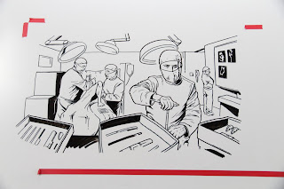
Photon Creative and the Zimmer Whiteboard Animation
Notes on whiteboard animation: OK, this is kinda tough. Its like time lapse performance art.
Working on a whiteboard is like trying to coax sensitivity out of a hammer. The markers aren't particularly well made, nor are there a lot of variations that you can purchase. We purchased all of them, and i similarly abused the hell out of the tips of said markers.
The work was being done for Photon Creative in San Francisco, under the direction of Ed Carden and Brandon Butrick for Zimmer, whose artificial joints are pieces of insertable art. Seriously, the artificial knee joints that they make are like holding new Apple products.
We worked small, then larger and tried to capture all the coolness of the initial sketches in the final product. I'll post the link when the final is cleared for public consumption. If you've see RS Anime's work in this, I think that we did some different things and pushed the form more than a little bit.
Now, its back to brushes and india ink and some slightly more traditional work...
Tuesday, March 12, 2013
G.I. Joe by Noto & Yoakum
Pen and Ink and Copic marker on 2 ply bristol, commission work...
Not being a G.I Joe fan, i had to ask, "who ARE these characters?" Now i know.
Monday, March 11, 2013
What have you been doing? Glad you asked...
A little of this, and a little of that. working a freelance whiteboard animation project that more than doubled in scope along the way. I'll post more on that.
Wanted to do a little housecleaning in the studio however, between projects. Found this experiment mixing ink and gouache and trying, in vain, to find the right paper. Finally emails J.G. Jones who directed me, in about 2 seconds, to the right stuff. While I never finished this one, I like what i learned from it.
Planning ahead is the key. Know what your values are and stick to them. Cap works completely with teh light source, which i could have dimmed if i needed to. the Skull does not work, as i let the values bleed into each other and the entire head flattened out. bleh.
Plenty to talk about with comics over the last 5 months, no question, but for now i'm trying to jump back into the second issue of The Carnival and dive back into my usual stuff, as opposed to whiteboard markers.
Subscribe to:
Posts (Atom)