Saturday, December 06, 2008

A Tribute to Gene Colan: the Cartoon Art Museum

With the original cover for Iron Man and Submariner #1 staring at you from the wall of the Cartoon Gallery, just a foot or two away from the cover to Iron Man #1, and Captain Marvel #1 you come away with three distinct impressions: 1) Gene knew how to put big dynamic figures front and center - they're great covers; 2) Gene definitely wasn't great with knees; and 3) Marvel's production department looks like a bunch hacks given that the printed versions of two of the three covers are not the originals!

Gene himself is a true original, as his one man show at the San Francisco Cartoon Art Museum will attest. A gracious and talented gentleman, Gene was on hand to soak up the applause last thursday night from the 150 people or so who crammed into the museum to hear testimonials from Steve Englehart, Joe Rubenstein, Steve Leialoha and Stan Lee.

Curated by Glen David Gold, the author of Carter Beats the Devil, who deftly straddles that line between uberfan and actual functioning adult, Glen gave us original art lovers the chance to see some art that, I suspect, we will never see again given that it is all in the hands of private collectors. He also gave us the chance to fete Gene in person, a rare treat.
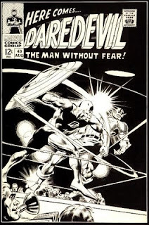
The scans here are a sample from the catalog of the exhibition, which itself is a nice treat. Great commentary by Gene's peers and collaborators, including excellent reproductions of work that you’re not going to find anywhere else: The original cover to Daredevil #43, which Kirby ended up redoing so that it didn’t appear that Captain America was losing to DD in the ring. For those interested, there may still be more available from the Cartoon Art Museum itself.

Stan Lee didn't come himself, but did send along a video tribute, one that sounded and felt terribly heartfelt. However, it is difficult for me to listen to Stan say:
On a personal note - Gene colan is a gentleman. honorable, dependable and loyal. I always got a kick out of calling him Genial Gene or Gentleman Gene, but most important of all, I'm proud to call him my friend.
Knowing that Stan is in good health, and wealthy enough as the perennial company man that he was, to be able to say these things, while Gene struggled with his glaucoma and no health insurance over the last decade. Once again, Marvel continues to ignore the aching backs of the men that the company was built upon, and it hurts to see.
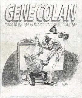
Given the Gene has no vision in one eye, and limited vision in another, the newer pencilled works here show remarkable clarity of composition and pencil technique. Gene's hand has lost none of its subtlety, and the new work doesn't suffer in comparison to the beautiful two page spreads from Doctor Strange and Tomb.

The best line of night: there are entire schools of Kirby or Steranko or Adams, and yet, there is no school of Colan. There is simply no one with the touch and ability that Gene has with a pencil, nor his idiosyncratic layouts and storytelling approach. In his tribute, Stan uses the word "inimitable". Gene truly define that word, from the ground up.

All the very best Gene, I'll probably never be able to afford a piece of your art for my collection, but I'll never stop trying!

In addendum: the cover for Captain Marvel #1 is completely hacked up, cutting out the Marvell figure and moving it up to change his position on the page. The Iron Man #1 cover has a side note: "after inks - raise up to get IM's head overlap title", which means that the printed cover of IM #1, which has pretty murky line work, is not the result of bad inking by Johnny Craig, but of pasted up stats of the original cover, with some of Colan's beautiful vingettes moved or removed. Craig's line work on the original is actually both bold and delicate and extremely lively.

Wednesday, December 03, 2008

Cartoon Art Museum: Gene Colan Opening Tomorrow!

I can't wait to be at this, and I would love to see a great turn out to honor Gene, so i'm putting this up again:

The Cartoon Art Museum is honored to celebrate the life and work of cartoonist Gene Colan with a career-spanning retrospective entitled Colan: Visions of a Man without Fear. The opening reception for this exhibition will be held on Thursday, December 4, 2008 from 7:00 to 9:00pm, and will be free and open to the public.

Gene Colan and his wife, Adrienne, will be the Guests of Honor at this reception, as the Cartoon Art Museum pays tribute to one of the most talented and respected artists in the comic book industry with A Salute to Gene Colan. Frequent collaborator Stan Lee calls Colan “one of comicdom’s true immortals,” and Cyrus Voris, screenwriter of the hit animated movie Kung-Fu Panda, describes Colan’s work as possessing “a blazing originality, a uniqueness of vision that owed nothing to anybody.” Testimonials from Colan’s friends, colleagues and fans will be presented throughout the evening.

Gene Colan will also be appearing at Lee’s Comics in Mountain View, California, as part of his visit to the west coast. This in-store appearance will take place on Saturday, December 6, 2008, from 2:00pm until 4:00pm. Colan will be joined by award-winning comic book inker Steve Leialoha, his collaborator on a variety of books including Howard the Duck , Daredevil and Detectives Inc. Please visit http://www.lcomics.com for more information.

Wednesday, November 26, 2008

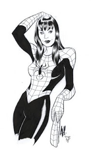
New Work: Mary Jane by Hughes & Yoakum

Another Adam Hughes ink job!

Love trying to get that Jazzy Johnny Romita hair sheen on MJ. Adam does interesting faces, not stereotypical women's faces, and I'm noticing it more now inking a few of these pieces than I ever did just looking at the work.

These are fun!

Tuesday, November 25, 2008

Women In Comics: Yet Again, into the Stereotypes!

Over at the blog, Stuff Geeks Love, the post Strong Female Characters Who Actually Aren't has generated at least three different responses, one at Are You A Serious Comic Book Reader? and two at The Mad Thinker's Blog, and, despite real reservations to this, I'm jumping a little into the fray. (And in the interest of keeping the focus, I'm not going into the "rape origin" discussion.)

First, thoughts on the original post. While the blogger makes some points that I agree with in discussing stereotypes, I disagree with the dismissal of some of the characters that were thrown under the bus in the name of stereotypes. Starbuck is a perfect example. Relegated to the "wo-man" stereotype:
The wo-man is a male character who happens to also have breasts. She is written exactly as the male characters are, shares all the same interests of the male characters, and has all the same problems of the male characters. Other than the breasts, her only other signifier of being female is that she will be in a relationship with one of the male characters. In addition to Zoe, the Firefly character mentioned above, other notable wo-men characters are Dana Scully from The X-Files and Starbuck from Battlestar Galactica.
Unfortunately, the whole "wo-man" stereotype as defined by Stuff Geeks Love, dismisses just about every interesting female character that isn't a) a whore with a heart of gold or b)the innocent virgin. Here are a couple of my givens: that interesting characters are by definition not perfect. They have flaws, they make mistakes, then they deal with the consequences. Another given: that not all women have the same set of "womenly" traits, just as not all men have the same set of "male" traits. What does this leave us with? That there are women who can be mothers and go kick ass like me do. That there are women who can be loving and callous. That there will be women who can have sexual appetites as indescriminately as men, and that those same women reserve the right to change their mind if they want later.

Using Scully and Starbuck as examples of the "wo-men" pretty much invalidates her arguement already. Scully naver moved into the "man with breasts". She was smart, loved her own family, did her job, was, in general, a rather multifaceted character. If Starbuck, a woman in the military who is a trained fighter pilot, comes across as a "man with breasts" for being a killer pilot with a sexual appetite, then I'm sure that the real world should take a look at all the female soldiers that exist in the real world. How many mothers and wives deployed in Iraq would love to be called a "man with breasts" for doing their job?

Sadly, the real world is messy, and the best characters have their own rough edges in fiction. And I totally agree with some of the original post: if I see another whore with a heart of gold in fiction, I'm going to hurl the book against the wall. The next prostitute that shows up in one of my stories will be a cold hearted bitch, just to play against type.

And I do think that "Irony" was lost on the picture of all the different slave Leias posing with Jabba in that picture. Carrie Fisher did have a long discussion, that I cannot find the attribution to, with George Lucas over whether Leia would wear underwear in space on the set of the original Star Wars. She does bounce a lot coming out of that trash compactor.

Are You A Serious Comic Book Reader? veers into the realm of male comic readers becoming uncomfortable with the depiction of, gasp, penises on their beloved heroes. (Which, after all, ties into the sexuality of female characters and is somewhat parenthetical to the rape discussion: if too many of the female characters have been raped, then we would assume that the men have sexual equipment as well). A quick internet search on the Alex Ross Sgt. Steel cover, one that i blogged on back in 2007, should reveal the depths of homophobia that the average comic consumer seems to have.

Scott's Mad Thinker blog is one that I'm not a huge fan of. I've popped over to the blog a number of times and I tend to think that his posts just jump around way to much for me. Its clear that he's thinking about things, but the writing doesn't always gel with me. That being said, he at least thinks about things, whether I agree with him or not. He took the time to do research on the female characters who have been raped, as well as taking the time to annotate some of the lists that he found. He very accurately identifies that fuzzy thinking behind the original posts problems with Buffy, and I completely agree with his case for the men in Buffy being the ones that can't handle sexual power. The women in the series use and have sex according to who they are: evil and good in equal measure.

I think that I have to disagree that simply listing the number of female characters who haven't been raped to get a statistical analysis for the percentage of women in comics is missing the point of the arguement for the data: Comics have primarily been a boys club, and there are years and years worth of negative stereotypes to overcome, especially to a traditional male audience that is generally no known for having fairly enlightened views of sexuality. When the rape stereotype comes up, it can stand out a bit too much like a sore thumb, or at least lazy writing. As the comics ahve become targeted to a more adult audience, the suggestion of the sexual assault have moved from the inference to more concrete, and thus, has become even more disturbing. As a father of two girls, yes, it bothers me tremendously, and while you could argue that that makes the rape an effective dramatic device since I do have an emotional reaction to it, I'm tired of it. Just as too many years of off-off-off-Broadway plays in New York made me hate the "every male is gay, they just won't admit it" plot line constantly written by gay off-off-off-Broadway playwrites.

Give me something else.

There, I'm done. The flames can begin.

Thursday, November 20, 2008

Jane's Addiction: the latest reunion

i've usually kept this blog just to comics and tried to keep it well focused, but tonight i realized that i had to post this.

I've known plenty of artists who were total video heads, who could keep the tv going in the background next to their drawing board and just look over occasionally. Ron Lim and Howard Simpson were two like that. I couldn't do that at all. I was the music freak, listening to music as a way to psych myself up or down as necessary, to keep me going on the late night deadlines, to add the soundtrack to the panels and images that i was creating. Each note somehow made the ink lines make a little more sense.

Jane's Addiction was at the forefront of literally decades of artwork on my part. Perry Farrell, Dave Navarro, Perk and Eric Avery were so much more than the sum of their parts with that band that they created their own little music reality. For those of us who loved them, they took the stature of The Who, or Zeppelin or the Stones for our generation.

I saw them twice back in the day and, sadly, was underwhelmed by the sound system, by that particular night's performance. I've sat through various incarnations of the band, with Flea or Martyn sitting in on bass for Avery during his 20 year feud with Perry and wished that i had had the chance to see them the way i had discovered some other bands: in a small club with all that energy, all that fucking over the top bottled up youth and noise and sex energy ready to burst and bust and explode all over the stage energy bouncing off of the ceiling and back into the crowd.

So it seem that they're playing again. At the el cid tonight down in LA, pretty much only to family and friends, maybe with a few fans coming in, but basically at a club that holds 150 people and you're standing in line for 9 hours on the hope and wing and prayer that you get in.

Except that you can't do that now. You're not a slacker working at Kinko's so taht you can knock out a cheap zine at 3am when no one is counting the paper stock. You're not closing down the bar and then going to sit in line on the pavement for 24 hours so that you can get in to see your favorite band. You're married and you have kids and a mortgage and a job and the time when that music seemed so vital seems like a long time away.

I loved these guys, and it did sit on the pavement back in 1997, drawing backgrounds on the JG Jones' Shi:The Series so that i could make my deadlines, for 8 hours back then to see the best of all the shows that i personally witnessed, and to see the crowd pull the MTV camera in to the pit just to fuck with the corporate tools who were sucking off of Jane's reunion with Flea. I love them, but its not 1988 again and Nothings Shocking is shocking, shocking that it is putting Poison and Def Leppard and all the other hair metal bands into wheelchairs and pushing them gleefully down the stairs to split their skulls open. "If you've got some big fucking secret, then why don't you sing ME something?"

I love these guys, but its not 1988. If they want to play again, I'll absolutely go see them, but it won't be transcendent, it won't change my life (again), and it had better not be the same 20 year old material. For their sakes, i hope that they write some new material and move on. We're not the same, they're not the same.

It was said so well in all the longing post mortems that surfaced in the wake of the band's breakup, "No one listens to Jane's anymore, because Jane's was the fuck soundtrack for a generation that has broken up."

Sunday, November 16, 2008

New Work: Donna Troy by Hughes and Yoakum

A little new something. Some more inks over Adam Hughes sketches for a collector. here is Donna Troy, a favorite from back in the days of the Teen Titans, is the cool starfield costume.

Ink and Copic Markers on Bristol. Starfield courtesy of Dr. Ph Martins Bleed Proof White.

Another Adam Hughes piece to follow!

Thursday, November 13, 2008

Cartoon Art Muesum: A Tribute to Gene Colan

There isn't a lot of press on this, and there should be. So I'm posting this up to help the great folks over at the Cartoon Art Museum.

Colan: Visions of a Man without Fear
Cartoon Art Museum Exhibition: November 15, 2008 – March 15, 2009

Opening Reception: Thursday, December 4, 2008
With special guests Gene and Adrienne Colan

The Cartoon Art Museum is honored to celebrate the life and work of cartoonist Gene Colan with a career-spanning retrospective entitled Colan: Visions of a Man without Fear. This exhibition will include over 40 examples from Colan’s long creative career, from his one and only story illustrated for legendary publisher EC Comics in 1952, through his career-defining work for Marvel Comics from the 1960s and 1970s on titles as diverse as Iron Man, Tomb of Dracula and Howard The Duck, to his notable run on DC Comics’ Batman in the 1980s, to his more recent efforts, including illustrations commissioned by his fans and his beautiful pencil artwork on titles such as Michael Chabon’s The Escapist, published by Dark Horse Comics.

This exhibition has been assembled by Guest Curator Glen David Gold, author of the novel Carter Beats the Devil and many comics-related essays. Gene Colan and his wife Adrienne will be the guests of honor at the December 4 reception, and many Bay Area comic book professionals are scheduled to be in attendance. Additional information regarding this reception will be announced later this month.

I'll be there for the reception, and so should you if you live in the Bay Area. Imagine, the original art for Iron Man #1 right next to the art for Iron Man & Sub Mariner #1, right next to rejected cover art for Daredevil vs. Captain America. If you don't know who Gene is, you're probably not really reading this blog. I expect to see amazing art from EC, to Tomb of Dracula, to Tales of Suspense, to Steward the Rat, to Detectives Inc. And Gene himself, who has been suffering from ill health the last few years, making the trip out here. Gene and Adrienne are genuinely some of the nicest people in comics and it will be a pleasure to see them again.

Don't miss out. When you come by, tell me you saw it on "Ink Destroyed My Brush"!

Thursday, November 06, 2008

In Review Of: Darwyn Cooke's Retroactive

I have to say that there isn't a whole lot to review here, other than to perhaps make the rest of the world aware that this book exists, but perhaps that will suffice.

I missed seeing Retroactive at San Diego this year, partly, I'm sure, since it sold out in the first day or two. A simple hardcover collection, slightly oversized, of Darwyn's work in a hardcover format.

Given the loose brush stroke slightly "cartoony"style that Cooke works in , one might think that it wouldn't be as effective large as it is in reduction, with the tightening effect when the art shrinks in size. The opposite is true, as the larger version lends a greater abstract power to the best images here, the simplicity of the image gains impact as the artist's choices are magnified.

It is a bit like what Lichenstein was after, but Roy was able to demean the medium of comics while at the same time trading in on their power and stealing from them for his source material. Many of the oversize pieces, such as "Old Miami" in the frontpiece, are so enlarged that we can easily make the grain of the rough tooth bristol under his brush strokes on the art. Other skteches, such as "Hal", "Jetage" and "Score" work even better at 500% than the do at actual size.

One of the best pieces in the book, an untitled Spirit piece done on duotone board, is one that i had never seen before, and was instantly captured by. A great deal of work went into this one, the planning of the four different tones (white, black, 30% grey, 60% grey) and it does a magnificent job of capturing the energy and tone of Eisner's best work. In a curious omission, there is no title for the Spirit two pager.

Mint copies of this book, by the way, will be impossible to find unless they're still in the damn shrink wrap. The back cover is mostly white, and already is showing scuffs on it from being in my studio on the shelf or on the table. Now, mind you, books in my studio end up getting used, opened, read, paged through but they're not dipped in ink and driven over by snow tires. Get used to seeing shelf marks on any of these and just move on.

It has long been my contention that more people would be impressed by comic art if they saw it full size. The reproduction may hide some flaws, but it also robs the art of some of its grandeur, and I simply that is a shame. When guests come over and see the various originals that I have in the house, you can see the non comic readers looking at the art in a new way, they're clearly seeing things that they would never have noticed with cheap printing and bad reproduction. Cooke's best stuff, from New Frontier to Catwoman, has the strength to stand no only on its own but to stand up to repreaded examination.

The Iconic Batman: Steve Englehart

With a twist of the cape, and the most devastating cowl ever to be put over Bruce's head, the Marshall Rogers Batman is delicious, dark, powerful version of the revenge archetype, and, as i've said many times before, the best version to ever get laid on to newsprint of the character. The team of Steve Englehart/Marshall Rogers and Terry Austin laid down the law when it comes to the Batman.

And yet, as Danny Boy posts on his blog, here is a little missive from Steve Englehart that says volumes:
As most everyone getting this knows, I wrote DARK DETECTIVE III beginning in January 2006, but Marshall Rogers died tragically and completely unexpectedly as he was drawing the first issue. What happened after that was puzzling.

A DC editor called up Terry Austin - not me - and said "There are some people up here who want that series dead, and Marshall's death gives them their excuse." Whereupon they cancelled the series. That in itself was not so puzzling, because DC has never liked the idea that the Englehart-Rogers-Austin Batman established the Batman film and animation franchise (and in retrospect, by creating the first adult superhero, the whole superhero film genre since 1989). They never deny that it did, because they can't; they just never talk about it at all.

I've exerpted my favorite part, but you have to go read the whole thing. Don't worry, I'll be here when you're done.

Back? Good. I was watching Constantine on Tivo last night, and basically watched a comglomeration of the best of Jamie Delano and Garth Ennis with a decent budget, but with nary a credit in sight. And its a shame. The Batman movies? Must be even worse for Steve, since, given how many times they're thrown a bucket of money at people to do a new and great version of the character, they keep going back to 1977 to steal the right ideas for the movies. That they decided to rip off the most recent version that Steve did surprises me not at all. Just makes me sad.

And really, they're not going back to 1939 to make this work, are they? They really are going back to Steve's ideas of what makes the character work in a modern context, because going back to a gothic Bob Kane version would be all kinds of retro fun, but would hardly work for the character in the present day.

Lis Fies, fresh from the editing bay, watched Dark Knight and had the same reaction that most people had: why doesn't the film end? Why are we sitting here in the theatre still when the main story seems to be over? Given that Lis was busy paring down her new horror opus The Commune down to its terror-soaked marrow, why, she wondered, is there a whole extra 60+ minutes of padding in The Dark Knight?

Good question, now we know.

Why not just pay Steve to write the damn first draft and hand that over to Nolan? Is it so hard to spread a little of that green around to people who are supplying your main ideas?

Yes, that is rhetorical. I know that. No one wants to let go of their money, not even a little bit. but where do you go from here? Do you want a third Batman film that is as bad as the third X-Men film? If you're Warner Bros., don't you want to give Nolan whatever it takes to get him on the third film?

Howzabout a good story?

Wednesday, November 05, 2008

Short Takes: Steve Ditko and Defiant Comics

Carl Potts, has a great post on steve ditko on his blog here, the best part being this little bombshell:
In the late ‘80s, Ditko told me that, when he quit Marvel in the ‘60s, he didn’t turn in two Dr. Strange stories that he’d plotted and penciled. My jaw hit the floor.

This was amazing news and I urged (begged) Ditko to bring in the story! He politely declined, saying he didn’t want the pages to ever be published or copied. I told him that I’d be happy to look over his shoulder as he flipped through the pages/ That way the pages would never leave his hands, but he still declined to bring them in. Since then I’ve fantasized about what those pages look like and what the story was about. I wonder if I’ll ever find out!
I somehow doubt that we'll ever see those pages until Steve passes on, and i wouldn't put it past him to have it written into the will to have the executor have to shred them before getting anything else.!

My near-miss Ditko story: I started working professionally at Defiant under Jim Shooter in 1992, just as Ditko had finished drawing the promo-issue of Dark Dominion #0. Defiant had offices on the 15th floor of a building on west 36th st. with both an elevator and stairs. One time Steve showed up and was told that Jim was in a meeting and would be out in about 15 minutes and would he please wait? Steve, who had walked up all15 flights turned around and walked out. He declined to wait, but came back about 15 minutes later for the meeting. Now Ditko was notorious about not taking elevators. Did he just go down the stairs and then come back up? There really was nowhere else to go! Everybody there was convinced that he walked down, and walked back up.

Ditko's last day in the offices was the day before i got there. Argh. I felt like Steve was just out of reach, as if he was slightly at a distance and in shadow, like all those original panels hiding the identity of the Green Goblin.

Ditko's best work, in my opinion was most likely on Dr Strange, although i always see them as an extension of the short story monster work that prevailed in the Pre-Marvel line. Some of those litttle twilight zone scripts received rare treatment by Steve in terms of beautiful light and dark work. His story about the man who traps death in a stasis ray is a great little gem.

Saturday, October 25, 2008

Watchmen Porn: Watching the Watchmen by Gibbons

Is there any Chip Kidd book that doesn't have a serious staredown happening somewhere in the end papers, let along the cover? Am I alone in thinking that the books tend to follow you across the room?

Watching the Watchmen is really Watchmen porn, with every single bit and piece of the creation of the seminal series held up to 600dpi treatment, and it is hard to think of many other books that could really stand this sort of scrutiny. Sketches, thumbnails, watercolors, bits of Alan's scripts all litter that book which should be a primer for anyone that has ever wondered just how easy it is to produce a comic book, let alone one with this depth. The answer, to no ones surprise, is that it was a mountain of work, and it shows in each series of thumbnails as Gibbons lays out panel after panel after panel of nine panel grid, moving the camera around, in, and out and around each of his set pieces.

My god is it a ton of work. I'm exhausted just looking at it.

How much new stuff is there you ask? Hard to say, given that the best of preliminary work was all put into the Grafitti hardcover from back in '87 that i own, so i've not bought the Absolute edition, although the new coloring is quite a draw honestly, as it the increase of page size. The thumbnails are a masterful touch, but I think only to someone who is really deep into the artistic process. (Seeing the transition from Sharpie thumbnails to pencils to full inks is quite an education in itself.) If this is art porn, and, lets face it, it really is, then its got a very specific fetish audience in mind.

But there is some delight in seeing all the work that was put in behind the scenes, even though two things, of course, jump out at me: that some 16 pages in we have the handsomely put together indicia page "WATCHMEN and all related names, characters and elements are trademarks of DC Comics" and that 200 pages or so into the book, Gibbons writes
It was certainly beyond the imaginings Alain andI had as its creators. We expected that three years after the original series had gone out of print the rights would revert back to us, as stated in our contract. Instead, it has been in print ever since.
Meaning, of course, that this is why Moore will never work for DC again. Victims of their own success, the work has been in print ever since. Had we all just stopped buying the damn thing it could have gone back into the hands of its true parents: Alan and Dave. Sad. DC could never bring itself to do the one thing that financially would have paid huge dividends: bit the bullet, given them the rites back in exchange for all that Alan could have brought to them over the last 20 years. Small change for what they could have had.

Sad. Sad. Sad.

This is a beautiful companion volume, one that sits perfectly on the shelf next to the Grafitti edition that I had to freakin' pry out of the hands of the Downtown Sacramento Comics and Comix guys. They only received two copies and sold the two of them to myself and Ron Lim. Sorry everyone in the Sacramento valley, we got 'em.

Who is watching the Watchmen? These days, just about everyone.

Thursday, October 23, 2008

In Review Of: Local Hardcover by Wood and Kelly

I came to the Local series in the middle, and made a totally 2008 decision: to not search out the back issues but simply wait for the trade. Except that the trade isn't a trade, but a beautifully produced hardback . And the series holds together exceptionally well. The issues that I had with it when it first came out are the same that i have here, with all the supplemental material in one spot.

The series was a good idea, one that allowed for some fascinating vignettes in the life of Megan. Stories like "The Last Lonely Days at the Oxford Theatre" don't have to go too far to wallow in the level of fucked-upedness that so many of us felt at that age. Wood has captured it beautifully; the hopelessness, the subtle treachery of the minimum wage worker, the small victories that the lost feel with the subtle deception of the switching name tags. There are other standouts here as well: the abject hopelessness of Megan's cousin as a teenager, and, best of all, the real coda of the series, issue #11.

Wood had taken a pretty unflinching look at Megan and her immediate family: her father and brother's alcoholism, her own inability to make commitments or to have any empathy for others in her travels, her cousin's casual violence. After suffering through all the growing pains and intransigence of her earlier years, the story actually opens on Megan in a good space, perhaps the only time that any of the stories have, and puts her into a story headlong with a younger self, and not a carbon copy but simply another young woman with with as little empathy as Megan ever showed in any of her earlier relationships. It not only lets us revisit the small bits and pieces of her past as they're shown on display in the gallery, but puts us in the position of being both voyeur and sympathetic friend. We have been there as Megan ran out on roommates, blew perfectly healthy relationships, lied casually to anyone that she had run into and yet we're to feel her violation as her things are stolen and held up as fictional items for everyone to see. It is both a betrayal of trust and a suitable comeuppance to her. And it helps her take one more step forward in her level of maturity.

If there is any problem that I had with the series, it really is only in the last issue. The story tries to follow Megan back home to the house that she ran away from 20 years earlier, and tries to answer the nagging questions that we all have as we get older: am I just the sum of my experiences, the sum of my parents longing for me to become something else, the sum of my own mistakes? For most of us, and for Megan, the we're left with our own answers, since the ghosts and wall don't talk. But the issue is oddly overly sentimental, and, in returning Megan to the old house, seems to betray the growth that we had finally seen from her in the last issue. Megan steps back, and seems to be going back to nothing particually interesting. It serves the authors needs, but not Megan's needs, and that's an issue. There really is nothing there for her, at least not for the character thatwe've been seeing, the walls won't talk, and her mother's decision to leave the house to her may not have anything deeper to it at all as much as Wood might wish to pretend.

The package of the book is superb, with great design and all the bits and pieces that made the series interesting to pick up along the way. The guest pin-ups in the back are all included, and I'm sorry taht I didn't get mine in in time to be included! I had a neat one with Megan and her shirt is a map that was kinda neat. While i doubt that I'll need to go back and reread all the text pieces for each issue, they are an intersting slice of time when each issue was created. I specifically like the "soundtrack" portion, since I tend to have different CDs that I can recall listening to as I worked on each page. Practically every comic that i ever drew has its own soundtrack. Overall the hardback is essentially better to have, in my mind, than the original issues. It sits better on the shelf and reads well, since this is a series that works as a thematic whole, despite being a collection of single stand-alone stories.

Friday, October 10, 2008

Comics as Metatext: These Are The Days of Our Lives

So why is it that I know more about Tony Stark’s heart condition than I do my own father’s? Why am I more curious about Wolverine’s past than my family’s own checkered and mysterious past? Why, sadly, do most fanboys know more about Diana Prince’s bust than… well… then about any real busts?

Are comics the true metatext for our times? Have the long running series developed a life of their own in our memories, and our discussions, and our continuing their lives into other media? Have the Fantastic Four become more real to those that had their brains permanently scarred by Lee and Kirby, or those whose chromosomes were altered by Claremont, Byrne and Austin?

For all those that will claim movies as our fictional consciousness, can six hours in the life of Indiana Jones compete with months and years of following the minutea of Reed, Sue, Johnny and Ben? Like the album that was playing when you had your first kiss, your first break up, your first make up sex, these serials become the soundtrack to our lives. I can recall not only the 7-11 where I would purchase the X-men comics, but also all the little bits surrounding going down there on Wednesdays after school, getting that hideous Charleston Chews to go along with the new comics. What else can make all that come back?

As well, comics have provided the same sort of story stability the music can provide. When all else is going to hell, you can go back, again and again, to stories and watch everything going to hell, and somehow come out all right yet again. Comics can personify the cathartic element in storytelling as our heroes confront an endless series of troubles that should seem to overwhelm them, and yet somehow do not. While we might expect that somehow there will be a point where they breakdown over the troubles and yet they do not.

If there is a furthering of the metatext, then it is in the addition of the breakdown that has taken heroes one step further than they ever went before. Daredevil breaks down with Karen Page as she returns from her drug addiction, and takes his life as Matt Murdock down with it. Jack Knight, father and girlfriend gone, breaks down with his newborn son in his arms, his precious Opal City no match for his personal losses. Comics grow up when our characters face real dangers, but those dangers act as a real advancement of the characters, which is a danger to the corporate metatext. Perhaps the only way to continue then is to follow the prince Valiant path, where the characters do age, obviously not in real time, but slowly and surely, so that their path eventually mirrors our own.

It is perhaps The Batman who personifies the longest running metatext currently available to those of us who follow popular fiction. Superman has been rebooted enough times that only the very basics of his Jewish origins have stayed true: Ma and Pa Kent, Smallville, and a few others. Batman, on the other hand, has been the true Gilgamesh, whether written by Kane, Fox, Miller or Moore, he’s never quite been able to shake Joe Chill pulling the trigger on his parents. Whether it was from a distance or so close that the pearls break and spill to the ground, it matters not. Two-Face will always be Dent on his worst day, the Joker always the rogue force of chaos, Catwoman his own self with a looser set of morals and a greater sense of who she really is.

Bob Segar once sang, “Come back baby, rock and roll never forgets” but comics do forget. DC and Marvel have, in some measure forgotten where they came from. There is nothing wrong with adult heroes, but we need the heroes of our children as well. While Civil War was heavy handed allegory, Secret Invasion takes the very underpinnings of the Marvel Universe and spins a tale out of Skrull cloth whole. Right now, the Marvel Universe is an odd mix. DC had dragged the entire universe into Morrison’s world, and it is not a happy place with Final Crisis. Oddly enough, Grant knows almost better than anyone how to mix the light and the heavy into a delightful stew that many different ages can enjoy (see his All Star Superman). Somehow, in all the politics and editorial decisions seem to have driven the fun out of it. A selective memory is what is called for here.

And memory is what its all about, then, isn’t it?

Monday, October 06, 2008

Gallery Show: Cici's in Mill Valley Calfornia

A few pics from the my first gallery show ever. Been meaning to post these all month!

Shown here is one wall solely devoted to work on The Carnival:The Human Hourglass while the opposite wall was a mix of illustrations from the original Pistoleras graphic novel proposal and some spot illustrations.


Sunday, September 21, 2008

Spider-Man and The Green Goblin: finally!

Finished!

Maybe someone will like it.

Your Friendly Neighborhood Who? Pt III

More detail on Spidey here.

It does seem odd to do the full on process without showing the sketches that lead to this point. I may have to go back and scan them so we can really see the piece develop.


Also, I develop a Green Goblin sketch on a nother page and blow it up on the photocopier. I'm showing you the good one, not the crappy Goblin sketches....

I then do the shading work on the photocopy so that I can play with the lighting without losing the structure of the original drawing if i mess it up. But I kinda like this one off the bat.

Tuesday, September 16, 2008

In Discussion Of: Work for Hire and Working the Workers

Noah Berlatsky makes some interesting points in his Who Watches the Super Serfs post in reaction to Joe Quesada's comments on work for hire. Joe, for those who simply don't wish to click about 5 layers down to get to the quotes, points out that Work for Hire is just life under capitalism and that we should all just shut up about it.

And yet, there are very few other artistic forms where the creator is expected to give and give and give and get nothing back. The music industry is one, at least in the old days, where only the publishing was important. (Does it not depress anyone to know that a song, pick any song that has achieved a certain level of cultural fame, for all those times that you've heard it on the radio growing up, nothing goes back to artist's pocket book if he or she didn't write it? Music that we consider the soundtrack of our lives sometimes is created by an artist who receives nothing for the continued radio airplay. In Europe, at least, there has been a "performer credit" that paid the performing artist for decades).

By anyone's estimation, Siegel and Shuster should have been millionaires, but they didn't even get the working wage as they were fired off of the Superman books relatively quickly so that DC didn't to worry about fighting with two men who had an emotional investment. DC stole the greatest idea in the history of the medium and bailed on the inventors.

Is this any better or worse than some of what Tom Crippen points out in his rather depressing self-examination of his younger comic reading days, when he discovered that Romita and Buscema were not inspired artists gearing up for another exciting issue of Marvel Team Up, but were, in fact, workhorses, churning out yet another issue? Perhaps not. Since the result, in any case, is a depressingly mediocre product for the reader.

That workhorse/work-for-hire mentality has stuck us with a level of mediocrity that is rather hard to surpass unless one looks at television with a long lens. Another medium that started out in the mud and never climbed up any higher until recently and only by:
  • rock star mentality where one creator occasionally gets enough power to actually force through something interesting and innovative
  • sheer accident.
Whatever interesting work that a John Buscema might have done was long since crushed out of him. When teaching younger artists, "Hack away boys!" was what he told them. Joe Kubert is one of those few who came out the other side, with decades of work for hire, he still turned out Fax From Sarajevo late in his career.

Is there incentive for the creator to actually give a Marvel or DC anything other than to get a paycheck? Unfortunately, yes, there is, and much of it rests on the heart fulfulling its wishes to go play in the sandbox with all the favorite toys that one had growing up: The X-Men, The Avengers, Batman, Superman, Wonder Woman. and the dream of getting a paycheck for actually sitting around doing what your parents told you was a waste of time: drawing.

But neither of them leads to a happy old age, to a pension, to anything other than a bad back. Ask Gene Colan where his long term health benefits are, or Dave Cockrum where his were. The lived the dream, but like the hourly employee at Taco Bell, the first day that they don't show up and make tacos, they don't get paid. And, as we all know, Gene and Dave made a hell of a lot more than tacos.

Tom makes the point, late in his essay, that he found himself "ground down" by the relentless quality of reading all the Marvels, til staring at the carpet was the equivalent of reading yet another issue of Thor. Many of the artists who have worked on a monthly schedule can attest to that feeling, and I realize that this has long since been about getting the product out on the stands, as opposed to getting a good product out on the stands. Would any other market want to actually cheapen their goods at that level? I guess if your business plan includes a built-in turnover of consumers, especially consumers who you consider to have no taste differential, then yes, cheapen the product all you want.

But not in this day and age. The business model has changed, or it should. Work can stay in print and, like an actual book, continue to entertain. Good creators should get paid well, great creators even better. And if the idea lives on, and there is money to be made, then the creators should continue to get paid. Quesada's idea of work for hire being the only way to go only works if you're going backwards from here. And I think that we're going anywhere but.

Monday, September 15, 2008

First Look: Bowen's Jack Of Hearts


Damn it, Randy Bowen's company does it again.
Just when I thought I was through with the figures (and as I write, I have a Cap/Red Skull combo on one shelf, Iron Man, Thanos, Warlock and Captain Marvel on top of another book case and a classic Iron Man flanked by Kang and Ultron over my shoulder), I check the Bowendesigns website and see that he's doing a Jack of Hearts figurine.

And Magog.

Dammit, now i have to get them now that I know that they exist. I was doing all fine and dandy without knowing that.

And I want the full-size Death Statue. Ooooh, yes I do.

Remind me to someday tell you my proposal to redo the Jack of Hearts from the early 1990's. He would have become what Nova became with the Annihilation storyline.

Your Friendly Neighborhood Who? Pt II

A little more done on this. Its funny, but somehow, once you just pencil in the webbing on his costume that suddenly "it looks like Spider-Man"! Its just somehow the one thing that really get the visual appeal going with the character.

Good old Sturdy Steve Ditko.

Saturday, September 13, 2008

Your Friendly Neighborhood Who?

In the middle of working on a new commission piece.

I literally think that this is the first time that I've drawn Spider-Man since i was about 10 years old.

And I actually remember the costume without reference. Scary.

Thursday, September 11, 2008

Rene Angstrom: Anders Loves Backgrounds

Rene Engstrom, who draws Anders Loves Maria, has a great little post on backgrounds that I wanted to alert the great world of comicdom to.
For many it can be a pain to have to think of what to put in all that dang negative space. I totally used to over do backgrounds, unnecessarily. Your backgrounds should have a purpose. Generally they are used to set the atmosphere. You see these a lot in the comic's establishing panels. How to use panels are important, but also what you use for backgrounds is important.
I used to love doing backgrounds, still do, in fact, but I think thats the inker, the technician in me loving doing the work and getting a world that looks and feels real. I used to totally feel cheated by artists who consistantly didn't do the work to get the backgrounds right, or worse, didn't put in backgrounds at all.

And yet, I find myself analyzing who really puts in the work, and who is just better at suggesting the backgrounds. It was easy to get spoiled by someone like Marshall Rogers who had a background as an architect building a real Gotham City in his head and bringing it to life in Detective Comics. And yet, when I think back to the old Ross Andru Spider-men that I bought in the 1970's, I know now that he was a stickler for getting the backgrounds right, (i.e. showing Spider-man swinging the right way past the New York Public Library when he was going uptown rather than downtown) but somehow the world never felt nearly as real to me as Daredevil's New York. Mignola's Hellboys are perhaps some of the best work of suggested backgrounds since Milt Caniff. I totally buy the world that he's in, and I have only to start trying to dissect the backgrounds to realize how little information he is actually giving us.

But it works.

I remember John Byrne's worlds as being very real in his X-Men, and it was the Terry Austin inks on both that book and the Marshall Rogers Batmans that made me a stickler for using the ruler and getting backgrounds right, but now the storyteller in me is thinking that its a matter of focusing on the trees rather than the forest. My work on the Carnival pages is making me think just how much can be implied rather than said, but when you say, make sure that it really says "something". Marshall wanted his Gotham to be an actual character in his Batman books, and I am looking for the same thing in my story, but that doesn't mean putting in everything in every panel. Perhaps the hardest thing to do is to actually edit yourself in the drawing process.

And without looking back at those X-Men, I wonder just how much work John did on those backgrounds. Did he just imply it so well that my 14 year old brain filled in the Savage Land around Cyclops and Storm? I'm resisting the temptation to go find out.

Wednesday, August 27, 2008

Virgin Comics Closes Down: Still No One Gets It

The last two days poor Dirk Deppey's blood pressure must be going though the roof over at the comics journal. With the closing of Virgin Comics' New York offices, we've watched yet another comics company implode and all for many of the same reasons. Dirk has one of his best rants in ages of why it didn't work:
Lots of books that I think are badly executed nonetheless find readers (see: Marvel’s Civil War). The question is, can they find the market where such readers might be available? I argued yesterday that because Virgin’s outreach seems to have been restricted to the Wednesday Crowd, the answer was effectively “No.”
and the truth, as they used to say in the 90's, was out there. I don't recall seeing a single Virgin TPB at any of the stores that I go into. They were playing to a calcified audience, one that is simply too locked into prior patterns to want or to be able to support the new.

And that is their perogative. I'm all about comics audiences voting with their money, as for years they supported bad series and poor editorial choices because they had to have a complete run of Black Goliath and Night Nurse.

The problem is that the business model really is broken to get new work in front of new eyes. Not, and lets be clear here, old work in front of new eyes, or new work in front of old eyes. The powers that be have every intention, we know by now, of sitting on thier butts and staying with what isn't working until they're forced out on the street.

And yet the new business model is working. Jeff Smith didn't get to where he is by doing Spider man before doing Bone. The manga audience has come in droves for what American publishers were sure they wouldn't buy. Diary of a Wimpy Kid has only moved a few copies since being picked up off of the web.

There you go, three different business models to follow, and the powers that be in marvel and DC aren't doing any of them. Scholastic has an entirely different distribution model, manga digests are filling the shelves in Borders and B & N, and the web is filled with tiny little pockets of coolness that can prove the effectiveness of micropayments.

The answer here, with all of Virgin's money, is to simply not go the Marvel/DC route. Don't try to compete with that universe. The audience won't accept it, period. Cross Gen and Virgin simply bare this out. There was solid talent here, putting in time and money to create books that were halfway between something alternative and Marvel/DC. And that space is clearly NOT a good place to be.

When i was in Paris a month ago, in a Virgin Megastore on the most famous boulevard in the fabled city of lights, I went to the top floor and found a huge area of graphic novels. And in the middle of the day were all sorts of professional adults, on lunch hour, lounging, browsing and reading graphic novels. The vast majority would have separated well into the similar catagories that we stuff movies into at the video store: Adventure, romance, comedy, adult, a little fantastic history or sci fi, but then again, thats the whole point. There was a huge range of graphic novel for everyone, just as even the tiniest video store is filled with something for everyone. My average comic shop can't say that, almost none of them can.

And I can recall seeing pretty much none of Virgin Comic's work in the Paris Megastore. Why? Can't guess, but if I was Richard Branson, I'd have made sure that some of it was there. Unless comics mean a lot more to us than Richard Branson.

Friday, August 22, 2008

New Artwork for August

Not a whole lot to say, some new artwork to look at. Inspired by the paperback book covers of the 1950s. Click for a larger version!

Tuesday, August 19, 2008

In Review Of: the Starman Omnibus

I've already called Starman The Great American Comic Book of the '90's, but haven't gone into much detail as to why I think that it deserves its title. The release of the Starman Omnibus #1 is a great reason to revisit the series and do a little dissection of the Robinson and Harris' creation. We also get to take a look at the Omnibus format as well.

In a prior post on the Kirby 4th World Omnibus, I commented on the paper and its quality, perhaps calling it a bit too light. While commenting on paper may put me in the "oh come on" catagory, it does have a lot to do with how it takes the color, and I think that I actually like this weight. I bears the very saturated colors of the Starman series as well as the older color style of the Jimmy Olsens.

And make no mistake, the colors of Starman look very much like the 1990s, which is not a knock on the series, but a compliment. The series has its own individual look, with distinctive Harris and Von Grawbadger artwork through the entire volume, with only two "Times Past" exceptions.

What is shocking is the quality in the early issues of how bad the reproduction is, particularly the black plate. There are entire pages that muddy up and word balloons that are either dropping out completely or have letters closing up. Its shocking really. So here is the conundrum: if the initial scans of the pages, because this is as far back as 1995 we're talk8ing about here, as really that shitty, do you not take the time to reletter the balloons for what is a true archival project, or do you leave it "as is" so that the archiving keeps the production errors as well as the charm of the growing young artist? I hate to say it, but the Sandman editions get it right. If there is a coloring error, or a balloon that you can't read, fix it for the premium editions. Get it right for posterity.

And this series is worth keeping for posterity. Robinson tackles our assumptions about superheroes and turns them on their ear more than once. But he also tackles thornier issues that resonate at a higher emotional level than "what happened to Solomon Grundy". Issues like fathers and sons and brothers and love and family and faith and redemption and he doesn't derail the cool comics concepts like Merritt's soul stealing poster, or the succubus circus or the new Mist. Somehow, inside what Robinson mentions as not an always harmonious working relationship with Tony Harris, was the making of a classic story, comic or not. I prefer to think that the sparks the exist between creators may not make for the easiest relationship, but they can certainly take the collaboration to new levels by playing off one another.

Robinson ties everything up neatly by the end of the series, much is the same way that Neil Gaiman was able to over in Sandman, and it makes for a great read. Unlike the endless saga of open ended cliffhangers that Claremont did for a solid 10 years of X-men, everything here means something. And while I still insist that he stretches far too much for the connection of Will Payton and the King Gavyn Starman (and in a classic comics touch, he even writes a scene de facto admitting that it can't all be shoehorned into position, no matter the size of the shoehorn, as Will tells his sister Sadie, "Its all pretty fuzzy."), is that really the point of the series?

But I'm getting ahead of myself. That scene wouldn't happen for years later in the comic. Here, we're treated to the storytelling conceit of a writer taking 5 issues to show a single day from five differnt players in the Opal City crime wave. And it works. Not totally, completely, in a flawless way, but it works, ocassionally bumpy narrative and all when read together, and it makes for a powerful canvas to continue the rest of the story of the Mist's first crime wave on.

Bottom line: great project, a dream to have on the bookshelf. I'll be getting more of the Omnibuses as they ship in the Starman series. A great collection of a classic series.

Thursday, August 14, 2008

Critics vs Creators: Bring it on!

Noah Berlatsky has an interesting blog post on the role of the critic that he titles Critics Vs Creators, responding to cartoonist Scott Kurtz, who has a bit of a manifesto going. I quote a bit below:
All of the progress I’ve made in my work, be it writing or art, was accomplished through getting it wrong the first time. My father always told me that the first brush stroke will never be perfect. There’s only so much you can learn from reading books on writing or art theory. You have to create and get your hands dirty and see what works. You have to take risks and you have to fail.
Noah responds in a point by point refutation that is, given that we are talking about blogging here, both well reasoned and well crafted. So why the hell am I chiming in on this you might ask. Good question. I'll try to answer that.

Noah responds right off to what he calls the "artist as tragic hero" which, I hate to say, is not something that I really see in Scott's post. I do see artist as "defensive creator" which I recognize as I've been there myself many times, but not tragic hero. It is a sad fact, and the underground classic book "Art & Fear" addresses this many times over, that most artists talk themselves out of ever even failing. You do need the arrogance to put that pen/pencil/brush to paper and get that first line wrong a million times so that it eventually becomes right. Most artists can't get themselves to that point.

I do think that most artists don't want some sort of criticism, because you're usually criticising decisions that they agonized over making, but that most artists NEED some crit, even if they pout, yell, and are generally assholes about getting it. The finished piece is the finished piece, and the best critique can't change that fact. But it can change the next piece, the next two pieces, the next ten.

Thematically as well, most artists are very good about being able to justify what they do and why they do it, but they generally are so far inside their own head that they don't see the sub-conscious themes, the inadvertant stuff that comes out during the creative process. The "public" is usually able to see that far better than the "too close to the work" artist. Artists typically do want an audience, but I'm not too sure that they all want to please that audience. In fact, there are as many reasons that people do art as art itself, so challenging the viewer and eliciting that negative is just as valid as doing something very pleasing and generating the positive. Art is about communication, as Noah points out, but who the hell knows what is being communicated? Personally, as much as I love comics, I can't take one more indy "Oh look, I love porn" autobio mini comic.

[The criticism leveled at the work also always has a measure of the reviewer as well, and that is something that you have to take into account. I know that there are certain movie critics that don't like science fiction, so I'll be damned if I going to listen to what they have to say about "Clone Wars". Know your sources if you're the audience. Wait, come to think of it, do I really need someone to tell me anything about "Clone Wars"?]

Certainly being a webcomic artist is daunting because you can pretty much get hit by anyone in the world with their opinion. And it may make your day or totally piss you off. For Scott to write "Ultimately, we can’t chart our course based on what our readership or critics thinks is working. We have to go with our gut." Is both true and not true. Yes, you can go with your gut and do the work that you want, but no one may want to ever read the thing. If you're trying to get readership, then hell yes, listen to your audience, because they will vote with their wallets and clicks and that, friends, is how you actually make money.

No whining allowed.

Tuesday, August 05, 2008

Graphic Novel Master Class: Ariel Schrag

While just getting into the mode for working on the first story The Carnival: The Human Hourglass, I received a flyer for SF's Intersection for the Arts doing a number of graphic novel/comic related pieces in the month of May. While busy, I signed up for Ariel Schrag's Graphic Novel Master Class because, while my work is nothing like hers, I wanted to see other approaches apart from my own experience inside the "mainstream" comics world.

It was an interesting evening, and I did get some new ideas out of it. It must have been tough to go into the class for Schrag, not knowing exactly what level of students she would have, their backgrounds, their ambitions, their skill level. Certainly the intro discussions of materials were the most interesting, but I'm sure that someone ran out the art store the very next day to find these new fangled "rapidiographs", so you do have to cover all your bases.

Schrag's four graphic novels run directly in the alternative comics spectrum, falling as neatly into that catagory from just about every angle: autobiographical, a looseness in art that could be either brilliant or sloppy depending on your attitude, and less concerned with so many of the technical points in terms of lettering and straight borders.

What I found most interesting was almost a dislike for "craft", along the same lines as beat poet Ginsberg railing about editors and needing to get it all down straight from his brain. Why take away the reality from what you're doing? There may be a point to that, but I found myself disagreeing with it to a point. What we've ended up with, in many cases, is the alternacomic confessional, one that wallows in "what porn do I like, how bad am I to my girlfriend, what dreams have I had, how many times a day do I masturbate". Very little great literature has been created solely in the autobiographical sense.

And yet the artist that avoids learning the craft of fiction never is going to move beyond those particular themes. "But they're real!" is the usual defense, and, true, they are. But that doesn't make them good.

Certainly, the best of the artists that Schrag uses as her examples are counter to the high speed DIY ethos that many in the class would subscribe to: Speigelman, Ware, Pekar, Sacco all have a great deal more craft that a Joe Matt. Spiegelman famously spend up to a month a panel on Maus, editing and editing til what was left was a masterpiece in pictoral literature.

All in all, it was an evening well spent, apart from the photocopier breaking down and not reproducing the jam comics that we knocked out as a class that night.

Saturday, August 02, 2008

A Bizarre Business Plan Pt. II

Pop Quiz: What do you need to get to the true value of art?

Give up?

Two people. Two people who want the same piece and you get to see what both of them are willing to spend.

I keep harping about original art since it happens to be a love of mine, so you'll have to bear with me on this one.

One thing that has driven me mad, besides being priced out of an art market that I felt a part of, hell, that I helped drive, is a single strategy of many of the art dealers. I've noticed it now for a number of years and just have to point it out: many of them took pieces of art, primarily covers and splashes, and years ago put extremely high price tags on them. OK, fair enough, try to see what the going rate is for the art.

And they didn't sell.

And they brought back the same pieces, and have been bringing back the same pieces, year after year, and raising the prices again and again. Case in point: when an old Master of Kung Fu cover was really worth about $2K, they were asking for $4K. Now, a good bronze age cover is probably worth that $4K if its a good Kane or Cockrum or Romita piece but a B or C level character, but they're asking $7K now.

Perhaps I'm missing the ppoint here, but isn't the business plan to turn your inventory? What good is it to continually hold on to the pieces, not sell them because you're well beyond what any single one of your customers is willing to spend? Does it help with other business? Why not get the cash to invest in other pieces? I'm seeing the same pieces from some dealers going on 8 or 9 years now.

And you don't have two people who want those pieces at those prices. You don't even have one person at those prices.

Albert Moy has always been on the high end of the art dealers, but give him credit. When he moved a single page for $7K, it was a Steranko splash, not simply a cover hacked out by the Romita Raiders with some slapdash inks on it. The fact that he has had original Byrne/Austin pages from the X-men at his booth speaks well about his connections and the quality of the art that he carries. I may not have been able to buy much from him over the years, but I've found a few things that I couldn't live without. He has turned up with some pretty rare stuff on occasion, like the majority of the Clayface issues of Detective by Rogers and Giordano. Where they've been hiding all these years, no one knows except for Albert.

But I digress. Given that the New York Times is running articles on the value of comic art, I feel vindicated by my love of the work, since now many other people are clearly catching on to what I always knew. And I also feel sad, knowing that my days of being able to find some of the work that I would love to get are long since past. The older pieces that I would love to have are either going to simply trade hands among the private collectors, or will come up for dollar amounts that I will certainly never expect to be able to pay.

And some of the damn pieces are still just sitting there, in the same dealer's portfolios, year after year, as opposed to going to a good home. Don't these people need cash to live or buy new art to sell? Like I said, a bizarre business plan.

Sunday, July 27, 2008

JH Williams, Bryan Hitch and a Bizarre Business Plan

You know you're looking at something special when you are inches from a piece of artwork and you still have to ask, "How did you do THAT?" Years of training, and I'm holding page after page of JH Williams artwork for his forthcoming Batgirl stint, and I can't quite wrap my brain around how he's getting his beautiful grey tones.

I also can't wrap my brain around these two facts: one - that the artwork is so good that it is making his Promethea and Desolation Jones work look like a warm up to these issues, and two - that DC isn't announcing this work at the biggest comic show in the country. I mean, this work if absolutely flooring me, and no one knows about it.

A musician once said, "There are two kinds of guitarists: some, that when you hear them, make you want to drop everything and go home and play, and some that make you never want to pick up your axe again." I've got original Promethea pages, and they're gorgeous, but they make me want to draw. The Batgirl artwork just makes me want to go home and be a fan boy and wait for the issues to come out.

Perhaps, once again, this is a microcosm for everything that ails the comics industry. One of the great, not good, great current artists on their roster, and DC fails to take advantage of promoting stellar work to 140,000 unique visitors. Why? Perhaps because it doesn't come out for a few months. and yet Warner Bros. has no problem plastering the entire convention with Watchmen posters and bags, and that doesn't hit til March of 2009. With everything to gain, and nothing to lose, DC again makes the worst possible choice with regards to getting readers excited about what is, lets face it, a "B" level book.

Marketing people, please log in to post your resumes online. Clearly, unlike other jobs, success elsewhere isn't necessary.

Also had the chance to meet Bryan Hitch, whose work on The Ultimates was a revelation. Bryan was hard at work doing sketches, as well as being represented by his art dealer, Rich DeDominicis. I enjoyed seeing some some of the FF originals, which are huge, massive pieces of art, and thinking that Bryan's work is meant to be seen that way, that a 50% reduction may not be the best physical approach for reasons of reproduction, but man, do those originals look good. Also walked away with a sketchbook copy, and I may just do an inked version of a Hitch piece just for the hell of it. You can see a few scans from the sketchbook with this post.

Saturday, July 26, 2008

San Diego Con - In Review Of: Travis Charest's Spacegirl

Back early from San Diego this year, just getting to Preview Night and Thursday and Friday in 2008. Can you pack a whole lotta crazy con-ness into two days? Heck yeah. Wore my Nike's out strolling the Con, and packed a whole bunch of craziness into those two days. We've got a bunch of books to review as well.

First off, I had the fun of hanging with Bully at the W.H. Norton Booth, which is was great, as Bully is one of the few devotees that love the current Doctor Who franchise as much as I do. My only sadness was not getting a picture with the extremely photogenic stuffed friend. Bully's Comics Oughta Be Fun blog is one that I always love reading. They also had a new book on Jews and Comics that I forgot to go back and pick up, but fully intend to get my hands on.

Over at Steve Morger's booth in the illustrator's section, there were a great group of artists, and one of the fun little delights was seeing Travis Charest's Spacegirl in hardcover form. Simplified into a single strip per page format, with only 55 total, Travis plunges us into the story of Spacegirl with nary a thought of world building, over wrought narration or even annoying intro. Spacegirl is that cool sci-fi movie you stumble on to in while channel flipping and you fall in love with. What universe are we in? don't care! Gimme some more cool stuff!

Travis an amazing artist, one that JG and I used to marvel over while he was doing WildCATs with Alan Moore. With his insanely delicate lines and detailed, layered approach, I can hardly imagine anyone less suited for the horrendous grind that is monthly comics. If there was anyone that I wanted to see do a hardcover european album, it was Travis.

Coming up, reports on JH Williams and the single best book that DC is going to publish this year that they decided to not promote, San Diego layout and useablilty, Steve Rude and oil painting, and enough reviews of make you wish that you had more time to read!

Tuesday, July 22, 2008

The Carnival: The Human Hourglass

Page 3, all done without tones. Enjoy. The site will be up soon! For all of my friends who have been waiting a long time for me to do this, and have been very patient, I hope its going to be worth it.

Charles

The San Diego Multi-Media Experience

Heading down to San Diego tomorrow for convention #20 and I wanted topost a couple thoughts on the entire "Media Con" experience as opposed to the "Comic Con" experience.

I recall having a lot of second thoughts about where the convention was going just a few years ago, as the toy companies and movies started to move in. I'll admit, it too adjusting to given that we were used to having the little corner of geekdom to ourselves and didn't have to share too much.

And you know what I think that's like now? Its like starting to hate a band you discovered on college radio or Myspace when they get big. I'm sorry that your "property" is now everyone's favorite, but really, just 10 or 11 years ago this thing was dead. DEAD. Comics were dead, the Con was aging rapidly, and i was publicly comparing us the best Horse and Buggy manufacturers when the Model T started rolling along.

What I expect to see over the next couple of days will be pack with people of all ages, all able to get their freak on with whatever sub-genre stokes their furnace. And, man, thats the way it should be. I mean really, I could care less that the zombie lovers would have to make their way past the Naruto folks and Alex Ross line. The fact that we have that many different art styles and story styles butting up against each other should be refreshing. Bring the kids, let them see just how much cool stuff there is out there, and let them grow up thinking that there is a world of stuff for them to learn about and absorb.

Now we're not a dying art form, we're actually a MASS MEDIA again. Don't argue with me that the periodicals aren't selling, that business model is outmoded anyway, Phil Seuling saw to that with the creation of the direct market. After all, isn't it about the stories, the art, not just the delivery system?

I'll take your thoughts on it later. Back to work on The Carnival: The Human Hourglass.

Thursday, July 17, 2008

Avengers Original Art: Truth or Consequences part II

Continuing the Avengers #1 splash saga -

Here are scans of the Essential Marvel Avengers, Avengers #1, which does not have the job code, in the lower left corner.


And, interestingly, the splash for Avengers #2, which does have the job code.

I'll answer a few of the thoughts that Danny Boy has posted. One, that I've changed my mind in one way from looking at the scan of the Avengers #1 splash, and that I like seeing the page number marked in the lower right hand corner. That adds points to me on the legitimate side. Also, that there appear, from other comments, to be repeated sightings of the original in collections prior to this apprearance on ebay. It lends a lot of credence to the page being either a) legit albeit restored and cleaned or b) a recreation but not one of recent vintage.

Personally, the fact that the page might have been restored or deacidified or some such is rather beside the point. Yes, I prefer the art with the warts and all; I love Kirby's margin notes to death, they're fascinating. However, the original art is preferable to anything, and given that the artwork is almost half a century old, you take it the way that you can get it, period. If I had that kind of money, I would be bidding on it too. Should you find a lost DaVinci, you take it the way you find it and feel lucky at that. Same thing with this. Its not the holy grail, finding pages from FF#1, but its close up there.

Here is the other part of this: the job code could easily have been stripped off at the printing stage by someone working with the negative. Happens all the time with those printing methods. And here is the kicker: the job code makes sense. The job code on the Avengers scan is X-337, the job code for issue #2 is #X-435, issue #3: X-525. As I read the old job codes, the first number is the month, the second and third are the place in the schedule. So not only does it fall into the monthly position, but all three issues fall into the same relative place on the schedule. (issue #4, BTW, does not have a job code.) Only someone who had an understanding of the codes could have produced the piece.

Does this make it legit? Not entirely, but it certainly elevates it. Since the auction has been ended prematurely, I'm willing to bet that the owner was offered an insane price for it, and simply sold it to a private collector. I have the feeling that we'll never see that page again for the next 20 years.

Peace out. Looking forward to San Diego.

Wednesday, July 16, 2008

Avengers Original Art: Truth or Consequences?

To follow up on what 20th Century Danny is continuing in his blog, I pulled out the original pages that I discussed in my comment on the subject at his blog. I wanted to post scans to illustrate more clearly what I was talking about, and what it is that makes the Avengers #1 splash so suspect.

You can clearly see here the red pencil used to note the issue number on the top margin here at the top of FF #20 page 14. I have no idea what "No. SPS" means.


Here, at the bottom of the same page, is the thick black marker used to denote the page number.


And here is the code seal on the back.


And now, Avengers #14, page 24. Interestingly, there is no large black number on the bottom of the page as the artwork has been trimmed, but we get the same sort of markings on the top part of the page, from book to page number.

Interestingly, there is no code seal on the back of the Avengers page, which I find rather interesting, considering its vintage. Perhaps trimmed off of the bottom?

and, ah! I see that Dan posted a new post with other scans from Avengers #1 on his site while I was typing this. Ah well, more data to mull over!