Sunday, December 29, 2013

Sketch A Day #6 - Miscellaneous Stuff

Lots o' little stuff here, wasn't using the white charcoal on this page. Started drawing with my little mechanical pentel, a holdover that I used for years, and it looked really nice of the toned paper. Next thing i knew, i had a bunch of little sketches on the page.

HB graphite on toned paper

Wednesday, December 25, 2013

Michael Jantze's Norm!

The great Michael Jantze gave me the gift of an original Norm strip yesterday, and its a beaut. I'm even featured in the last panel in the black t-shirt. My wife and kids think that he absolutely captured me and I'm enclined to agree with them. To see the strip up close, go here! If the jam section has enough room at the back of the newest Norm Graphic Novel I may have a piece in there as well. I wait with baited breath.

You can follow the adventures of The Norm on Youtube at the jantze Studios link as well. Lots of archived material to work your way through!

Monday, December 23, 2013

Sketch A Day #4 - Woman's Face in Shadow

A new sketch on the very lovely tanned paper.

So here is the deal. I hate the sketchbooks section of the art magazines. Do you know why? Because the sketchbook is the place that you can make mistakes, take chances, screw up and its OK. By cherry picking the best of the Adam Hughes sketchbook, or the Kevin Nowlan sketchbook, what we end up with is even doubly defeating to artists like myself.

Because what it says to us is, "Not only is their finished work better than yours, but their sketches are practically flawless." Not fair, not fair at all. So the deal is, for the next year, I'll show you all the sketchbook pages, warts and all, and i won't hide even the stuff that I'm utterly embarrassed by.

Thats the sketch a day manifesto here.

Today's sketch (well, actually from last night) has its problems.

Saturday, December 21, 2013

Sketch A Day #3 - Nude Figure Study

More toned paper, gonna be working this sketch pad for a while. A figure study of a nude, draped over what looks to be a medium sized ottoman. Artistic, and very comfortable looking pose.

Generals Charcoal White pencil, Ritmo Charcoal HB pencil, Strathmore Toned Tan 400 series

Friday, December 20, 2013

Sketch A Day #2 - Female Head on Toned Paper

working on freeing myself from the same materials i've always used, so moving to do some sketches on toned paper, and using that as a midtone, is just one way to do it.

also using white and black charcoal pencils to work against the grain of the paper. Should be interesting. Could be terrible. You'll have to let me know. My critical filter will be up, probably higher than yours.

A female head, study in contrasts, not bad, not great. Page 1 of this sketchbook.

Wednesday, December 18, 2013

Sketch A Day #1 - The Sandman

Getting back to it, and going to try to do the sketch a day thing... we'll see how long a slow artist like myself can keep this up.

This Sandman is india ink on bristol, a little PH Martin's white on top, and zip-a-tone via photoshop. Enjoy!

This is an inking of a sketch started a while ago, and inspired by my visit to the Cartoon Art Museum in San Francisco to see The Sandman retrospective, and hear Mike Dringenberg talk about the work. I've not seen Mike in about 15  years, so it was nice to go and see him.

More on that later!

Monday, November 04, 2013

You Must Go: The Jack Kirby Museum Opens for One Week in NYC!

The Jack Kirby Museum opens TODAY for one trial week:

Monday, November 4–Sunday, November 10th
178 Delancey Street, New York City
Admission is FREE; suggested donation $2 for adults

It looks like it’s open 12pm-7pm most days, but check www.kirbymuseum.org for details. There’s an opening reception Monday night at 7pm.

Thursday, October 31, 2013

The Return of the Sandman: Revising the Revisions

As difficult as it may be to do so, try to return to the halycon days of 1989, when the Rob Liefields and Jim Lees of the world were starting to push superhero comics into a new artistic paradigm, and when how novel the concept of finding anyone to actually follow up Alan Moore on Saga of the Swamp Thing would be. And a sweet little goth book showed up on the stands with some very interesting covers. And it was really anything but sweet.

Years later, and one great revolution of Vertigo later, with millions of copies in print in tons of different permutations, Sandman started to actually look quaint. And a bit coy in places. At least to some. While I'm unable to find the link now, somewhere around 2007, a comics roundtable came together, of reviewers that i generally respected even if I didn't always agree with, to reassess Gaiman's Sandman. The result was a beatdown that made Liefield's New Mutants look fairly good by comparison. I thought that they were spectacularly wrong. While not faultless, Sandman was brave and bold and interesting and managed to pull off way more than it didn't, and slagging off the series showed more than a little of the biases of the reviewers more so than it did the faults of the series. One quote I remember was, "With some distance, the whole series is looking slightly embarassing."

In 1990 I moved in with a girl who had never read comics before, so i gave her a stack of material that she promised to read. A mix of stuff i personally enjoyed, including the just published Doll's House collection. The rest of the comics she could have cared less about. the Doll's House? She came back demanding more. The collection she'd already loaned out to a girlfriend, who would loan it out to more friends. It was the perfect collection of horror and drama and fantasy and sex and otherworldliness to hit a whole chunk of females directly in the head. She didn't become a comic fan, but she did become a Sandman fan.

I hated to tell her that there wasn't, right then, a whole lot more.

The guardian has a nice write up, with spoilers for the just released Sandman Overture, as well, and it always sounds like those music beat writers who can tell you exactly where and when they first heard Hendrix/Sex Pistols/Nirvana. It was profoundly different, it was moving, and it changed everything.

So for all the reviewers who look back, and with the somewhat brilliant and snarky hindsight of 2007 or 2013, and find the adventures of Rose Walker, or the giddy introduction of Death (holding an infant who died in its crib slightly plaintifly asking, "Is that all there is?"), or the brilliant little bits of the city who slept and dreamed away its citizens, slightly cloying. Please note that there are far more of us who were moved and touched by the beauty of the series than will ever be embarassed by it. And while none of us were clamoring for the prequel, the fact that it exists as drawn by the very best artist working in comics in the last couple of years, is a testament to the fact that neil must have a story that wanted to be told, as opposed to a check that he wanted to cash.

And I can't wait to read it.

Wednesday, October 16, 2013

Follow the Work in Progress on Instagram

Got back from APE 2013 and ready to get back to work! in fact, I'm utterly psyched to be at my board again, the quality of work was so much higher at this year's show. Great, great stuff.

I'm always putting pics up of work on progress on Instagram as well under the username "Cultural_Lamprey" so go and follow to see the new work as it happens! Of course I will always hashtag #comics #art #thecarnival #comicbooks #pencils #inks as well.

Tuesday, October 01, 2013

Sneak Peek: Wraparound Cover for The Carnival #2

Finished the new cover for what will be the second Carnival story, and wanted everyone to get a peak at it without trade dress and tones... just pure black and white! A wraparound cover to make things interesting.

Thursday, September 26, 2013

A Must Read: How Working In Comics Is Like Dating by Valerie Gallaher

This post by Valerie Gallaher is one of the funniest and most dead-on things that I've read in a long time. I'm so sorry to be so late to the game to have missed linking to it when she first posted it. Valerie is smart, courageous and damn funny. And yes, I recognize myself in some of this. It was why i created my "What do comics owe you? Anything? Nothing?" post, just to have a little public therapy.

"How working on comics is like dating" should be required reading for just about everyone who buys a badge for Comicon. You know, just to warn them.

Sunday, September 22, 2013

The Carnival: New Cover Pencils

Working hard to have part 1 of my new book ready for APE 2013 in San Francisco. If you're going, please be sure to stop by table 824 and say "Hullo!" to Alex Sheikman and myself.

Here are cover pencils to the new book, and, as you can see, I started to ink before I remembered that i hadn't done the scan, so a few errant inked lines are already on the page. Let me know what you think!


Thursday, September 19, 2013

Oh The Anger: Genesis West's Red Nails - Artist's Edition

As I hold in my hands the Genesis West Artist's Edition of Red Nails, I find that i had misgivings about certain aspects of the packaging: The one sided pages, the glossy paper used, the unnecessary slipcase, but it did not occur to me just how much this would be discussed, with such anger, online.

I should have known better.

This is what the internet is made for. And never suffer a geek, whether sci fi or comic or fantasy, not given what they want, especially if you get really, really, REALLY close to what they want. (Mos Eisley is no longer a one horse town? great, but do i have to have Han shoot second to get the bigger town? Really?)

Case in point here are the rise of the artist's editions by IDW. Never, in my life, would i have thought that anyone would get their hands on the art, get the money to reproduce comic art full size, and get enough buyers to actually not go bankrupt producing that book. Clearly I was wrong. Ever, happily, oh so wrong. That first Simonson one took me, and I think, a lot of folks by surprise. After all, someone was actually taking a chance of catering to a fairly niche market. And it worked. Yay for us.

There is a charm to the original art that, I thought, only came across when you were holding the originals in your hands, looking at the margin notes and the erasures and white-outs, and i certainly didn't think that many of us had that gene. IDW has proved me wrong on that account.

Now lets be very upfront on this: if this book doesn't come out, you and I NEVER EVER will see the Red Nails originals. And I seen and held a lot of original art, more than most, since i started collecting originals back in 1989. We would, NEVER, get to see this artwork full size in original form. So, I kept that in mind when i slipped the book out of its case.

Now, i do have some of the IDW books, and I do like that format. I don't think that the glossy paper is ideal, but its OK when you get down to it. Partly this book just suffers from IDW delivering so much bang for the buck with regards to production values and their choice of material. We've gotten used to seeing artwork on bristol and it looks "like is should". So, no, its not the ideal format in my mind, but its OK in every aspect other than the non-facing pages.

Slipcase I really don't want? Glossy paper? Borders to the artwork? Fine. But do not, on any other editions, give me one piece of artwork with nothing on the back. Its a huge waste of space and money and that is the one thing that would stop me from getting another Genesis West book. Yes, I bought this, and will love having it, but you're not getting my money again without that adjustment. This book, with facing pages, should have been "Song of Red Sonja" and Rednails and the piece that Barry did for the Marvel 1975 Calendar and then we'd be talking something worth the money.

Friday, September 06, 2013

Quick Sketch: Manhunter ala Walt Simonson

Finished my warm up sketch on my board, and i blame the subject matter all on Alex Sheikman, who is quite the Simonson devotee.

So, when last we hung out, Alex handed over a couple great Walt Simonson issues for me to read/study. Those, of course, got me to realize that it had been a number of years since i'd perused the astonishing Manhunter series that Archie Goodwin had written with Walt on art chores back in the 1970's Detective Comics.

Well, one cheap special edition later, and a number of hours poring over the amazing "Cathedral Perilous" chapter, I decided that i had to try my hand at their version of Paul Kirk.

Incidentally, I had started the initial layout on Jack Kirby's 96th birthday, and toyed with making this a 1940's Paul Kirk ala Simon/Kirby, but the modern era won out. Perhaps next time.

Tuesday, August 27, 2013

Jack Kirby: Happy 96th Birthday

Oh yeah, "Battle" it is!

Happy Birthday to the King.


Robert Fawcett: Lights and Darks and the Whys and Wherefores

I have developed a deep and abiding love with Robert Fawcett, whose bio/art book Robert Fawcett: The Illustrator's Illustrator has completely overwhelmed, and was delighted when David Apatoff of the Illustration Art Blog, posted art that Fawcett had created to teach while visiting the Famous Artist's School back in the day. Not only are they delightful examples of his art, there is, of course, so much that we can learn from them. Now, thanks to the post from David, i'm sharing with my readers as well.

here are three different drawing of "They heard a knock at the door..."


The emphasis was on the pattern of lights a darks within the picture to create tension, movement, interest. To help convey that, it appears that he then put tracing paper over the drawings and shaded in the darks, knowing that he could then remove the top layer with just the fascinating negative/positive patterns to make his point.


His handwritten instructions on what to learn from this exercise are insightful and interesting. And timeless. And if you can't get enough, here is another blog post on Fawcett by Apatoff for you to enjoy.


Thursday, August 22, 2013

Dave Cockrum 1975 Sketch: Nightcrawler & Storm

Just wanted to post this because, well, Dave was great. The Nightcrawler is actually pretty generic and the face is a bit long, but the Storm... well, Dave clearly has actually looked at women and captured the languid sensuality of her body language. The delicacy of her left hand in the grass is a small be delightful touch. Well done Dave. Miss ya.

Sunday, August 11, 2013

Drink & Draw with Dave Johnson @ Isotope Comics

None of the drinks got spilled, which is pretty damn good, when you consider the amount of alcohol that was being consumed at the Drink and Draw last night. Kirsten, our bartender, had a bevy of interesting cocktails to keep us either 1 - on our creative toes or 2 - on the floor under the tables. Take your pick.

The house got packed and the had folks spilling out on the street, which the local folks must love. i'm sure James Sime knows how to handle the noise when all is said and done.

Dave Johnson, founder of the Drink and Draw movement, along with Dan Panosian, was on hand to sign books and spent a great deal of time sketching some rowdy penises. Good man. Keep the drinks coming.

For my part, i knocked out the piece you see here, which keeping the alcohol further but no further than an arm's length. I inked and drew, all while holding a spirited discussion with Ted Naifeh, writer and artist of Courtney Crumrin over the best Batman artist of all time.

It was a great chance to see other artists at work, which can be rare, once you get out of school, to compare notes and get psyched by working around others.

Thursday, August 08, 2013

Who is DC making comics for? I don't think that they know

Lets get right to it and say, "No, you don't." Which is kind of like saying, "The answer is 42." and, of course, not knowing what the question is.

Well the answer is in response to this:
“Batman did pretty well, so I sat down with the head of DC Comics. I really wanted to do Kamandi [The Last Boy on Earth], this Jack Kirby character. I had this great pitch … and he said, ‘You think this is gonna be for kids? Stop, stop. We don’t publish comics for kids. We publish comics for 45-year-olds. If you want to do comics for kids, you can do Scooby-Doo. And I thought, ‘I guess we just broke up.’”– Paul Pope, relating his attempt to pitch an all-ages (or perhaps young-adult) title to DC Comics, during his Comic-Con International conversation with Gene Luen Yang.
Now, it would be one thing if DC had a focus and Paul, who has a distinct creative voice, was not going to be part of that, but, and we can put this right on the table, DC is NOT making comics for 45 year old men. 45 year olds were brought up on Frank McLaughlin and Carmine Infantino and Joe Giella and Cary Bates and the Flash, and the classic JLA and Superman coming from Kansas and this new 52 is not their DC at all. 
Perhaps DC thinks that the hypersexualized fanboy driven new versions of the characters, and the darker Green Lantern will appeal to the adults in the audience who haven't really grown up, but its clearly not happening. None of the these versions of the characters are recognizable to anyone in their 40's. Those of us in our 40's had to deal with the reordering of the DC universes when Crisis first threw a big blanket over continuity back in '85, but it was a fairly loving blanket, inclusive for the most part. But now they've rebooted so many times that all they have done is made a point of pushing away older fans to an extent that we've never seen before. Welcome to the NEW DC!
Now, combine that with Karen Berger's exit interview in the New York Times and you have the other interesting side to this:
Dan DiDio, the co-publisher of DC Comics, said there was “some truth” to these feelings of a shifting landscape, which he said were industrywide. For comics published by Vertigo and by DC, he said: “There’s not a challenge to be more profitable out of the gate. But there is a challenge to be more accepted out of the gate.”Mr. DiDio said it would be “myopic” to believe “that servicing a very small slice of our audience is the way to go ahead.”“That’s not what we’re in the business for,” he added. “We have to shoot for the stars with whatever we’re doing. Because what we’re trying to do is reach the biggest audience and be as successful as possible.”
So lets parse this: Vertigo, the line that primarily would bring in female readers, is being cancelled because "servicing a very small slice of our audience is [not] the way to go ahead.” How is it possible to go service a wider part of your audience when you've just cut out 50% of the population? 
So, really, who is DC producing comics for? Do they know?
I going to go with: catering to the needs of 25-year old fanboys who don't need a lot of old continuity to deal with, like the Reis/Lee art style, don't have wives bothering them over blatantly sexist comics coming into the house, and don't want any of that DC produced "alternative shit" messing up their comic lines. Now, is this any different than the individuals who were going to enjoy Dr. Light raping Sue Dibney? Not really, but i do think that its already a different generation of young men pushing what meager sales are out there, young men who don't have daughters that they don't want to sexualize, young men who believe that they have a slightly nihilistic attitude towards life because they've played too much "Tour of Duty". Not the sort readers that  might wander by the Top Shelf table at a con. 

Will DC succeed with this audience? Perhaps, but i'm thinking no, and it will be just a matter of time before they retrench. Again. And its not going to be pretty. Again.

Tuesday, May 28, 2013

Behind the Scenes: Do You Really Want To Know?

You know what my favorite mantra has been for the last 7 or 8 years? No spoilers. Even before Riversong started that mantra on Doctor Who, I find that I've moved from wanting to know all the behind the scenes info, all the gossip, to wanting to move back to the old days, days when i would pick up the comic, go to see the movie, read the book, and be entertained, surprised, delighted by the cleverness of the author, director, artist.

Two Morrows Publishing has started a new publication with Jon Cooke at the helm, Comic Book Creator, and its got all sorts of stuff on the torrid beginnings of comic books from the writer and artists.

Well, yes, it kinda does. However, they killed a Kupperberg piece that 20th Century Danny Boy prints that shows the DC production department and editorial in all their ugly, backstabbing glory. of course, its their right to kill anything that they don't want in their magazine, fair enough.

But it reminded me that most people don't really want to know the people who create their fantasy entertainment. They don't want to see the artist as he was: a chain-smoking, anti-semetic skirt chaser who cheated on his first two wives, and didn't cheat on this third only because he couldn't get it up, and who happened to draw pictures to support his bar bill. They want to read an article about their favorite old time artist who, it turns out, was a slightly quirky individual who loved fishing and classic cars. Well, there you go, you don't want to read the truth. Because, the truth is, comics paid terribly, the men who did them spent hours working their asses of drawing pictures that no one looked at twice, not their wives, not their mistresses, not even many themselves. Its not a pretty picture.

So, yes, while we've continued to mine the drek for diamonds, you have to ask yourself, do you really want to know?

Sunday, April 21, 2013

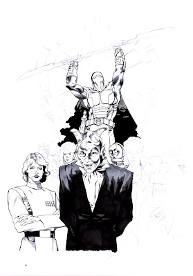
Crimson Empire Cover by Dorman & Yoakum

Finished up a great piece tonight, inks over the Dave Dorman rough for a Crimson Empire cover. Oddly enough, the interior was drawn by Paul Gulacy, who I worked with many times. I should have been inking the interior on that one!

Brush, technical pen, Copic marker on bristol

Friday, April 19, 2013

Thumbnails from The Carnival #2

Thumbnails on a two page sequence from the second issue of The Carnival: One Last Note Before I Go. I had changed this from a single page where i thought that the story had become too compressed. I was worried that I needed to keep pressing more information into the reader, and i realized that there needed to be a little... more space. Because my dialogue is so brilliant that it needed more pages. I love the way the action sets up, now we'll see how it looks full size...

Wednesday, April 10, 2013

In Process: The Avengers by Granov & Yoakum

Posted this "in process" piece, simply to blow Alex Sheikman's mind, since we approach inking completely differently.

This one is coming along I think.

Sunday, April 07, 2013

In Progress: Star Wars by Dorman & Yoakum

Not sure where this piece was used, but here are inks, in process, with Copic Markers for tones.

just a li'l something for a sunday night...

Tuesday, March 26, 2013

Making the Perfect Haggadah: 1982 or 2013

So I sit here, in my studio, with a drawing table equipped with a state of the art LED light board affixed, over a terabyte of memory available on the tower at my feet, a tabloid scanner capable of scanning at 1200 dpi in 24 bit color and downloading into Adobe's Photoshop CS suite, shown on a HD flat screen monitor and manipulated by a Intuos 3 pressure sensitive tablet... and i'm creating a personalized Haggadah for tomorrow night's seder using a photocopier, an X-acto knife and roll of scotch tape. And i'm then going to photocopy the whole thing, en mass, for over 30 people.

Oh yes I am.

Anyone have a band they want me to promote?

Friday, March 22, 2013

Alien by Dorman & Yoakum

A new commission piece, and an interesting one to interpret, since i have no idea if the pencils that i was working off of were going to be inked, or were the basis for a painted piece. It meant that the values of the piece could have been changed significantly by having Dave separate the planes on the art by color, as opposed to line weight. I went in and did... well, what looked right to my eye, that's what. I've never drawn the Alien, even though I've seen it a million times in my nightmares.

Don't get me started on the first two films of the Alien franchise, they're both so utterly brilliant that its hard to start talking about them.

Click the image to embiggen.

Thursday, March 21, 2013

Quick Look: Hulk Special #1 Cover by Jim Steranko

While i'm on this Adams and Steranko kick, I wanted to share one of the most iconic images from that era, one that has gotten lost over the years as time has marched by. Steranko's Hulk cover was an astonishing design, with the integration of the logo into the artwork, and the fact that Hulk's head is really too large for his body. But it works, and it works beautifully since it allows the expression to be read better at this size, a triumph of getting the artwork to fit the message rather than be a slave to any one master (such as pre-designed proportions).

It isn't a wonder that Stan gave Jim all this freedom when it came to his work at Marvel, after all, he was looking at the stuff and knew that Steranko was on that enviable upward curve where the artwork experiences rapid leaps almost every month. What I don't get is how he didn't realize how Jim getting the writer credit and freedom to experiment would hurt Kirby. That lack of emapthy was a huge miscalculation at best, or a huge blind spot at worst. I suspect the latter.

Wednesday, March 20, 2013

A Quick Look: Iron Man #1 cover by Gene Colan

Gene Colan was a great artist with an utterly unique style that many times defied convention. Having seen Gene's pencils many times, I can honestly say that i'm glad that i was never asked to ink him. I couldn't have done what Tom Palmer did and sort through those myriad pencil lines to figure out which ones to highlight. Despite being a "brush guy". I look at Gene's work and think, "What the hell do you do for this?"

The cover of Iron Many #1 is a great example of using the heavy blacks to really orient the weight of the figure without having to worry about pointing out how wonky the left leg and right shoulder of the figure is! As well, if you compare this with the printed version, you can see how the editors statted the vignette scenes around Iron Man and moved this into different positions. Lets face it, it IS too crowded at the top. I would certainly believe that they told Gene to leave space at the bottom for a blurb, which he did, and they later decided that the "Premiere Issue" blurb didn't quite fit.  Personally, while both covers for me, Gene's original is better.

Tuesday, March 19, 2013

A Quick Look: X-Men #58 Cover by Neal Adams

These days, it would be interesting to see what sort of budget it would take to get Neal Adams and Jim Steranko to do some work on your comics. And to then have it be cancelled. Because no one wanted to read it.

Welcome to the X-Men. Except that this is no X-Men like you've ever seen before. This is the "we're hanging on by the skin of our teeth and are about to get canned" X-Men. And it shows.

Adams and Steranko both dropped in and knocked out some stunning work on a book that neither of them could have cared less about, but that is because they were, in their prime, stunning artists who didn't need to be in love with the work to make everyone else in the industry look like amateurs. They were the next generation of stars in the comics and they would have a profound effect on the industry for the next 20 plus years. Longer even.

Adams' design for Havok was a delightful and inventive bit of visual imagery. the lack of highlights on the black costume, as well as the concentric circles showing the building of power in his body we something that no one had done before. And should have been done for the First Class movie. Why they didn't I don't know. Adams would also knock off designing the infamous Cerebro helmet that would get used for decades to come. Enjoy seeing the original art for this one, and ask yourself, what were they whiting out all over the cover?

Friday, March 15, 2013

Blade Runner: Producer's Notes - January, 1982

And our next little bit of priceless paper comes in the form of producer's notes from Blade Runner. Yes, the acknowledged, albeit troubled, classic film.

Anyone who knows me knows the level of involvement I've had with the history of this film, and all its various problems and editorial iterations. I've been obsessed with it for 20+ years since Todd Miro and I saw it opening week in a huge empty theatre. The fact is, given Future Noir and the documentary releases and the Blu-Ray Voit-Kampf set and having my own PK blaster, I think that i'm finally over it. Its brilliant and amazing and still has flaws, flaws that make me love it all the more, but I don't need any more data on it.

Until now.

The one pager, with the producer's notes, belongs in my Blu-Ray box set. It is, in fact, required reading.

"This movie gets worse every screening."

By the people who were making the damn thing.

Thursday, March 14, 2013

A Bit Of: Steranko - Our Love Story #5

Steranko's work back in the early 1970's was starting to wind down, before his final disagreement with Stan made him completely walk away. The last three short stories that he did for Marvel are fascinating, and among my favorite work of his. In particular, the Tower of Shadows #1 short story, is a devastating tour de force of pacing, lighting and narrative flexibility that has been equaled very few times in the last 40 years. Its that good.

Less well known is his attempt to re-invent the visual language of the romance story, and the short from Our Love #5 is an interesting stab at it. This is the first time I've ever seen a color guide from that story, a perfect example of how they called out the CMYK values back in the day. Take a little peak behind the curtain....

Wednesday, March 13, 2013

Photon Creative and the Zimmer Whiteboard Animation


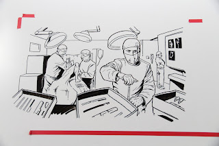
Notes on whiteboard animation: OK, this is kinda tough. Its like time lapse performance art.

Working on a whiteboard is like trying to coax sensitivity out of a hammer. The markers aren't particularly well made, nor are there a lot of variations that you can purchase. We purchased all of them, and i similarly abused the hell out of the tips of said markers.


The work was being done for Photon Creative in San Francisco, under the direction of Ed Carden and Brandon Butrick for Zimmer, whose artificial joints are pieces of insertable art. Seriously, the artificial knee joints that they make are like holding new Apple products.

We worked small, then larger and tried to capture all the coolness of the initial sketches in the final product. I'll post the link when the final is cleared for public consumption. If you've see RS Anime's work in this, I think that we did some different things and pushed the form more than a little bit.

Now, its back to brushes and india ink and some slightly more traditional work...

Tuesday, March 12, 2013

G.I. Joe by Noto & Yoakum

Pen and Ink and Copic marker on 2 ply bristol, commission work...

Not being a G.I Joe fan, i had to ask, "who ARE these characters?" Now i know.

Monday, March 11, 2013

What have you been doing? Glad you asked...

A little of this, and a little of that. working a freelance whiteboard animation project that more than doubled in scope along the way. I'll post more on that.

Wanted to do a little housecleaning in the studio however, between projects. Found this experiment mixing ink and gouache and trying, in vain, to find the right paper. Finally emails J.G. Jones who directed me, in about 2 seconds, to the right stuff. While I never finished this one, I like what i learned from it.

Planning ahead is the key. Know what your values are and stick to them. Cap works completely with teh light source, which i could have dimmed if i needed to. the Skull does not work, as i let the values bleed into each other and the entire head flattened out. bleh.

Plenty to talk about with comics over the last 5 months, no question, but for now i'm trying to jump back into the second issue of The Carnival and dive back into my usual stuff, as opposed to whiteboard markers.